Idukki Case study
At-a-Glance 👀
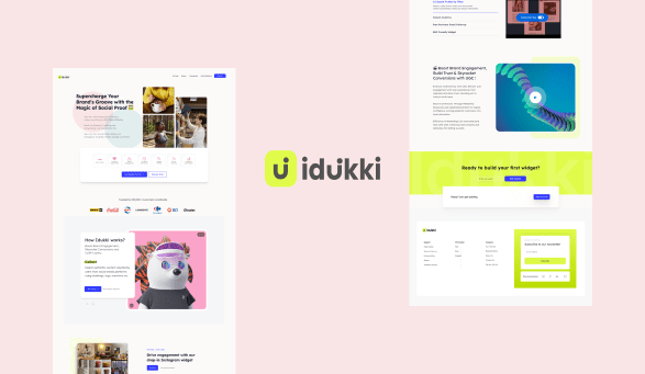
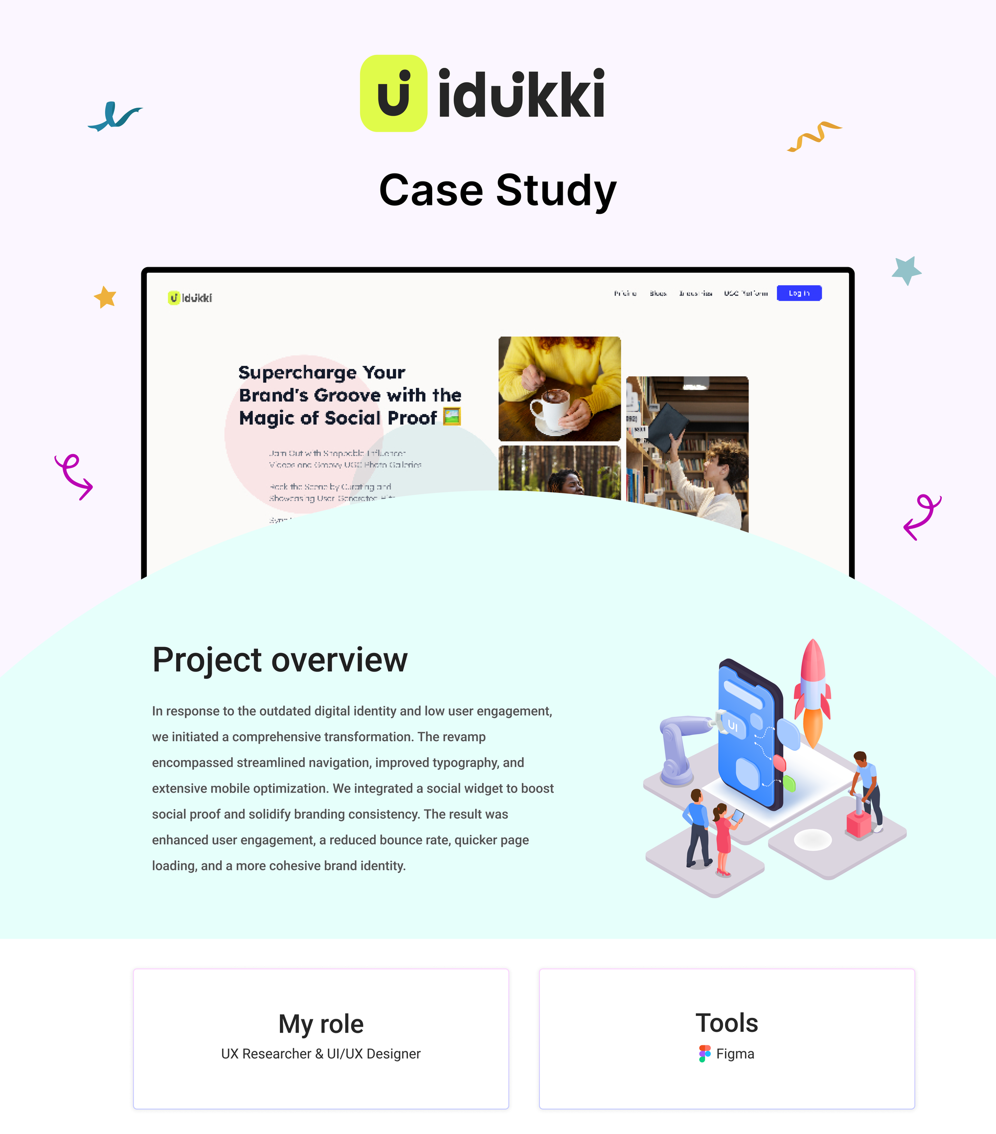
In response to the outdated digital identity and low user engagement, we initiated a comprehensive transformation. The revamp encompassed streamlined navigation, improved typography, and extensive mobile optimization. We integrated a social widget to boost social proof and solidify branding consistency. The result was enhanced user engagement, a reduced bounce rate, quicker page loading, and a more cohesive brand identity.
Problem
Their website, however, didn’t reflect this dynamic. Aesthetically it was a visual dumping ground which didn’t do justice to the brand purpose. There was no structure to the content. It amplified confusion rather than coherency.
👉 Not efficient in conveying to their users what the business does, is ineffective with generating leads, and is too lengthy to scroll through
Goal
In this project, our primary goals were to enhance user experience, increase engagement, align the website with the dynamic brand identity of Idukki, and improve aesthetics to meet modern design standards. These objectives were essential in addressing the challenges of an outdated, confusing, and visually unappealing website.
🚀 Make it easy to understand the company value and facilitate positive user experience through informative and relevant content to navigate potential clients in the right direction.
Process
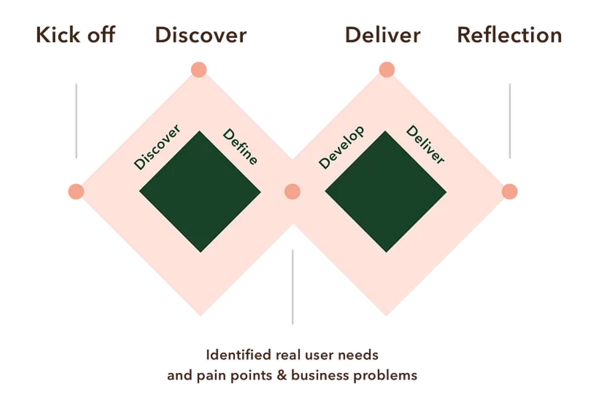
The Double Diamond design process is a structured approach to problem-solving and innovation in design. It consists of four key phases: Discover, Define, Develop, and Deliver. Here's an overview of each phase based on the Double Diamond model:
Discovery phase
I strongly assert that the foundational elements of any successful design process lie in precisely defining how a solution should operate, the problems it should address, and the objectives it should prioritize. Even when it may seem that the answer to a given problem is apparent, it is essential to pause and delve into research to confirm if the focus is indeed on the correct problem. In this context, cultivating a 'curious' beginner's mindset is pivotal to uncovering accurate business goals, genuine user needs, and the realm of technological possibilities.
Our project initiation centered on a thorough investigation of both internal (company) and external (user) catalysts. This exploration aimed to crystallize the domain for a potential solution, with an emphasis on delineating how the website should function, rather than its visual aesthetics.
Define phase
Conducted a Google Meet session with the owner to gain insights into the brand's vision, overarching objectives, and the obstacles faced. This session aimed to gather their perspective on:
Internally: Uncovering the business's needs, requirements, and goals.
Externally: Gaining an understanding of the broader context, competitors, and industry best practices.
Emphasizing the significance of documenting these insights, as they serve as a central source of truth that will guide the decision-making process.
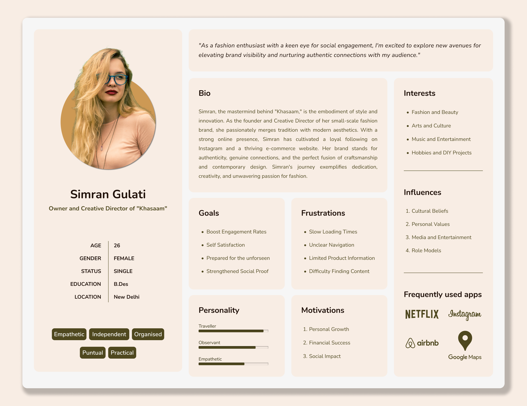
Create detailed user personas to understand different user needs and motivations.
Develop phase
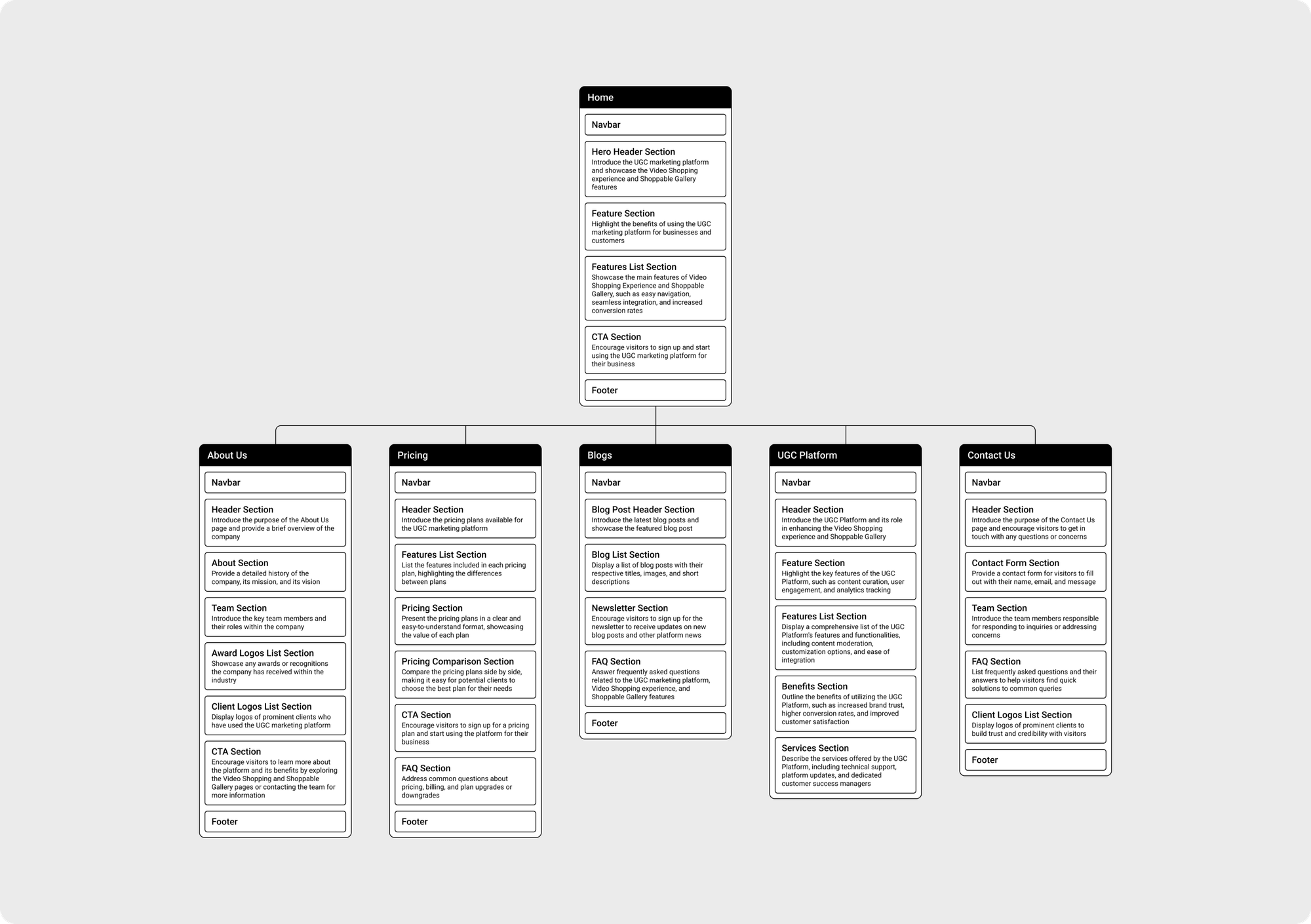
Sitemap
To ensure a delightful user experience, it's crucial to proactively address user needs by delivering pertinent information at each stage. Consequently, the structure of the site was shaped by considering various user personas and their unique journeys. This approach enabled us to streamline the transitions between pages by eliminating superfluous ones, merging existing content, and introducing new elements where deemed necessary.
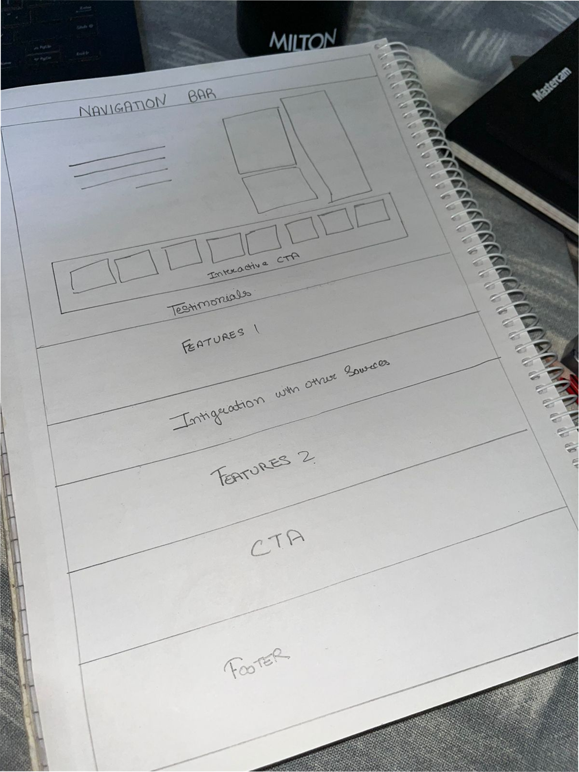
Sketches
The process below begins with my initial ideas wireframes, then moves to mockups, and finally to the high-fidelity prototype. In this simple version, you can see how the I approach solves the user needs.
Wireframes & Prototypes
I then brought my idea to an interactive digital low-fidelity prototype and brought it to five potential users to collect feedback.

Major Design Iterations 🔁
In the realm of major design iterations, we embarked on a journey of continuous improvement, marking each iteration as an evolution in design. These ongoing refinements bring us closer to our goal of enhancing idukki.io's user experience and visual appeal, creating a more engaging and user-friendly platform for our audience.
👇 Iteration 1. Homepage redesigned with more organization
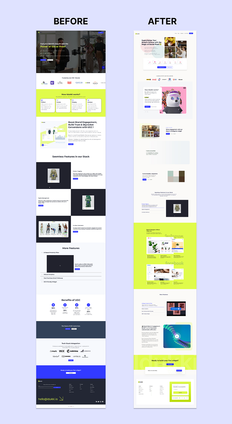
Final design

👇 Click to play with the prototype
Product Successes 👏
With ongoing design iterations, idukki.io is poised for future success. These refinements are paving the way for the website to meet and exceed user expectations, achieve its business goals, and maintain long-term relevance in the market once it's developed.
What I Learned 🌱
Through the idukki project, I've gained valuable insights into the importance of user-centric design, the iterative nature of the design process, and the significance of addressing user needs and objectives to create a successful and engaging digital platform.
Liked the project? Let's work together.
12 Nov 2023
