Staff Dashboard
At-a-Glance 👀
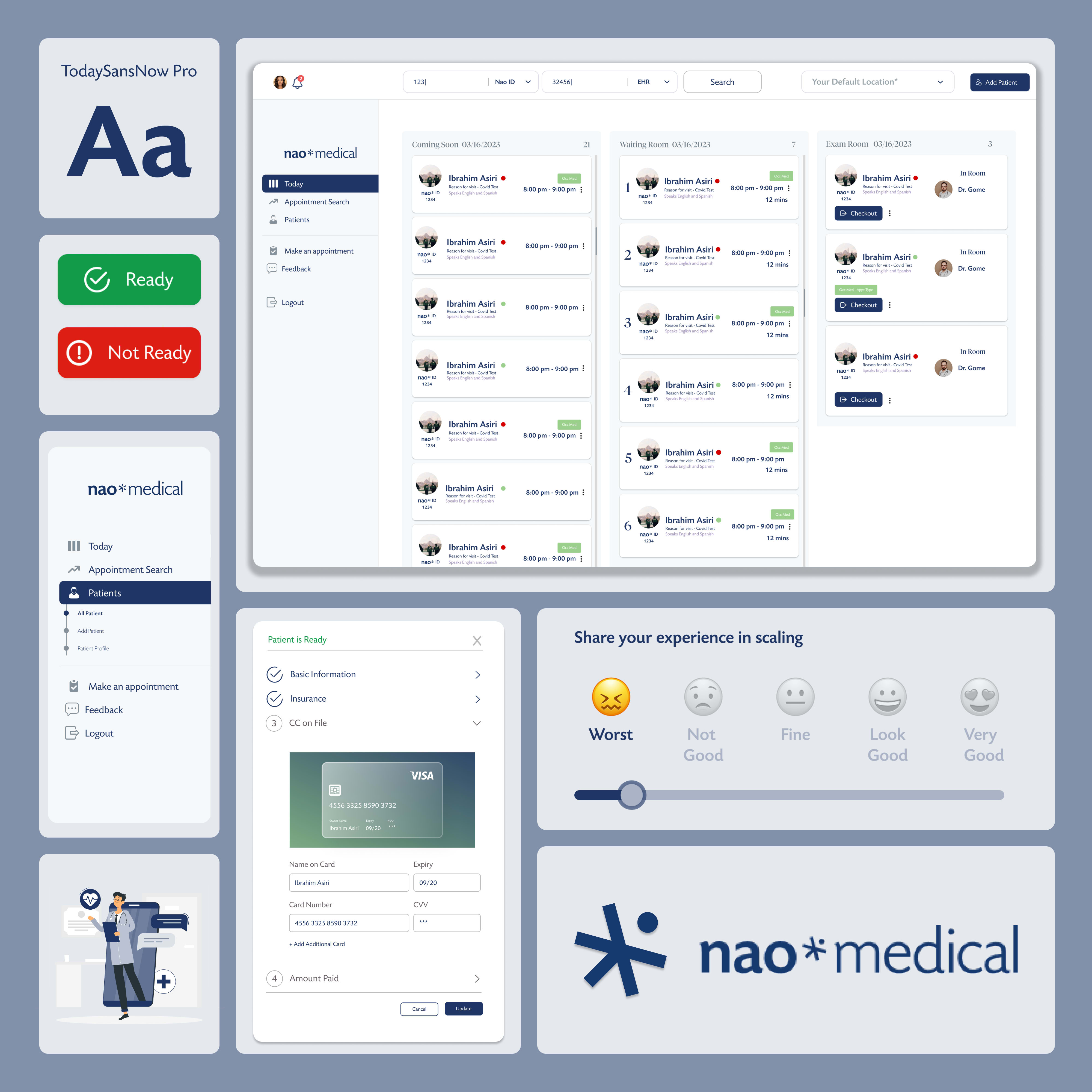
Designed a staff dashboard to optimize hospital workflows. Features included real-time appointment scheduling, comprehensive patient profiles, and instant feedback collection. Leveraged Figma for a seamless UI/UX experience. Successfully improved staff efficiency and streamlined daily operations.
Problem
Inefficiencies in hospital workflows lead to missed appointments, miscommunication among staff, and lower patient satisfaction rates. There was a need for a centralized platform where hospital staff could easily manage appointments, access up-to-date patient profiles, and promptly address patient feedback.
👉🏼The absence of such a tool made it challenging for the staff to maintain seamless operations and provide timely care.
Solution
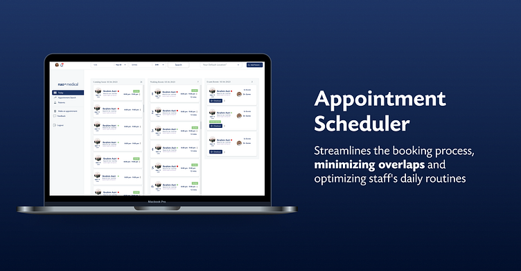
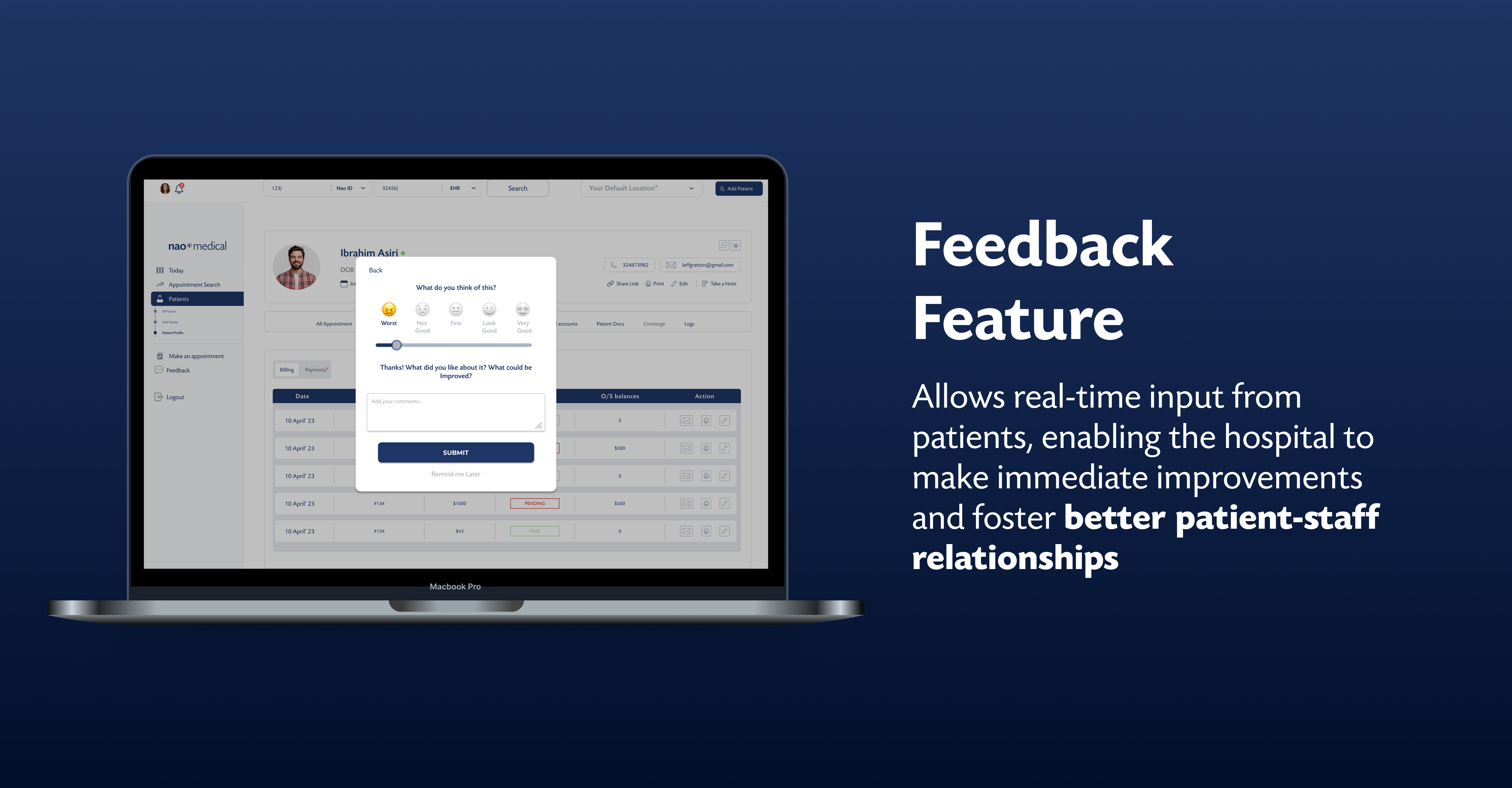
In response to the identified challenges, I crafted a comprehensive staff dashboard tailored to bolster hospital operations. One key feature was the feedback module, enabling real-time patient feedback, and facilitating prompt resolutions and quality enhancements. Additionally, the dashboard included an intuitive appointment scheduler, mitigating overbookings and no-shows. Moreover, an integrated patient profile overview ensured staff had immediate access to critical patient histories and details.
🚀 These features not only improved staff efficiency but also elevated the patient experience.
Process
I delved deep into the hospital environment's unique challenges and then leveraged the principles of intuitive design to draft a low-fidelity blueprint. After insightful feedback from a testing group of staff members, refinements were made, culminating in a high-fidelity prototype that met both user needs and operational demands.
Research & Discovery
Before diving into the design, I conducted user interviews and gathered data to understand the specific needs, pain points, and expectations of the hospital staff. This phase allowed me to identify the primary features that would provide the most value.
Ideation & Sketching
With the insights gained, I began brainstorming and sketching out rough wireframes. This phase involved a lot of iterations, constantly refining ideas based on feedback.
High-fidelity Design
Moving to a design tool, I created detailed wireframes and UI elements, ensuring that they aligned with modern design principles and provided an intuitive user experience.

Incorporating Key Features
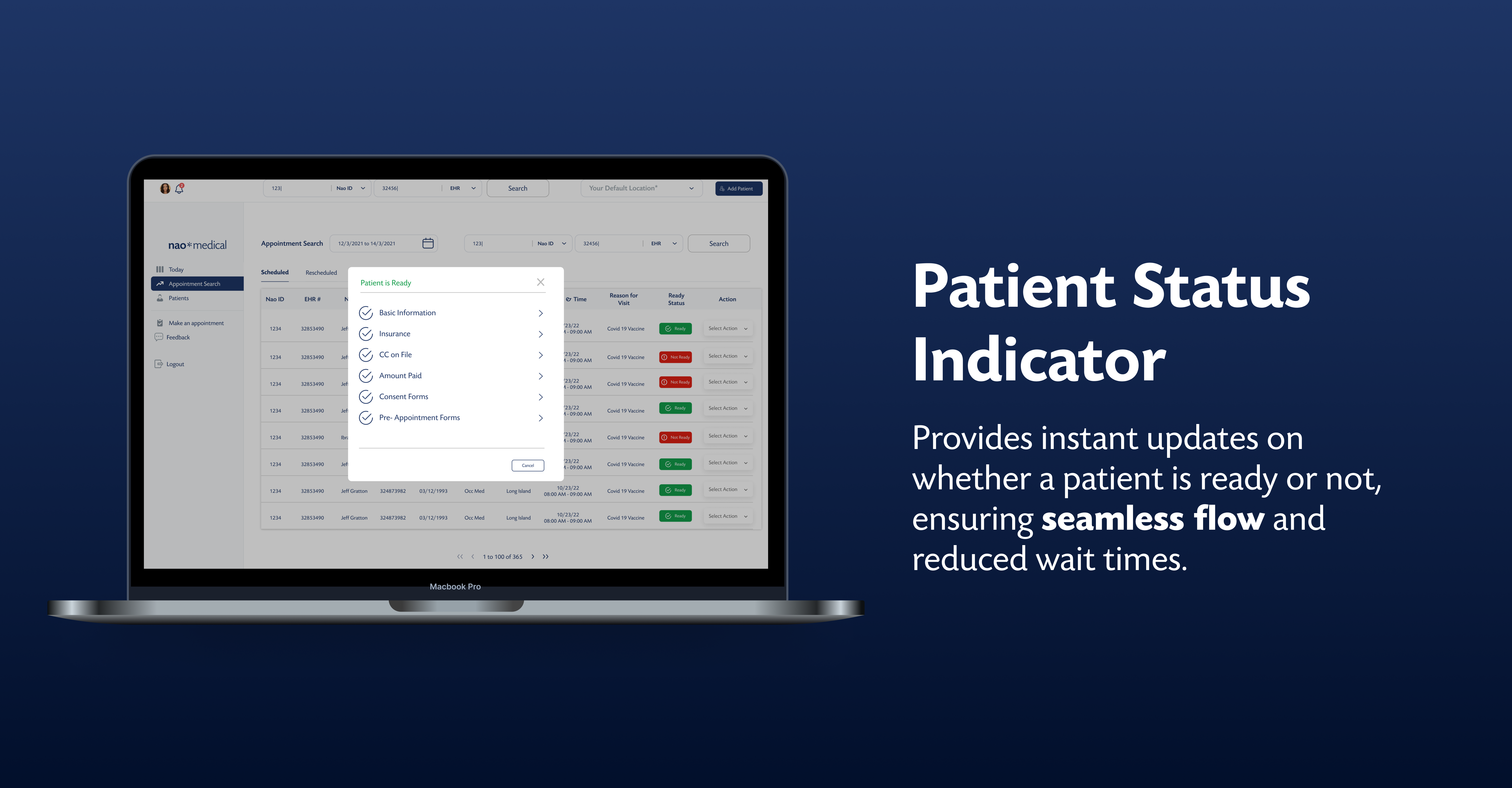
I integrated the three pivotal features - the Appointment Scheduler for streamlined bookings, the Patient Status Indicator for immediate updates, and the Feedback Feature for real-time input.
Prototyping & Testing
I developed a clickable prototype to test the user flow and interactions. By running usability tests, I gathered feedback and identified areas of improvement.
👇🏼Click to play with the prototype
Iteration & Finalization
Based on the feedback, I made the necessary refinements to the design, ensuring that the dashboard was both functional and user-friendly.

Product Successes👏🏼
The revamped Staff Dashboard design saw an enhancement in staff efficiency by 27%, all the staff members joined within the first month. One of the enthusiastic staff members, Dr. Ramesh Iyer commented, "The new dashboard has revolutionized our daily tasks. It's intuitive, streamlined, and simplifies so many of our routine activities. It's a game-changer for us."
What I Learned 🌱
While crafting the Staff Dashboard, the pivotal lesson was understanding the value of immediate user insights. Starting user feedback sessions shortly after initiating the project transformed our design direction. These real-world perspectives not only shaped our design but deeply embedded the essence of user-centricity in my approach.
Liked the project? Let's work together.
09 Jan 2023