
Spoonful - Digital Website UI Design - Shreya Kolluru


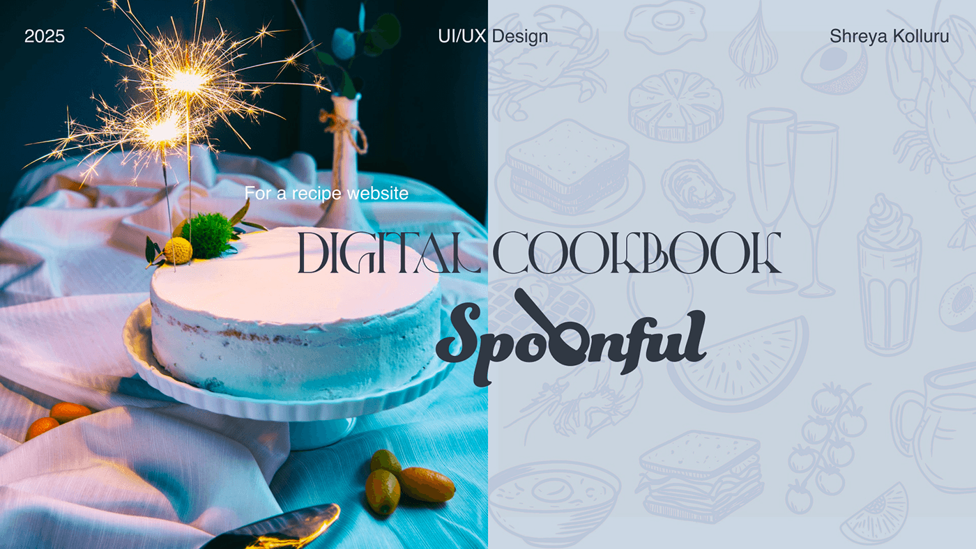
Spoonful Digital — Recipe Website UI Design
Description :-
Spoonful Digital was a recipe website UI project focused on creating a calm, minimal, and visually clean browsing experience for food content. The goal of the project was to design a recipe platform that felt modern and aesthetic while still keeping the focus on readability, usability, and content discovery.
Since recipe websites usually contain a large amount of information, ingredients, and visuals, I wanted the interface to feel lightweight and easy to navigate instead of visually overwhelming.
Design Direction :-
For this project, I intentionally chose a neutral and earthy color palette combined with minimal layouts and refined typography to create a softer and more organic visual experience. The direction was inspired by editorial food websites, modern lifestyle brands, and minimal cooking platforms.
Instead of using loud colors or excessive graphics, I focused more on whitespace, typography hierarchy, image balance, and clean content structuring to make the recipes feel easier to consume and visually calming.
I also worked on the design system first before moving into full screens. Defining typography scales, spacing systems, reusable cards, buttons, and layout structures early helped maintain consistency across the entire website and made the workflow much faster later during iterations.
The overall goal behind this direction was to make the experience feel more intentional and premium while allowing the food imagery and content itself to become the main visual focus.
Process & Problem Solving :-
One of the biggest challenges while designing the project was organizing content-heavy recipe layouts without making the interface feel crowded. To solve this, I focused heavily on spacing consistency, visual hierarchy, reusable layout systems, and content grouping.
I also tried simplifying the browsing experience by creating predictable and reusable UI patterns instead of designing every section differently. This helped improve readability and made navigation feel more natural throughout the website.
Building the design system early also reduced repetitive design decisions significantly and helped speed up the overall workflow while maintaining visual consistency across screens.
Impact & Design Metrics :-
Built a reusable design system with 20+ reusable UI components and layout structures
Reduced repetitive UI decisions by approx. 40% during the design process
Improved screen iteration speed through predefined spacing and typography systems
Maintained strong visual consistency using a controlled earthy color palette and minimal UI patterns
Simplified content-heavy recipe layouts into more scannable and readable sections
Reduced visual clutter through whitespace-focused layouts and structured hierarchy
Designed complete website screens and reusable systems within approx. 10–12 hours
Research & Inspiration :-
Pinterest, Awwwards, Behance, Editorial Food Websites, Minimal Lifestyle Brands
Tools Used :-
Figma, Jitter
Time Taken :-
Approx. 48 hours
Thanks for checking out my project ✨
31 Aug 2025
Keywords