
InkBlot - Book Review and Summary App UI/UX Case Study - Shreya Kolluru


InkBlot — Book Review & Summary App UI/UX Case Study
Description :-
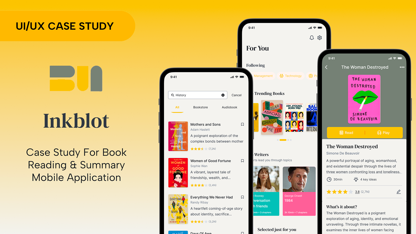
InkBlot was a UI/UX case study for a book review and summary app designed to make reading feel more accessible, engaging, and easier to fit into everyday routines. Along with book reviews and summaries, the app also included an audiobook feature to support users who prefer consuming content on the go.
The goal of the project was to create an experience that felt immersive, calm, and content-focused while still handling large amounts of information in a clean and intuitive way.
Design Direction :-
For this project, I wanted the interface to feel distraction-free and comfortable for longer usage sessions. The visual direction was inspired by modern reading platforms and editorial layouts with a focus on readability, hierarchy, and smooth content flow.
I used a softer visual system with spacious layouts, muted colors, controlled typography, and structured content grouping to reduce visual fatigue and make content easier to consume digitally.
Before moving into final screens, I created a reusable design system covering typography scales, spacing rules, navigation patterns, audiobook controls, review cards, and reading progress components. This helped maintain consistency throughout the app and sped up iteration during the design process.
Since the app included audiobook functionality as well, one of the focuses was making transitions between reading, listening, browsing, and saving content feel seamless instead of disconnected.
Process & Problem Solving :-
One of the biggest challenges was organizing multiple content types — summaries, reviews, audiobooks, recommendations, and reading progress — without overwhelming users.
To solve this, I focused heavily on content prioritization and reducing interaction complexity. I simplified navigation patterns, reduced unnecessary UI noise, and designed reusable content modules that adapted across multiple sections of the app.
Typography hierarchy and spacing also played a huge role since the experience relied heavily on long-form reading and continuous content browsing.
Impact & UX Metrics :-
Designed 25+ unique screens covering reading, audiobook, review, onboarding, and discovery flows
Built a reusable design system with 35+ reusable UI components and interaction states
Reduced primary navigation options from 7 potential categories to 4 core interaction points for simpler user flow
Structured long-form content layouts using a consistent 8pt spacing system to improve readability and visual rhythm
Reduced visual clutter by limiting the primary color palette to 3 core tones and 2 accent states
Created scalable card systems adaptable across summaries, reviews, recommendations, and saved content sections
Designed audiobook playback interactions with fewer taps required for common actions like pause, resume, and switching content
Maintained consistency across 100% of screens using predefined typography scales, reusable layouts, and component structures
Completed wireframing, UX flow planning, UI system creation, and high-fidelity prototyping within approx. 2 months
Research & Inspiration :-
Kindle, Audible, Goodreads, Notion Editorial Layouts, Pinterest, Behance
Tools Used :-
Figma, Photoshop
Time Taken :-
Approx. 2months
Thanks for checking out my project ✨
07 Jul 2025
Keywords