
Ledgerlink Website Design & Development


LedgerLink — Invoice-to-Payment Automation Website
Description :-
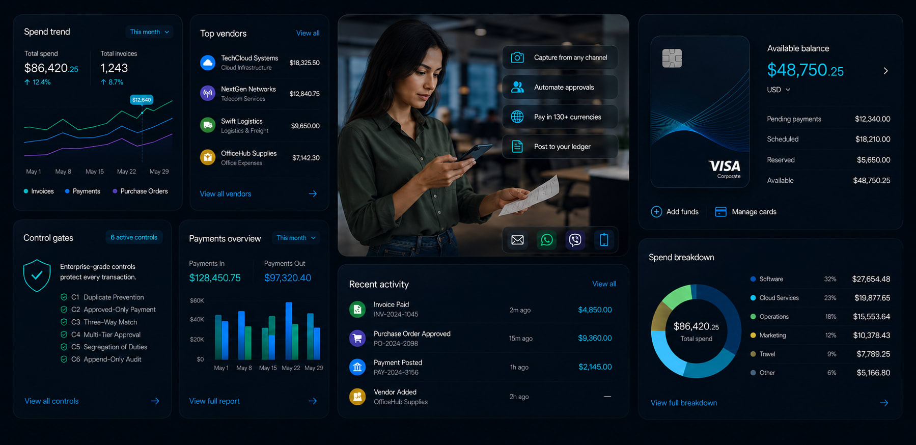
LedgerLink is an invoice-to-payment automation platform designed to help finance teams automate the complete workflow from invoice capture to approvals, vendor payments, and ledger reconciliation. The goal of the website was to communicate a complex finance product in a way that felt simple, modern, and easy to understand without making the interface visually overwhelming.
Since the platform handles finance operations, approvals, payments, and reconciliation workflows, the website needed to instantly feel trustworthy, structured, and product-focused while still maintaining a clean modern aesthetic.
Design Direction :-
For this project, I started by building the design system first before designing the actual website screens. Since the entire website was designed around a dark theme, I focused heavily on defining a controlled visual system including color palettes, typography scales, spacing rules, reusable components, gradients, and interaction patterns early in the process.
The biggest design challenge was balancing minimalism with communication. Finance and automation products usually involve a lot of technical information, but I wanted the website to still feel lightweight and visually clean while clearly delivering the product message — automating invoice-to-payment workflows with zero manual data entry.
To solve this, I relied more on hierarchy, concise content structuring, reusable layouts, and visual flow instead of overcrowding sections with unnecessary graphics or excessive UI elements. I also used subtle interactions and repeated visual patterns across the website to create consistency and guide user attention naturally.
Process & Problem Solving :-
Creating the design system first helped reduce repetitive design decisions significantly during both the UI and development stages. Reusable sections, predefined spacing systems, and consistent component structures made screen iteration faster and improved overall workflow efficiency.
Instead of designing every section from scratch individually, I focused more on building scalable systems that could speed up both the visual design and coding process while maintaining consistency throughout the website.
Impact & Design Metrics :-
Built a reusable design system with 10+ reusable components and layout patterns
Reduced repetitive UI/design decisions by approx. 40% during the design process
Improved design-to-development workflow speed by nearly 35% through predefined spacing, typography, and component structures
Maintained visual consistency across all sections using a limited and controlled dark-theme color system
Reduced visual clutter by simplifying finance-heavy content into more scannable layouts
Designed and developed the complete website workflow end-to-end within approx. 15–18 hours
Research & Inspiration :-
Bills, Tipalti, Pinterest, Finance related websites
Tools Used :-
Figma, Framer, HTML/CSS, JavaScript, React
Time Taken :-
Approx. 15–18 Hours
Thanks for checking out my project ✌️
11 Jun 2026
Keywords