Mentorify - A Mentor Mentee Platform
Introduction
Welcome to my project showcasing the UI design for a cutting-edge mentor-mentee platform 'Mentorify'. This platform aims to connect aspiring individuals with experienced mentors through video calls, providing guidance and support for personal and professional growth. Throughout the design process, I focused on creating an intuitive user flow, incorporating wireframes, and delivering a visually appealing and functional interface. Let's dive into the details!
Understanding User Needs
To begin the design process, I conducted extensive user research to gain a deep understanding of the needs and pain points of both mentors and mentees. Through surveys, interviews, and market analysis, I identified key features and functionalities required to create a seamless experience. This research formed the foundation for the subsequent design stages.
User Flow
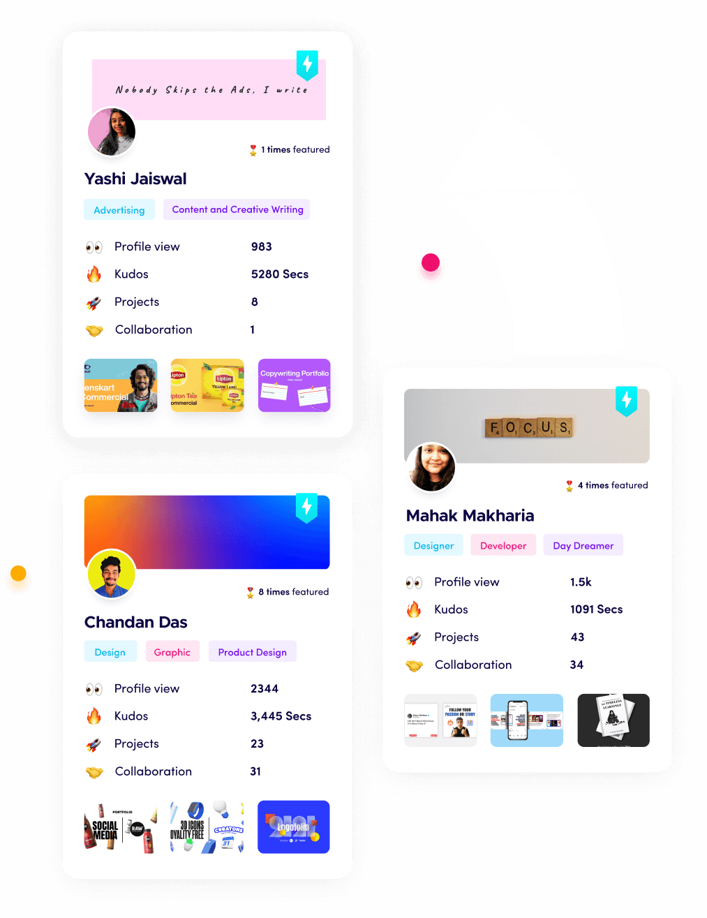
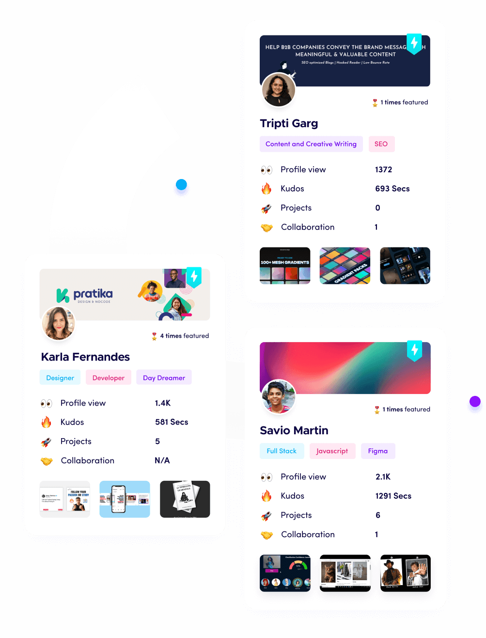
The user flow for this mentor-mentee platform was designed to be straightforward and efficient, allowing mentees to easily connect with suitable mentors. The flow begins with a user-friendly onboarding process, where new users can sign up and create a profile. Following this, mentees can explore a diverse range of mentors based on their areas of expertise, ratings, and availability.
To enhance the selection process, I incorporated a rating and review system, allowing previous mentees to share their experiences and feedback.
Check out the FigJam file here: https://www.figma.com/file/mi3QGE2Xxh3g5B1EZL97PB/Mentor-Mentee-Platform?type=whiteboard&node-id=0%3A1&t=MvYf6HJELAkTGP00-1
Wireframes and Prototyping
Before diving into the visual design, I created wireframes to establish the layout and structure of each screen. This allowed me to refine the user flow, placement of key elements, and interactions. With the wireframes as a foundation, I developed interactive prototypes using industry-standard design tools, enabling users to experience the platform's functionality and provide feedback.
User Interface Design
For the UI design, I aimed to create a visually appealing and cohesive interface that aligns with the platform's brand identity. The color scheme I chose combines soothing tones with vibrant accents, evoking a sense of trust, professionalism, and excitement. The typography is clean and readable, enhancing legibility across various devices.
Conclusion
This mentor-mentee platform UI design project aimed to create an engaging and intuitive experience for both mentees and mentors. By implementing a seamless user flow, visually appealing design elements, and efficient booking processes, this platform empowers mentees to connect with experienced mentors for their personal and professional development. I thoroughly enjoyed working on this project and am excited to present it as part of my portfolio.
25 Apr 2023


