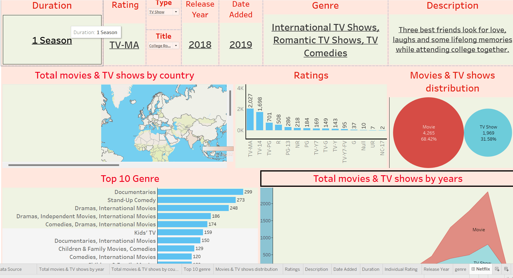
Netflix Dashboard -using Tableau
I'm excited to share one of my recent projects: a dynamic and interactive Tableau dashboard that visualizes Netflix watch trends, user engagement patterns, and genre insights! This project highlights how data can be transformed into a compelling story about viewer behavior and content popularity.
Tools used: Tableau Desktop, Tableau Prep Builder
🎥 Genre Performance Analysis
Track viewership across genres with interactive visuals that reveal top-performing categories, enabling better content planning and personalized recommendations.
⏰ Peak Streaming Hours
Visualize user activity by hour and day to identify when audiences are most active, helping uncover prime time slots and binge-watching trends.
📅 Seasonal Content Trends
Analyze viewing patterns throughout the year to discover seasonal spikes in engagement and content popularity.
👤 User Engagement Insights
Explore how user behavior changes over time through key metrics such as watch frequency, time spent, and user retention.
🔍 Dynamic Filtering
Leverage interactive filters to segment data by region, age group, and device, providing flexible and tailored insights into viewing habits.
📈 Trend Visualization
Track emerging patterns and long-term shifts in viewing behavior using line charts and area plots to display content performance over time.
This project deepened my skills in data storytelling, user behavior analysis, and interactive visualization, while showcasing the power of Tableau in transforming large datasets into clear, actionable insights for content-driven platforms like Netflix.
24 Dec 2024