Mobile app case study MY BANK app - Aryan K. J.
Why I Chose This Project
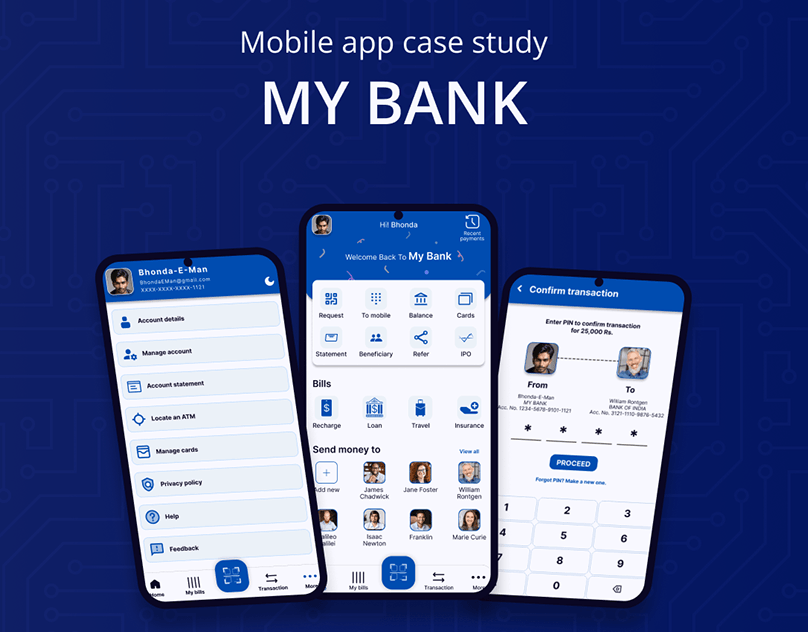
As someone passionate about solving real-world problems through design, I was drawn to the challenge of improving mobile banking experiences — which are often either cluttered and overwhelming or too limited in functionality. I saw an opportunity to rethink the way users interact with their finances: with more clarity, calm, and confidence.
This was my first complete case study as a UI/UX designer. I intentionally chose a complex, high-stakes product to push my limits and learn by doing. While the process involved many mistakes, it became my most valuable learning experience to date.
What Problem I Solved
Through competitive analysis and user scenario mapping, I uncovered several pain points common to many banking apps:
❌ Overloaded dashboards — key information buried under too much data
❌ Poor feature integration — budgeting, savings, and transactions felt disconnected
❌ Confusing navigation — users struggled to find common actions
❌ Cold, transactional UI — lacking trust-building design or emotional tone
My redesign addressed these by introducing:
✅ A clean, prioritized dashboard with only the most relevant financial data
✅ Seamless integration of money management tools (spending insights, transfers, goals)
✅ A friendly, modern interface that inspires trust and confidence
✅ Mobile-first responsiveness and interactive clarity across the experience
Duration
15 Days Total
This was a deep-dive, end-to-end learning experience:
Days 1–3: Research, competitor analysis, and problem definition
Days 4–6: Persona creation, journey mapping, and wireframing
Days 7–11: High-fidelity UI design and mobile-first layout in Figma
Days 12–13: Building the design system and prototyping
Days 14–15: Documentation, reflection, and case study write-up
My Design Process
Research & UX Audit
Analyzed mobile banking apps like Revolut, Monzo, and traditional bank interfaces. Identified usability issues, good practices, and emotional design gaps.
User Persona & Goals
Defined two core personas — a financially anxious student and a time-strapped professional — to guide decisions from both emotional and practical angles.
Wireframes & Flows
Created wireframes to map out simplified user flows for viewing balances, making transfers, tracking expenses, and setting savings goals.
Visual Design
Developed a calming, professional UI with structured spacing, clear iconography, and tone-appropriate color use to build trust.
Component Design System
Built reusable UI components (cards, graphs, inputs, modals) for scalability and visual consistency.
Prototyping & Reflection
Built a functional prototype in Figma. Reflected on the process, design flaws, and lessons learned — which became the foundation of my growth.
Outcome
This project taught me more than any tutorial could. It helped me:
Face real design challenges with critical thinking
Understand the importance of clarity, emotion, and accessibility in finance
Learn to embrace feedback, errors, and iteration as vital parts of design maturity
It’s not just a case study — it’s the starting point of my design career, and a testament to how far I’ve come in a short time.
29 Jan 2025