Syself-LOGO-redesign - Aryan K. J.
Why I Chose This Project
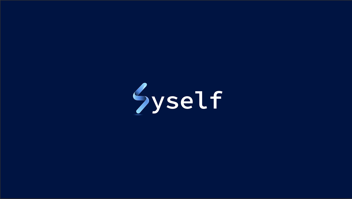
I selected Syself for this logo project because of its bold mission to simplify Kubernetes — making a notoriously complex infrastructure “just work” for users. As a designer passionate about clarity and purpose-driven visual identity, I saw an opportunity to craft a symbol that communicates simplicity, reliability, and automation — essential pillars of Syself’s brand essence.
What Problem I Solved
Syself’s platform is designed to be powerful yet approachable, but their visual identity needed to reflect that balance. My design goal was to create a logo that:
❌ Doesn’t feel overly technical or intimidating
❌ Is distinct and memorable in the DevOps ecosystem
❌ Scales across formats — from website headers to CLI prompts
❌ Communicates the brand’s core values: simplicity, reliability, and innovation
The final logo encapsulates these needs by:
✅ Evoking a sense of automated flow through clean, continuous lines
✅ Emphasizing clarity and reliability with balanced geometry
✅ Being versatile enough for digital and analog use (e.g., icon, print, CLI)
Duration
2 Days Total
Day 1: Research, brand analysis, moodboarding, and concept sketching
Day 2: Digital refinement, type pairing, color calibration, and mockups
My Design Process
Brand Discovery
Immersed myself in Syself’s messaging, mission, and product vision — especially its emphasis on making Kubernetes work seamlessly .
Sketching & Concepting
Explored visual metaphors for automation, flow, and infrastructure stability, translating these ideas into rough sketches.
Digital Refinement
Selected top concepts and refined them in vector software, ensuring clarity, symmetry, and scalability.
Typography & Alignment
Paired the symbol with a clean, approachable typeface that complements the technical yet friendly brand tone.
Mockups & Final Presentation
Presented the logo in real-world contexts — website headers, platform icons, and CLI environments — to demonstrate versatility and cohesion.
Outcome
The resulting logo captures Syself’s mission: an approachable, reliable symbol that reflects automated, self-healing infrastructure — without overwhelming the user visually. The logo is versatile and professional, ready to support Syself’s growth as a trusted Kubernetes platform.
This project underscored why design matters in tech: visual clarity builds trust, especially in complex domains. It sharpened my ability to translate technical purpose into meaningful design.
10 Mar 2025