Mascot-design-02 - Aryan K. J.
Why I Chose This Project
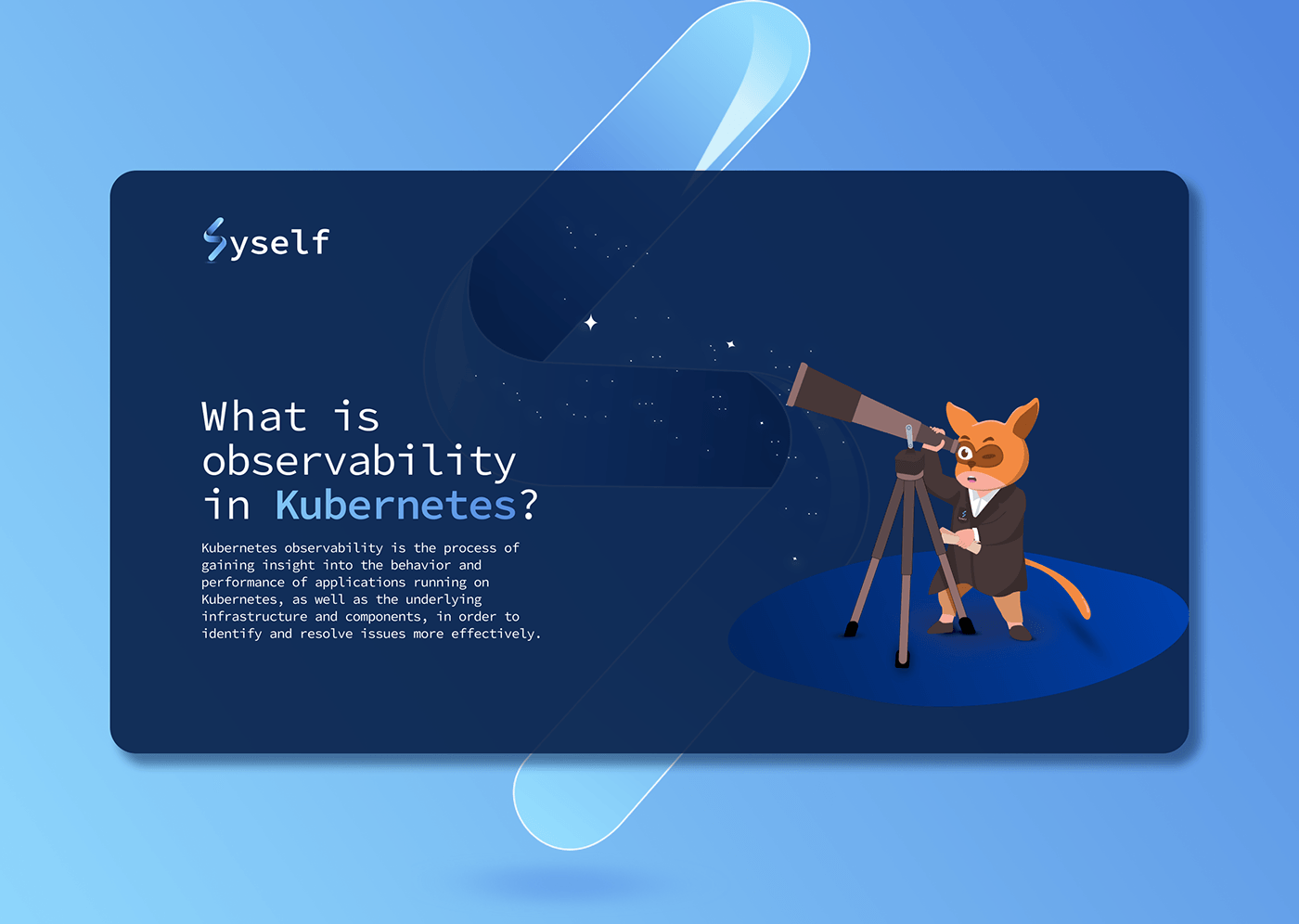
Following the logo identity work for Syself, I wanted to explore how the brand could further differentiate itself and connect emotionally with users — especially within a developer-focused environment. Given Syself’s mission to simplify complex infrastructure like Kubernetes, I saw an opportunity to humanize the brand with a fun, memorable, and meaningful mascot.
Mascots are uncommon in DevOps branding — and that’s exactly why I took on the challenge. This project allowed me to fuse technical storytelling with emotional design, giving Syself a brand element that’s approachable, recognizable, and conversation-worthy.
What Problem I Solved
Syself’s product is technical at its core, but the goal is to make it feel easy, reliable, and human-first. The brand needed a unique visual element that could:
❌ Break the monotony of typical enterprise DevOps branding
❌ Soften the learning curve for new users with a more inviting personality
❌ Engage users visually across documentation, onboarding, and community
❌ Embody Syself’s promise of intelligent, always-on automation
My mascot design addressed these needs by:
✅ Creating a smart, friendly character that symbolizes autonomy and support
✅ Using soft lines, tech-inspired details, and playful proportions to strike balance
✅ Designing with versatility — adaptable for light/dark themes, motion, and marketing use cases
✅ Making the brand more relatable, memorable, and emotionally engaging
Duration
3 Days Total
Day 1: Concept development, reference gathering, and sketching
Day 2: Refinement and digital illustration in vector format
Day 3: Color, expression sets, and mascot usage mockups
My Design Process
Brand Tone Exploration
Revisited Syself’s mission — automation that “just works” — and brainstormed ways to express this through personality and visual traits.
Concept Sketching
Explored various directions: robotic assistants, simplified AI creatures, and abstract tech characters. Chose a form that blends machine intelligence with emotional warmth.
Digital Rendering
Converted sketches to vectors with attention to proportions, facial expressions, and iconographic consistency. Focused on ensuring it was playful but not childish, and technical without being cold.
Color System & Expression Variants
Created color themes based on Syself’s brand palette and added alternate expressions for different use cases (loading states, alerts, greetings, etc.).
Mockups & Integration
Designed usage examples: CLI assistant, onboarding guides, 404 pages, and community avatars — ensuring it works in static and animated contexts.
Outcome
The Syself mascot has become a visual anchor for the brand — helping communicate support, automation, and human-centric design in a field known for complexity. It opens up new possibilities for:
Brand storytelling
User onboarding experiences
Educational and marketing content
Building emotional loyalty with users
This project helped me further refine my skills in character design for tech products, and reinforced how visual empathy can be a powerful differentiator in digital design.
02 Feb 2025