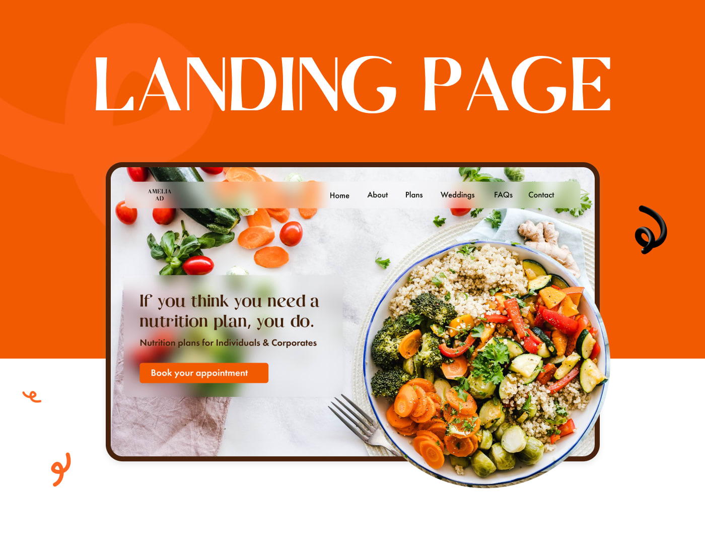
Nutritionist Website | LANDING PAGE
Project: This website design project aimed at crafting a nurturing and inviting online space for a nutrition consultancy, focusing on personalized nutrition plans and wellness journeys.
Key Challenges:
- Creating a Welcoming Atmosphere: Building a design that feels personal and supportive, encouraging visitors to take their first step towards wellness.
- Highlighting Personalized Services: Showcasing the range of tailored nutrition plans and the personal touch in the services offered.
- Simplifying the Path to Engagement: Designing an easy-to-navigate site that guides visitors from discovery to booking an appointment without any friction.
Tools & Technologies Used:
- Figma: Leveraged for its user experience design capabilities, facilitating the creation of a fluid and intuitive site layout.
- Photoshop: Used to edit and optimize images that bring the personal stories and successes of clients to life, adding authenticity to the site.
Learnings:
- Empathy in Design: Deepened my understanding of how to use design to connect with and inspire site visitors on a personal level.
- Clarity and Simplicity: Reinforced the importance of clear messaging and a straightforward site structure that enhances user engagement.
- Visual Storytelling: Gained insights on effectively using visuals to complement and elevate the narrative around health and wellness.
This project added a new layer to my design experience, teaching me more about crafting user-friendly spaces online. It was a good practice ground for balancing visuals and content, making sure the site's message was clear without overwhelming visitors.
Thank you for reading!
03 Feb 2023


