VRooze Mark X Landing Page Design
Concept:
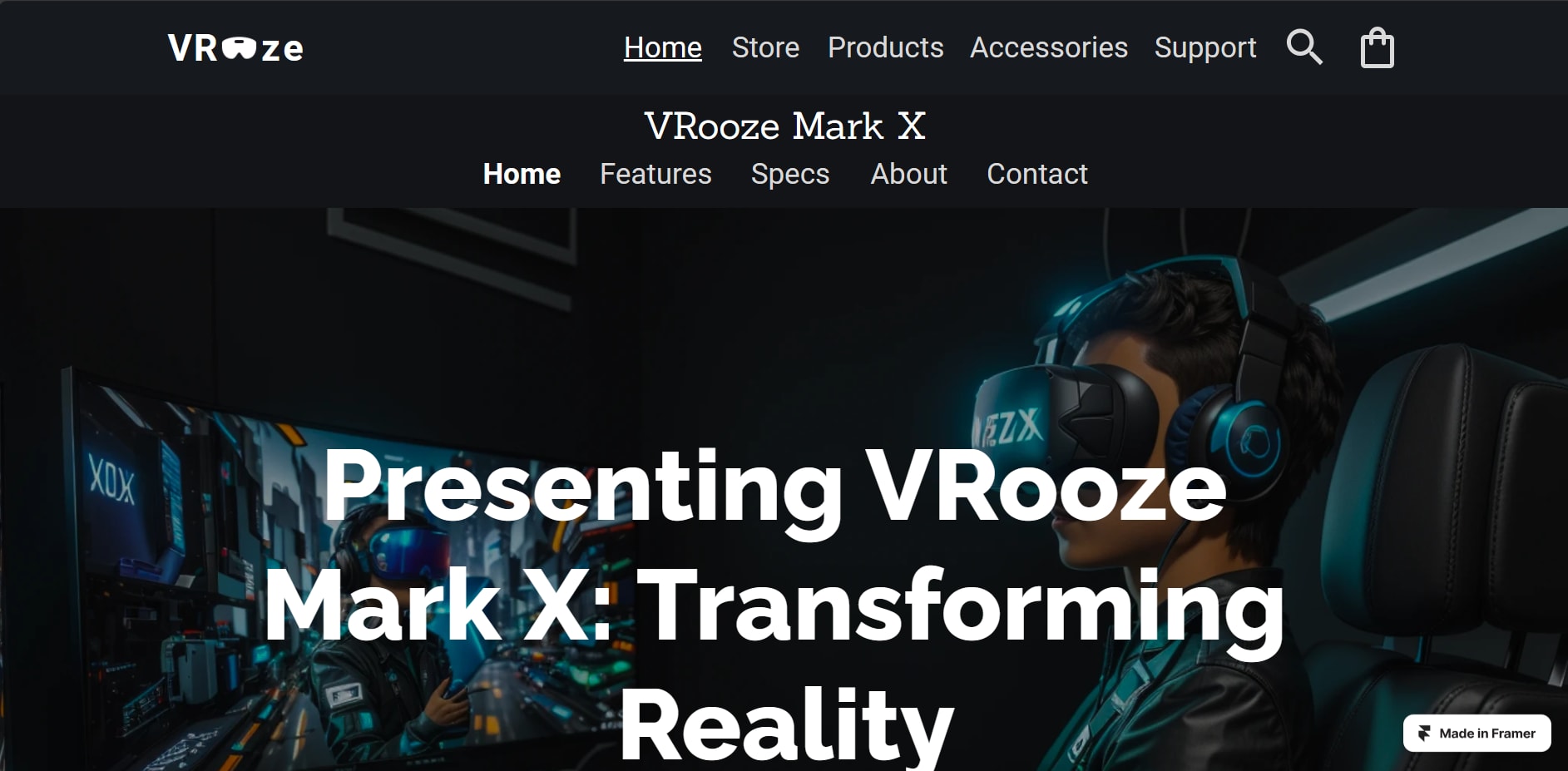
A fictional company named VRoooze is a VR headset hardware and software company. They are launching their new flagship headset "VRoooze Mark X" into the market.
This is the web design of a single landing page for the particular product launch.
Disclamer:
This project was assigned to me as part of the evaluation process for a UI/UX intern role at Digitea.
Concept and Inspiration:
VRoooze is a fictional company specializing in VR headset hardware and software. The VRooze Mark X is their latest flagship headset, and the landing page aims to capture the essence of innovation and sophistication. To be specific, I scrolled through Behance and Dribbble websites and checked out Apple's landing pages for inspiration.
Design Tools:
I utilized industry-standard tools, namely Figma and Framer, to bring the VRooze Mark X Landing Page to life. For an interactive experience, you can explore the Figma prototype here and view the design files on Figma here.
UI/UX Challenges:
Designing for AR/VR hardware and software presented unique challenges in creating an immersive user experience. The goal was to mirror the sophistication of Apple's product pages while maintaining a focus on the innovative features of VRooze Mark X.
As this was my first attempt at designing a multiverse, VR-based product showcase landing page, each challenge served as a valuable learning experience, contributing to the refinement of my UI/UX skills.
Major challenges faced:
1. Theme Adaptation: Blending the UI seamlessly with the multiverse theme posed a unique challenge. Ensuring that the design not only reflected the VR experience but also adhered to established UX principles was crucial.
2. User-Friendly Navigation: The complexity of a multiverse theme required careful consideration to maintain user-friendliness. Navigational elements had to be intuitive, allowing users to seamlessly explore the VRooze Mark X features without feeling overwhelmed.
3. Consistency with UX Laws: Upholding the laws of UX while incorporating elements of a multiverse theme demanded a delicate balance. It was essential to ensure that the design not only looked visually appealing but also functioned cohesively.
4. Innovative Interactivity: Integrating innovative and immersive interactive elements within the multiverse context was a challenge. Balancing creativity with usability was key to providing users with an engaging experience.
5. Color Scheme and Visual Harmony: The meticulous selection of a color scheme that harmonized with the multiverse theme while maintaining visual appeal was a challenge I approached with careful consideration. My aim was to evoke a sense of wonder without compromising the overall aesthetics.
6. Typography for VR Experience: Crafting typography that heightened the VR experience without sacrificing readability posed an interesting challenge. I aimed to create an immersive typographic environment that enhances the overall user engagement with the content.
7. Maintaining Focus on VRooze Mark X: Amidst the captivating multiverse theme, ensuring the VRooze Mark X remained the focal point required strategic design decisions. My challenge was to seamlessly integrate the product into the multiverse narrative while ensuring it took center stage as intended.
8. Adherence to UI/UX Standards: Striking a delicate balance between pushing the boundaries with a multiverse theme and adhering to established UI/UX standards was a unique challenge. I aimed to innovate within the framework of usability, ensuring the design met the high standards I set for myself.
Design Approach:
The color schemes and typography choices were carefully selected to convey a sense of innovation and elegance. The UI/UX prioritizes an intuitive and engaging browsing experience, ensuring that users can explore the VRooze Mark X seamlessly.
In order to make the website live, I have imported it in Framer from Figma and made it live.
26 Sep 2023


