MoodBoard Creation for a Medical Application
Title: Creating a mood board for a medical app involves a thoughtful approach to ensure the design aligns with the app's purpose, target audience, and brand values. The goal is to create an interface that is not only visually appealing but also user-friendly and trustworthy.
Here’s an in-depth look at setting up a mood board for a medical app:
1. Defining the Purpose and Audience
Before starting the mood board, it’s crucial to define the purpose of the medical app and understand its target audience. This includes:
- Purpose: Whether the app is for telemedicine, health tracking, patient management, or medical education.
- Audience: Identifying the primary users, such as patients, doctors, nurses, or medical students, and understanding their needs and preferences.
2. Color Palette
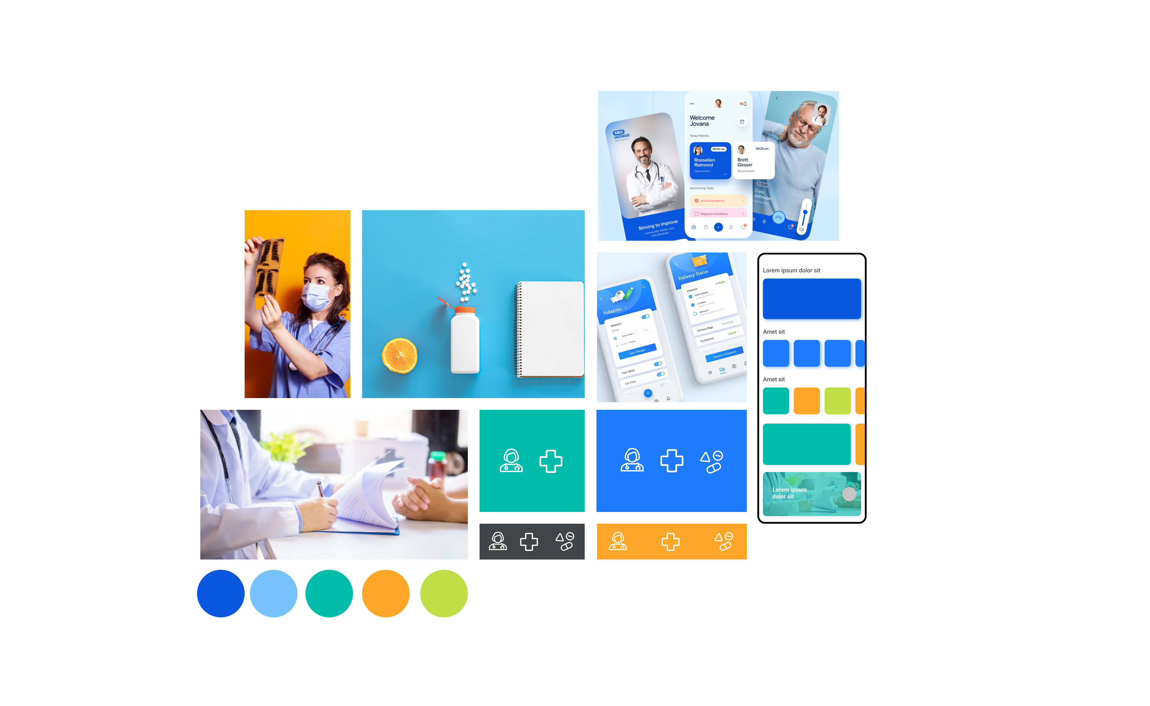
The color palette for a medical app should evoke feelings of trust, calmness, and cleanliness. Commonly used colors include:
- Blue: Symbolizes trust, professionalism, and reliability.
- Green: Associated with health, growth, and tranquility.
- White: Represents cleanliness, simplicity, and purity.
- Accent Colors: Soft and muted shades of other colors can be used as accents to highlight important elements without overwhelming the user.
3. Typography
Typography should be clear, legible, and professional. Considerations include:
- Primary Fonts: Sans-serif fonts like Helvetica, Arial, or Roboto are commonly used for their readability on digital screens.
- Hierarchy: Establishing a clear typographic hierarchy to guide users through the interface, with headings, subheadings, and body text differentiated by size, weight, and color.
4. Imagery and Icons
Imagery and icons play a significant role in making the app visually engaging and informative. Key points include:
- Imagery: Using high-quality, relevant images that depict medical professionals, patients, and healthcare scenarios. Avoiding overly graphic or distressing images.
- Icons: Implementing a cohesive set of icons that are easily recognizable and enhance the user experience. Icons should be simple, clean, and aligned with the overall design style.
5. User Interface (UI) Elements
The UI elements should be designed with the user’s needs in mind, ensuring an intuitive and seamless experience. Considerations include:
- Buttons: Designing buttons that are easily tappable with clear labels.
- Forms: Creating forms that are straightforward and easy to fill out, with sufficient spacing between fields.
- Navigation: Implementing a navigation system that is logical and easy to follow, whether through a bottom navigation bar, side menu, or tab system.
6. Textures and Patterns
While minimalism is often preferred in medical app design to avoid clutter, subtle textures and patterns can add depth and interest. Examples include:
- Backgrounds: Light, unobtrusive patterns that do not distract from the primary content.
- Dividers: Using subtle lines or shading to separate sections and improve readability.
7. Branding
Ensuring the moodboard reflects the brand’s identity is essential. This includes:
- Logo: Incorporating the brand’s logo in a way that is prominent but not overpowering.
- Brand Colors and Fonts: Using the brand’s official colors and fonts consistently throughout the design.
8. Practical Application
For practical application, tools like Adobe XD, Figma, or Sketch can be used to create interactive prototypes that bring the mood board to life. This allows for testing and iteration based on user feedback before finalising the design.
Conclusion
A well-crafted mood board for a medical app serves as a blueprint for the design process, ensuring that all visual elements align with the app’s purpose and user needs. It helps in creating a cohesive, professional, and user-friendly interface that fosters trust and enhances the overall user experience.
P.S. Need to boost your brand online? Lets have a conversation about how I can help you stand out.!!
10 May 2023


