Figma
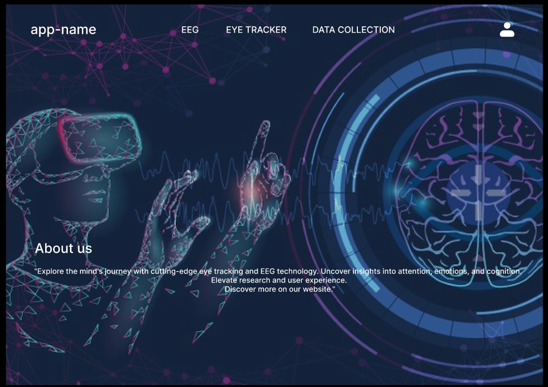
Project Title: Redefining User Engagement - An Eye Tracker An an EEG Analyzer
Being a first timer to this domain of designing. I've been given this opportunity during my Internship at IIT- Delhi where I was a Graphic Design Researcher.
Objective: It's only a prototype. The goal was to improve user engagement, communicate the brand's values, and increase conversions for their flagship product. And also to understand how Eye tracking and EEG analyzer tools works and give results.
Process:
Discovery Phase:
- Conducted meetings with the project head to understand the brand's vision, goals, and target audience.
- Analyzed competitors' landing pages to identify industry trends and differentiators.
- Gathered user feedback from the existing website to identify pain points.
Research and Persona Development:
- Conducted user interviews and surveys to gather insights into user preferences and expectations.
- Developed user personas to guide design decisions based on the identified target audience.
Wireframing:
- Created low-fidelity wireframes to outline the structure and layout of the landing page. Focused on intuitive navigation and clear call-to-action elements.
- Shared wireframes with project head for initial feedback and approval.
UI Design:
- Developed high-fidelity UI designs using Figma, incorporating the brand's color scheme, typography, and visual elements.
Prototype Development:
- Used Figma's prototyping features to create an interactive prototype. This allowed stakeholders to experience the flow and functionality of the landing page.
User Testing:
- Conducted usability testing with a small group of target users to gather feedback on the prototype.
- Iterated on the design based on user feedback, making adjustments to enhance the user experience.
Outcome::
I was successfully able to create a prototype website to help user understand how an Eye tracker and an EEG analyzer works.
Key Learnings:
- Collaboration and iterative design are crucial for aligning the design with user expectations.
- Regular user testing helps in identifying potential issues and refining the design.
- Figma's collaborative features significantly contribute to streamlined communication within the design team and with stakeholders.
Next Steps: Continued monitoring of user engagement metrics, gathering feedback, and potential testing for further optimization. Consider extending the design principles to other pages of the website for a cohesive user experience.
18 Nov 2023


