Biscoitos Belma | Brand Design
Biscoitos Belma is a company in the food sector that celebrated its 10th anniversary by redesigning itself with a new look. The old brand had communication problems with little expressiveness and design, which resulted in low recognition in the market and the company's own dissatisfaction.
Based on modernizing the identity of the company and its products, the graphic project was guided to give a new face to the company so that it was possible to transmit credibility via brand and product. A proposal then for brand and packaging redesign.
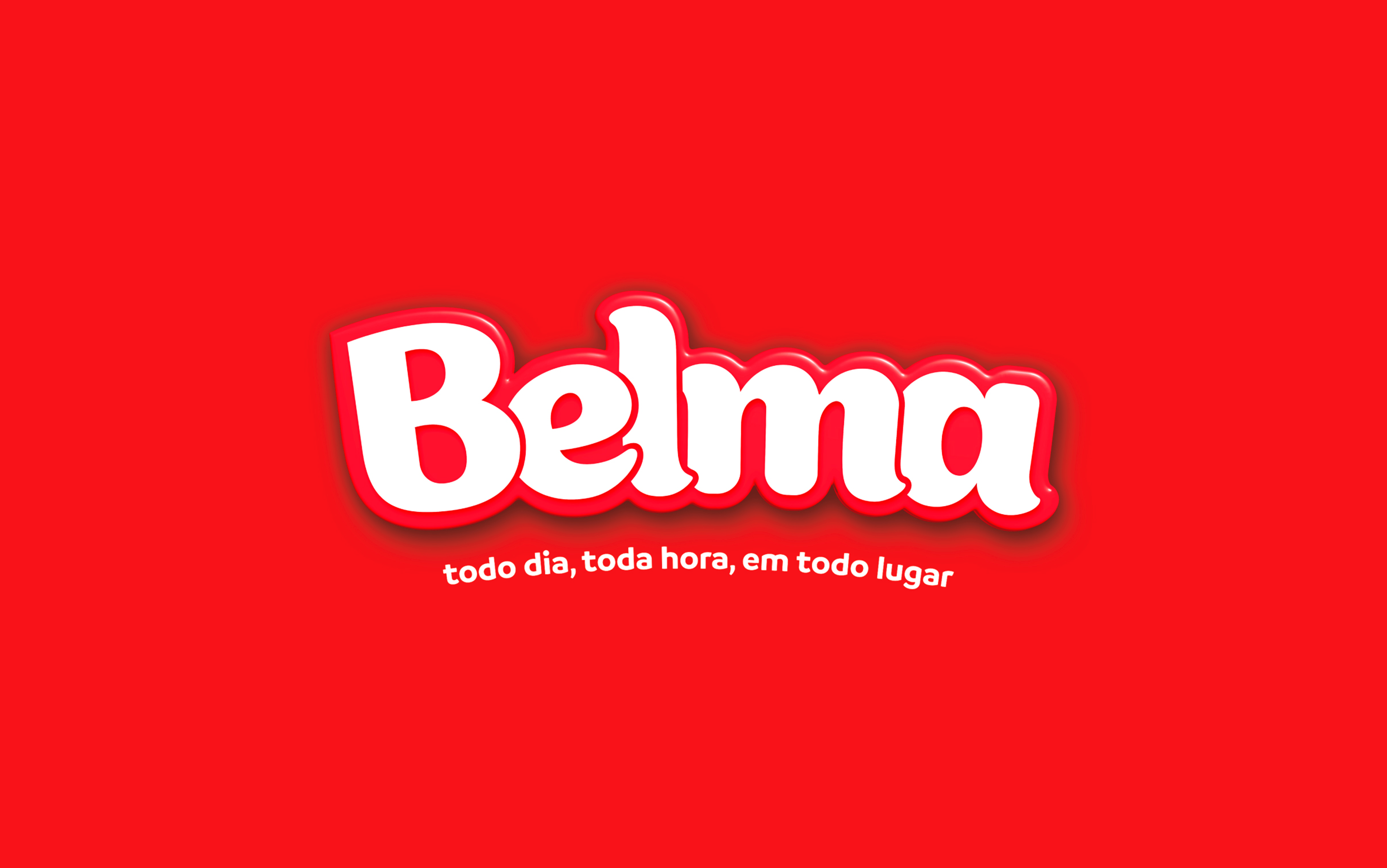
The logo, which still maintains the traditional colors, was built on several modifications of a beautiful typography. The slogan, an important addition to the visual composition, conveys the proximity between the product and the consumer's daily life.
Determining a dominant color for the entire material was a significant choice in the process, at that time the packages gained a new ally to support themselves. Not using "splash" as the main focus on packaging, but rather a real pattern of flavors was another differential approached in the development, as it went against most products available on the market.
Belma, which previously had little expression and an old-fashioned design, now returns to the market revamped in search of presenting quality and credibility in its new journey.
05 Aug 2016