
Slaps Branding Agency Redesign
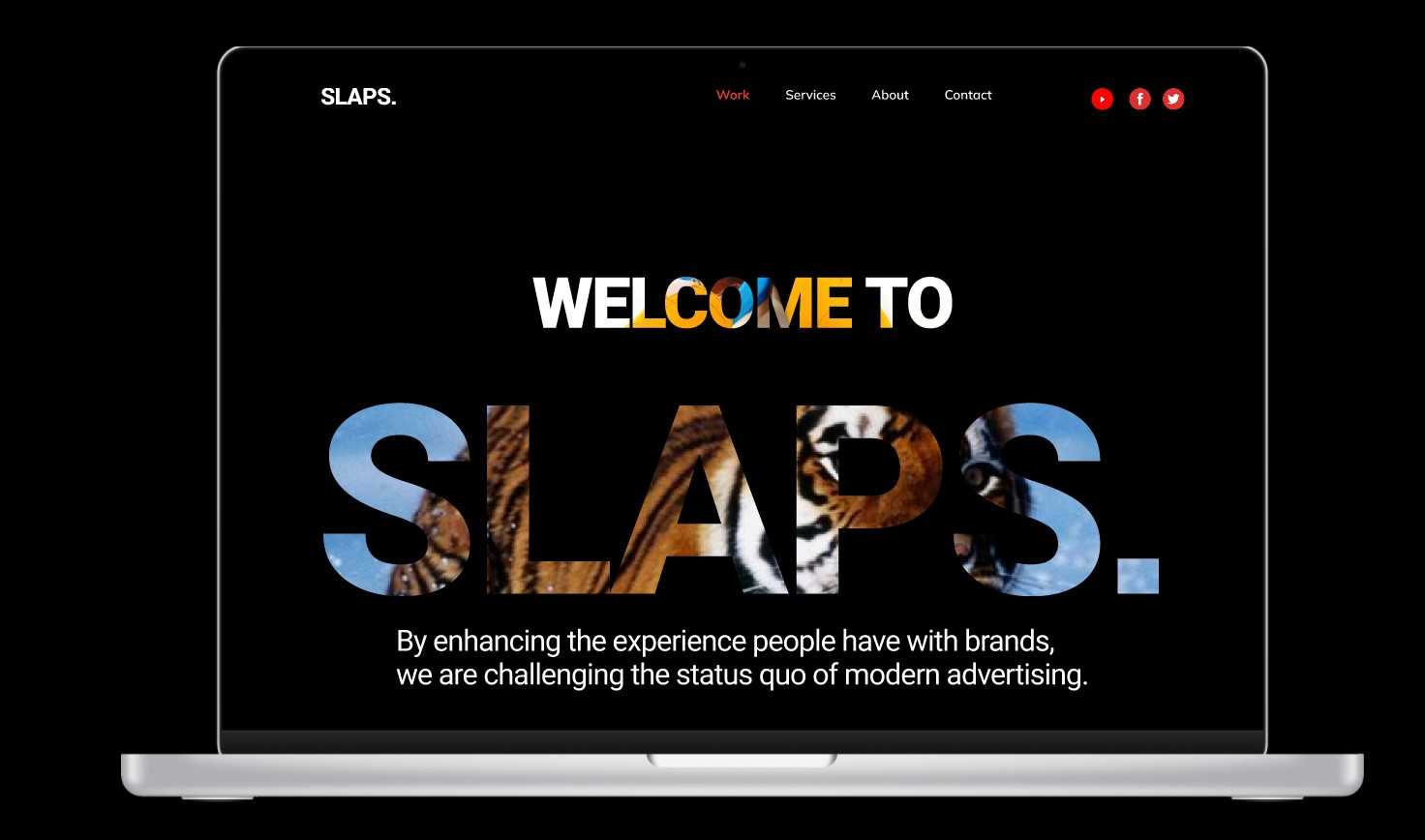
By enhancing the experience people have with brands, Slaps is challenging the status quo of modern advertising. Here are quick changes I made in the project redesign:
- For a highly reputable brand like Slaps, I consider Switching between Dark to Light skin a nice to have.
- I redesigned the Tunes categories to carry some uniqueness of the body of art. The component I used here is a stereo disc. Ultimately, a usability test can be conducted for the appeal of this new design to your target audience.
- Redesigned the card sessions to include some feel of arts. Projects portfolios and Tunes sections can now be endlessly swiped to create a plus on usability and make all Slaps more accessible to the next billion users.
Kindly find the link to the Figma files below:
- Dark Skin
https://www.figma.com/file/Not98WHnxBGn2b0SRKKLnf/Intuitive-Designer?node-id=502%3A1460
- Light Skin
https://www.figma.com/file/Not98WHnxBGn2b0SRKKLnf/Intuitive-Designer?node-id=508%3A1764
Prototype: This demonstrates the ease of switching between the two skins (light/Dark):
30 Jan 2022
Keywords
UI/UX
product
design
UX
UI


