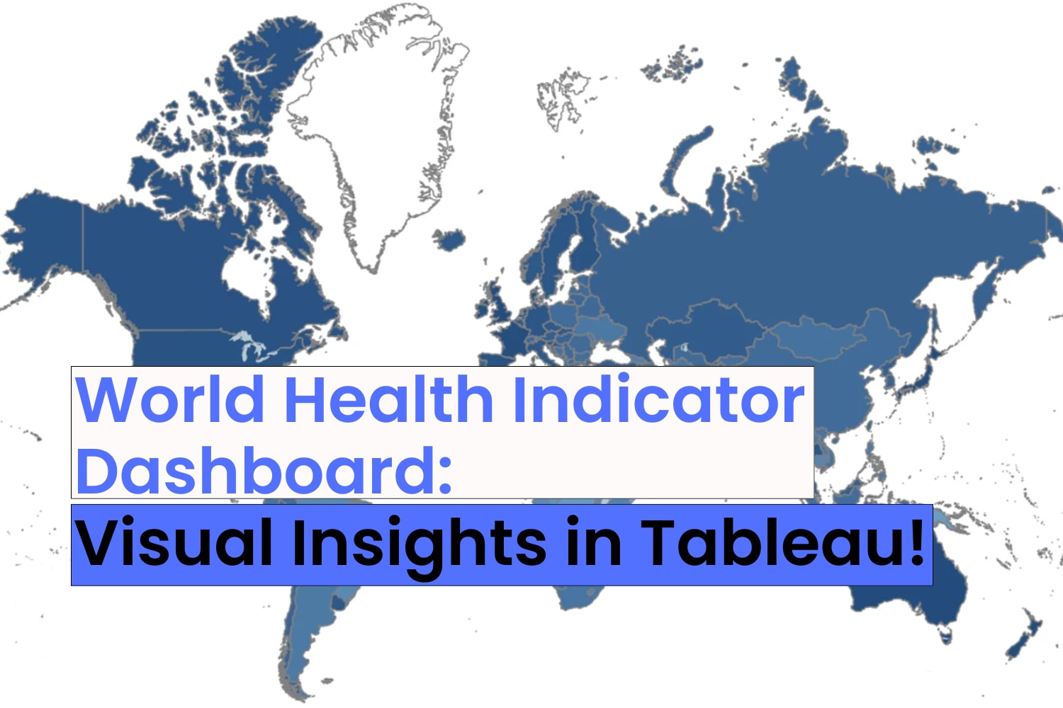
World Health Indicator Dashboard
An interactive Tableau dashboard exploring World Health Indicators! This powerful visualization offers meaningful insights into global health trends, enabling users to analyze key metrics across countries and regions:
Tools Used: Tableau Prep Builder, Tableau Desktop
🌍 Regional Birth Rate Analysis
Visualize birth rates across different regions with a color-coded map. The size of the marks represents the total birth rate, making it easy to identify areas with the highest and lowest rates.
🗺 GDP and Country Insights
Explore GDP distribution worldwide with a detailed map. Country-specific details are highlighted with color, and GDP values are displayed for clarity.
📈 Energy Usage Over Time
Discover global energy consumption trends by tracking total energy usage year by year, revealing shifts in demand and usage patterns.
👥 Population Growth by Year
Analyze total population trends over time. The dashboard uses color and size to represent population totals, offering a clear perspective on global demographic changes.
📊 Life Expectancy and Infant Mortality Trends
Examine male life expectancy across regions, with infant mortality rates visualized through mark sizes. This feature sheds light on critical health disparities and progress worldwide.
This project is a deep dive into global health data, showcasing Tableau’s ability to transform complex datasets into intuitive and actionable insights. Whether you're a health researcher, policymaker, or simply curious about global health trends, this dashboard offers a comprehensive view of the indicators shaping our world.
16 Nov 2024