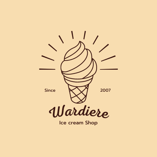
Logo for an ice cream parlour
My experience in building a logo for an ice cream parlor was an exciting one. It was a unique opportunity to blend creativity and functionality to form a logo that would represent the brand and attract customers.
The first step was to understand the brand values and the target audience. The ice cream parlor was a family-owned business that focused on providing high-quality, handcrafted ice cream using locally sourced ingredients. They wanted a logo that would reflect their commitment to quality and their traditional approach to ice cream making.
After several brainstorming sessions, we settled on a design that incorporated a classic ice cream cone with a modern twist. The cone was made up of colorful geometric shapes that represented the variety of flavors offered at the parlor. The font used for the business name was simple yet elegant, conveying a sense of sophistication and trustworthiness.
Once the design was finalized, we tested it on different backgrounds and in various sizes to ensure it would be visible and legible on different platforms. We also made sure the logo was scalable, so it could be used on anything from business cards to billboards.
Overall, the process of building a logo for an ice cream parlor was a rewarding experience. It allowed me to collaborate with a local business and translate their values into a visual representation that would help them stand out in a competitive market.
12 May 2023


