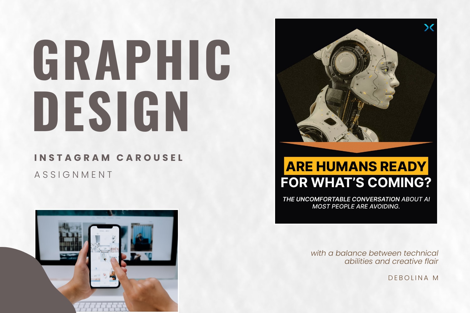
Instagram Carousel Redesign assignment
The focus of the redesign was to improve clarity, visual coherence, and narrative flow across the carousel.
‣ I used a single typeface, clearer hierarchy, and connected layouts across all slides. This was done to address inconsistencies in typography and visual language.
‣ Few other changes: font sizes were adjusted for readability, branding elements were made consistent, and the guest speaker’s presence was more clearly highlighted.
‣ Add-on: A real podcast episode snapshot was incorporated to ground the visuals in context.
TOOLS:
The redesign was created primarily in Figma, with selective use of Canva, and included recreating the logo to maintain visual consistency.
04 Feb 2026
Keywords
Graphic Design
Instagram Carousel
Figma
Redesign