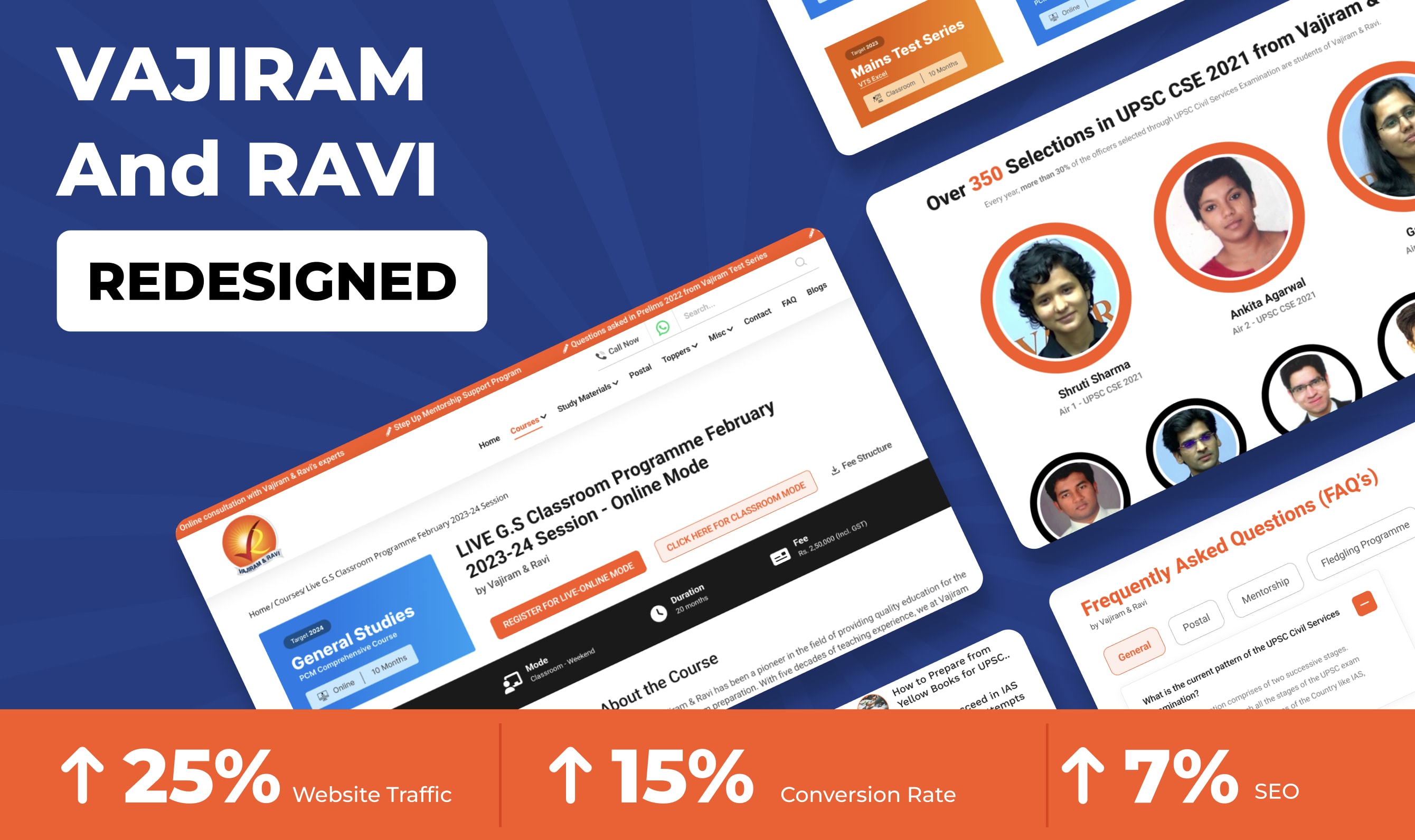
Vajiram and Ravi Redesigned
Challenges and Goals
1. The existing website faced challenges such as outdated design, complex navigation, and limited user engagement.
2. The goals of the redesign were to enhance the user experience, improve accessibility across devices, and increase conversions for course registrations.
Before
• Outdated and difficult to quickly scan interface: The research revealed that potential students preferred a clean and modern design aesthetic.
• Inadequate Mobile Experience: The lack of a mobile-friendly design hindered their ability to browse courses and access important information.
• Complex Navigation: Users found the existing website's navigation system confusing and overwhelming, leading to difficulty finding relevant information quickly.
• Content Prioritization: Users preferred concise and easily scannable information, with key details prominently displayed.
After
• Streamlined Navigation: Restructured the website's navigation, implementing a clear course categorization and intuitive menu system to help users find the information they need effortlessly
• Consistent and Engaging User Experience: The redesigned website offers a consistent user experience across different sections, ensuring that users encounter a cohesive design, formatting, and functionality. • Scannable and Action-Oriented: The redesigned website prioritizes scannable content and clear call-to-action elements, enhancing user engagement and facilitating seamless interaction.
• Responsive Designs: The website was optimized for responsiveness across various devices, ensuring a consistent and engaging experience for users on desktops, tablets, and mobile phones.
05 Jul 2023


