We Care Herbs — Meaning-Driven Logo Design for a Herbal Skincare Brand
When a logo carries meaning, the brand doesn’t need to explain itself.
That realisation shaped the identity work for We Care Herbs.
The products were thoughtful — herbal, face-care, rooted in nature. The intention was honest. But the existing logo didn’t reflect that care. It existed, but it didn’t communicate.
And that gap matters.
I didn’t begin with colours or style. I began with one question:
If the name is removed, does the symbol still feel like care?
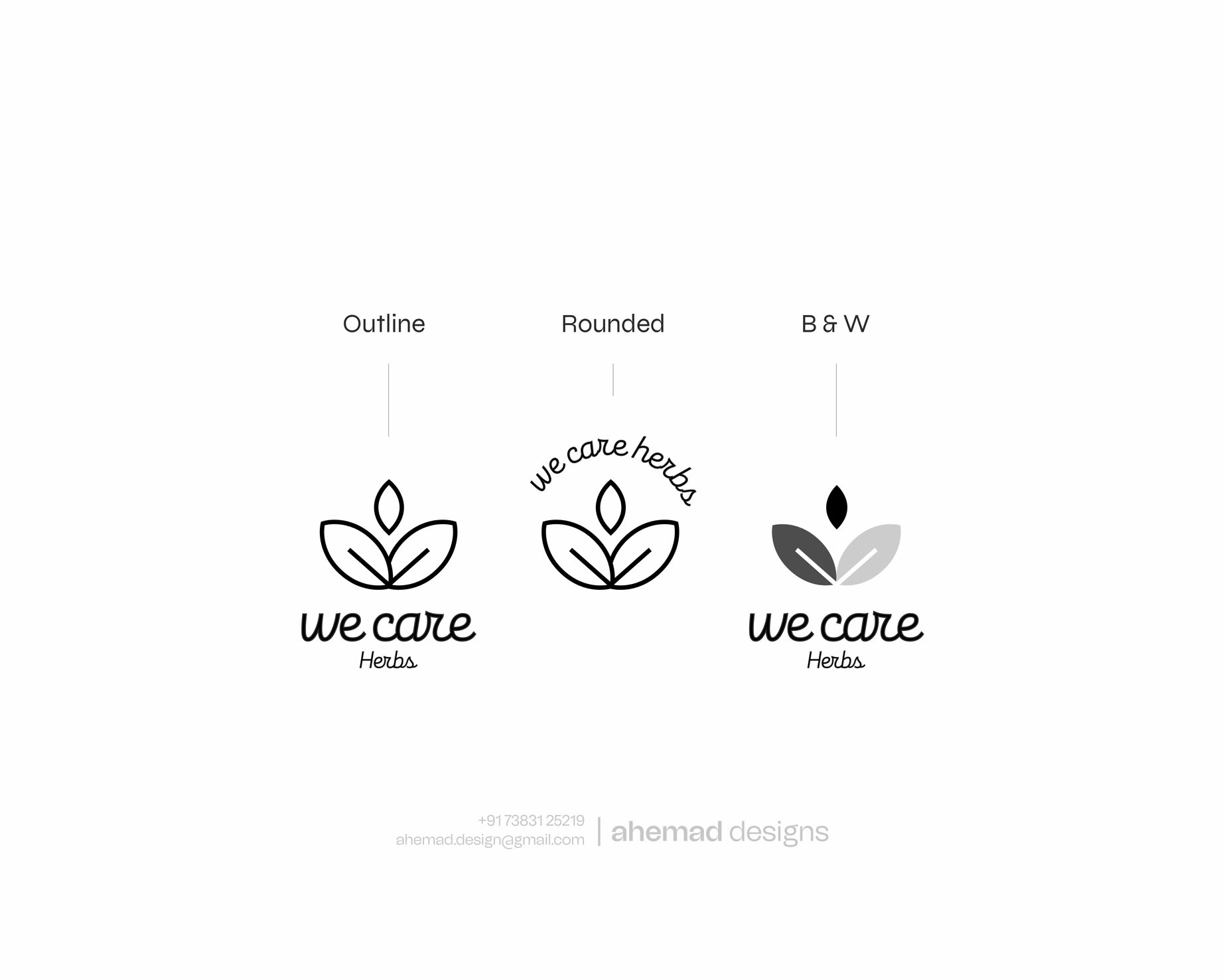
The leaf form was designed to naturally shape the letter “W”, holding nature, softness, and human touch together. Curves were kept gentle, symmetry intentional — to express balance, safety, and trust.
The final mark doesn’t try to impress.
It quietly belongs — and communicates before a word is read.
If your brand stands for something deeper, your identity should too
DM to discuss.
22 Jan 2026