
DÈLUCE — Minimal Luxury Branding for Shilajit Gummies
Good design starts with knowing what to leave out.
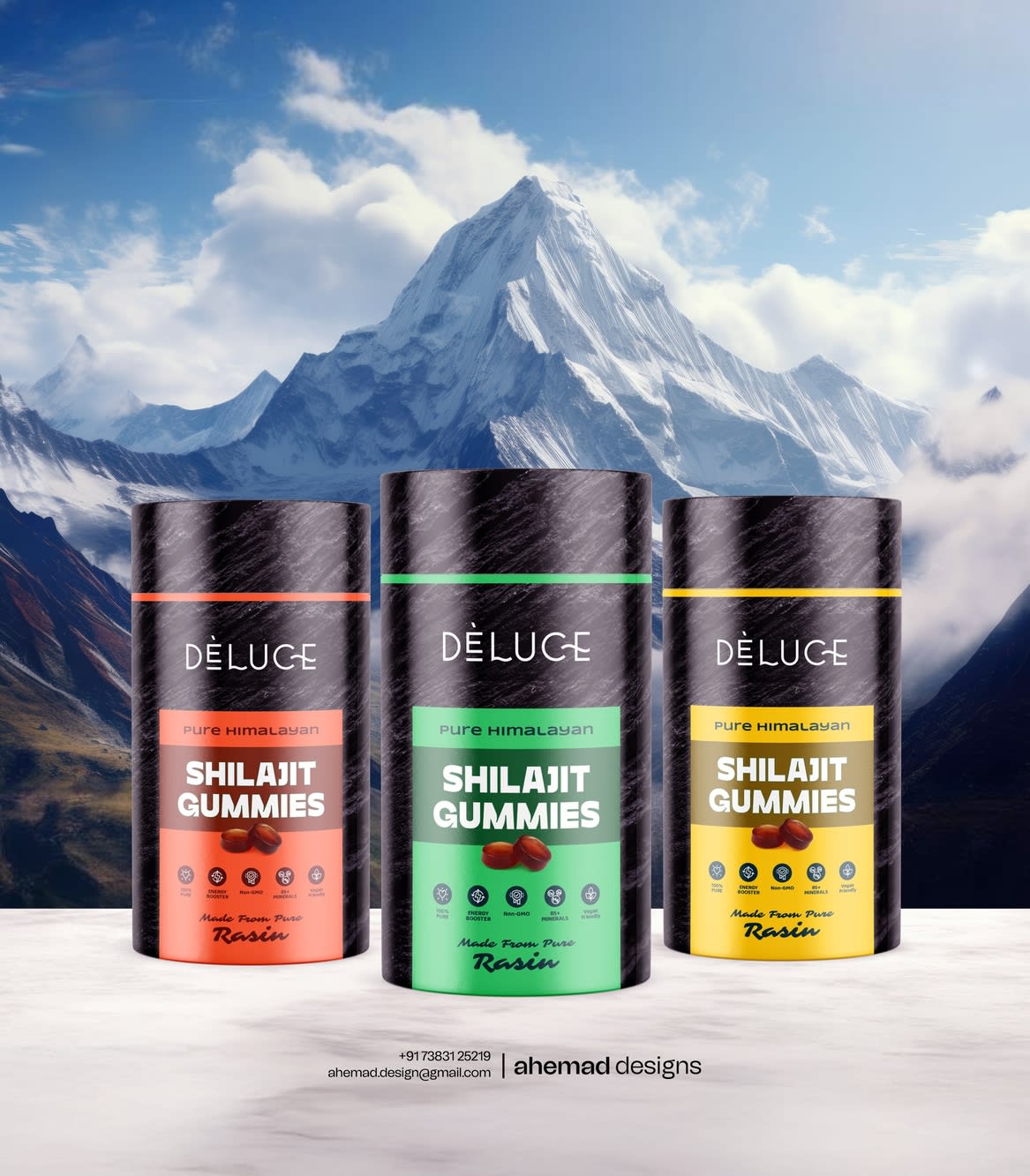
Shilajit is already powerful, so I made the packaging calmer, not louder.
While most packs shout benefits and claims, DÈLUCE stays quiet.
Quiet black. Clean typography. No visual drama.
Because when a supplement starts shouting, people stop believing.
Every element has a reason:
The marble texture hints at origin and purity.
The colour bands act as signals — one glance, one clear choice.
Nothing here tries to impress.
It simply knows what it is.
That’s the difference between adding graphics and making decisions.
Quiet works for me. What do you think?
31 Jan 2026
Keywords
Logo
Branding
Graphic Design
Dribble Branding
Minimal Design
Clean Branding
Design Thinking
Product Branding
Branding Design
Visual Identity
Modern Branding
Wellness Brand
Supplement Branding


