Jet Journey – Dubai Premium Travel Brand Identity
🚀 JET JOURNEY TRAVELS LLC – Dubai (Brand Identity Reveal)
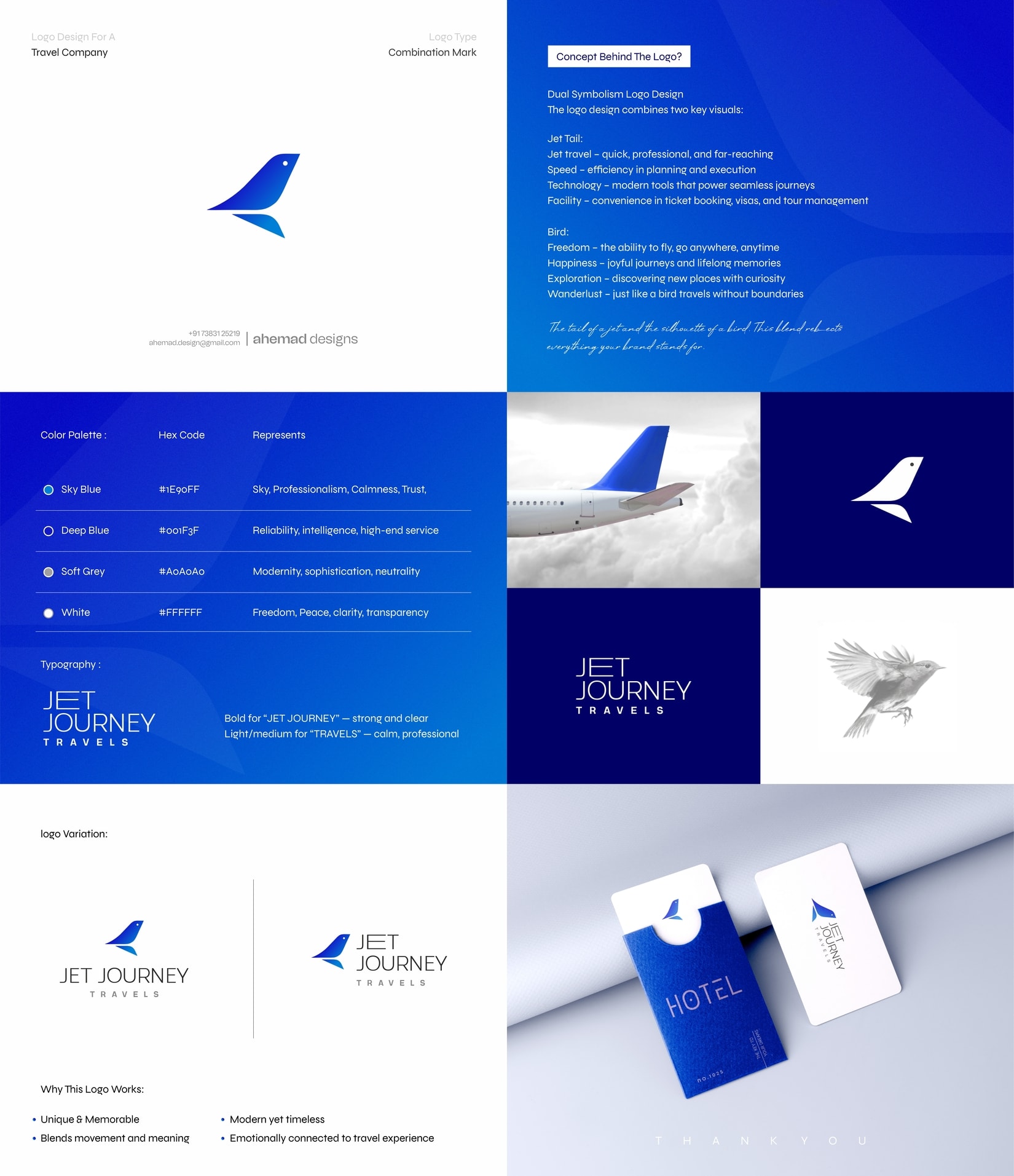
When the team approached me, their only request was:
“Not another airplane logo. Something with meaning, movement and emotion.”
So instead of choosing between a jet tail or a bird silhouette, I merged them — speed + freedom in one form.
A mark that feels premium, modern and truly travel-driven.
What I focused on:
✦ clean aerodynamic geometry
✦ sky-driven palette (trust, calm, exploration)
✦ strong + soft typography pairing
✦ versatile usage across hotel keys, tickets, apps and luggage tags
🛫 Approved in one go. Zero revisions.
The best part? It brought 3 more client referrals right after launch.
I’d love to hear your take:
Do you see the bird first or the jet tail first?
👇 Drop your observation.
20 Jan 2026