
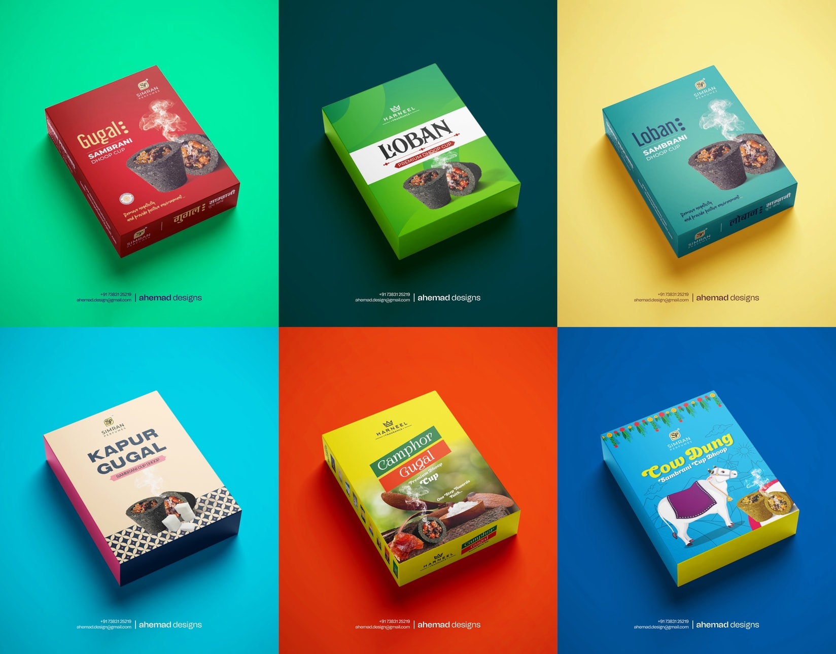
Incense Packaging Design Focused on Clarity & Calm
Design doesn’t fail because it looks bad.
It fails when it creates confusion.
That was the real issue with this packaging.
Too much information was competing for attention. The brand, the product, and the experience were all speaking at once. Instead of guiding the customer, the design was making them think too much.
I simplified the visual order — brand first, product next, experience last. By controlling spacing, hierarchy, and colour, the pack became easier to understand and easier to trust.
Design succeeds not by looking rich,
but by being clear.
If your packaging looks good but feels confusing, let’s fix that.
26 Jan 2026
Keywords
design
packaging design
brand identity
Design for Business
Visual Clarity
Product Packaging
Indian Graphic Designer
Incense Packaging Collection
Product Range Design
Visual Identity
Mutli Pro


