CN Bakers – Bakery Brand Identity & Logo Design
Designing a brand that earns cravings, not just attention.
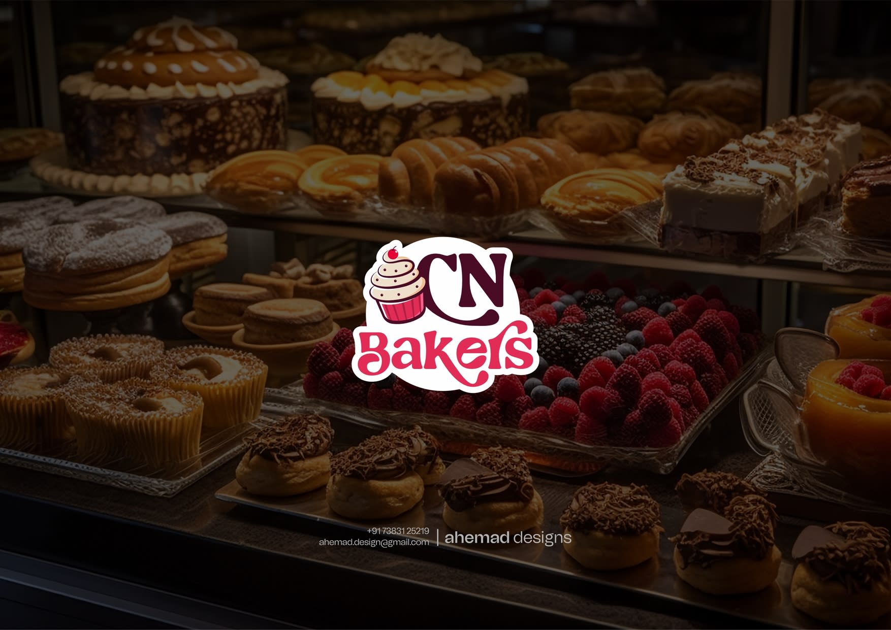
When a bakery becomes part of everyday life — morning buns, evening treats, celebration cakes — it doesn’t need noise. It needs warmth and trust at first glance.
That’s what shaped the CN Bakers identity.
The cupcake mark stands for consistency and freshness. Rounded forms and friendly type keep the brand honest and familiar. Bold reds bring appetite, softer tones add balance — everything working toward one feeling:
I’ll come back here.”
Color supports the feeling. Bold reds bring appetite and energy, while softer tones add balance and warmth.
CN Bakers didn’t need a makeover.
It needed an identity that feels just as welcoming as the brand itself.
Serious about your brand identity? Let’s start the conversation.
22 Jan 2026