Glamzone – Influencer Marketing Logo & Brand Identity
A logo that understands influence — and moves with it.
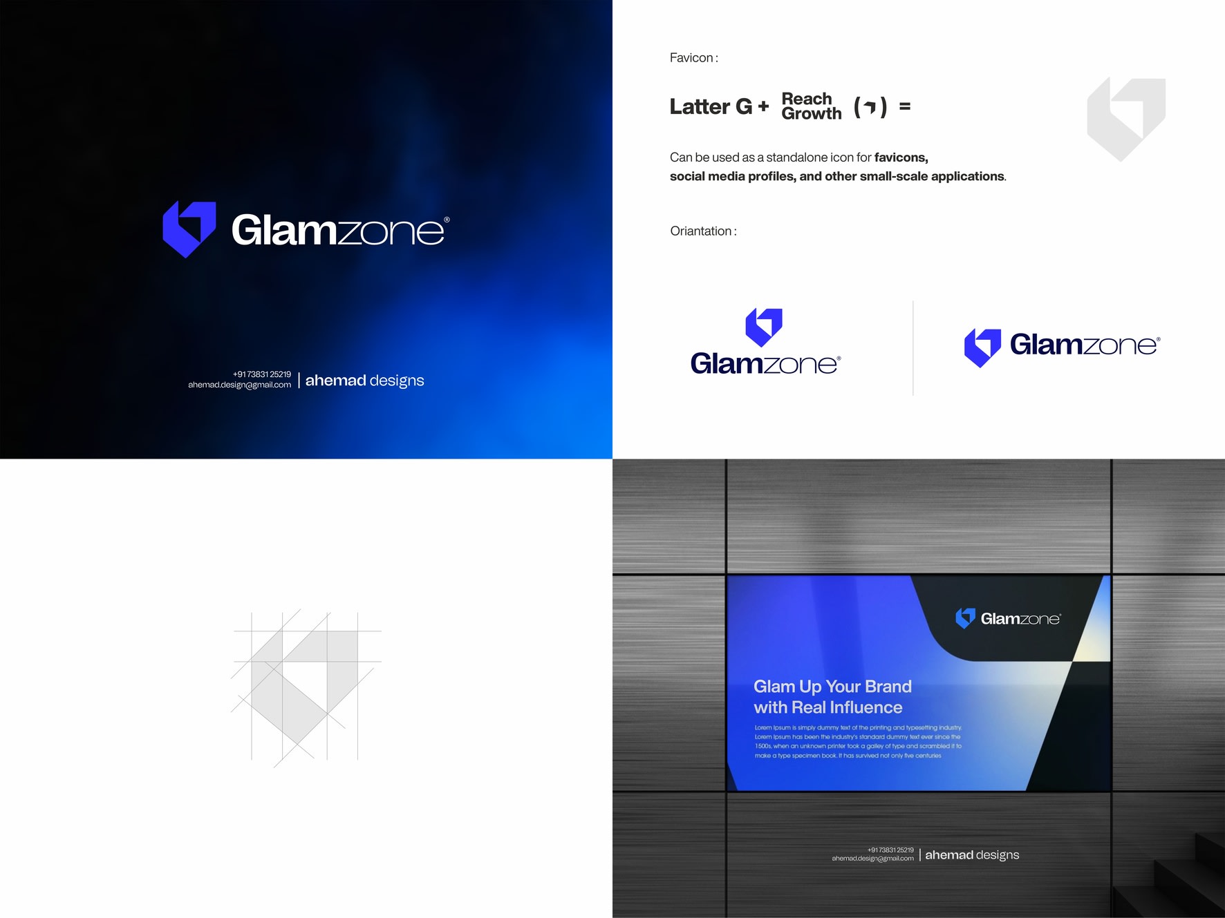
Glamzone sits in a very unique space: right between brands and influencers. They’re the connector, the amplifier, the force that lifts the right message through the right voice. So when I started shaping their identity, the strategy was clear — the logo couldn’t be passive. It needed direction. Intent. Upward motion.
That became the soul of the project.
The letter G was rebuilt from scratch, merging directly with a growth arrow — not as an add-on, not as an icon above it, but as a single geometry. One shape, one movement, one message: this is a brand built to push other brands forward.
Every element reflects their role:
G = the brand
Arrow = the reach they create
Fusion = the upward lift they deliver
The mark feels sharp, confident, modern — but more importantly, functional.
It scales cleanly across their entire ecosystem:
favicons, reels covers, profile icons, creator thumbnails, campaign hero banners, pitch decks, and everything in between.
In an industry where milliseconds of attention decide outcomes, a logo has to speak instantly. This one does.
It signals growth, clarity, and momentum without saying a word.
For me, this wasn’t about styling a letter.
It was about capturing Glamzone’s core function:
they help brands rise — visibly, measurably, consistently.
This identity simply puts that truth into shape.
Which version caught your eye first — the icon or the wordmark?
👇 Let me know your pick.
20 Jan 2026