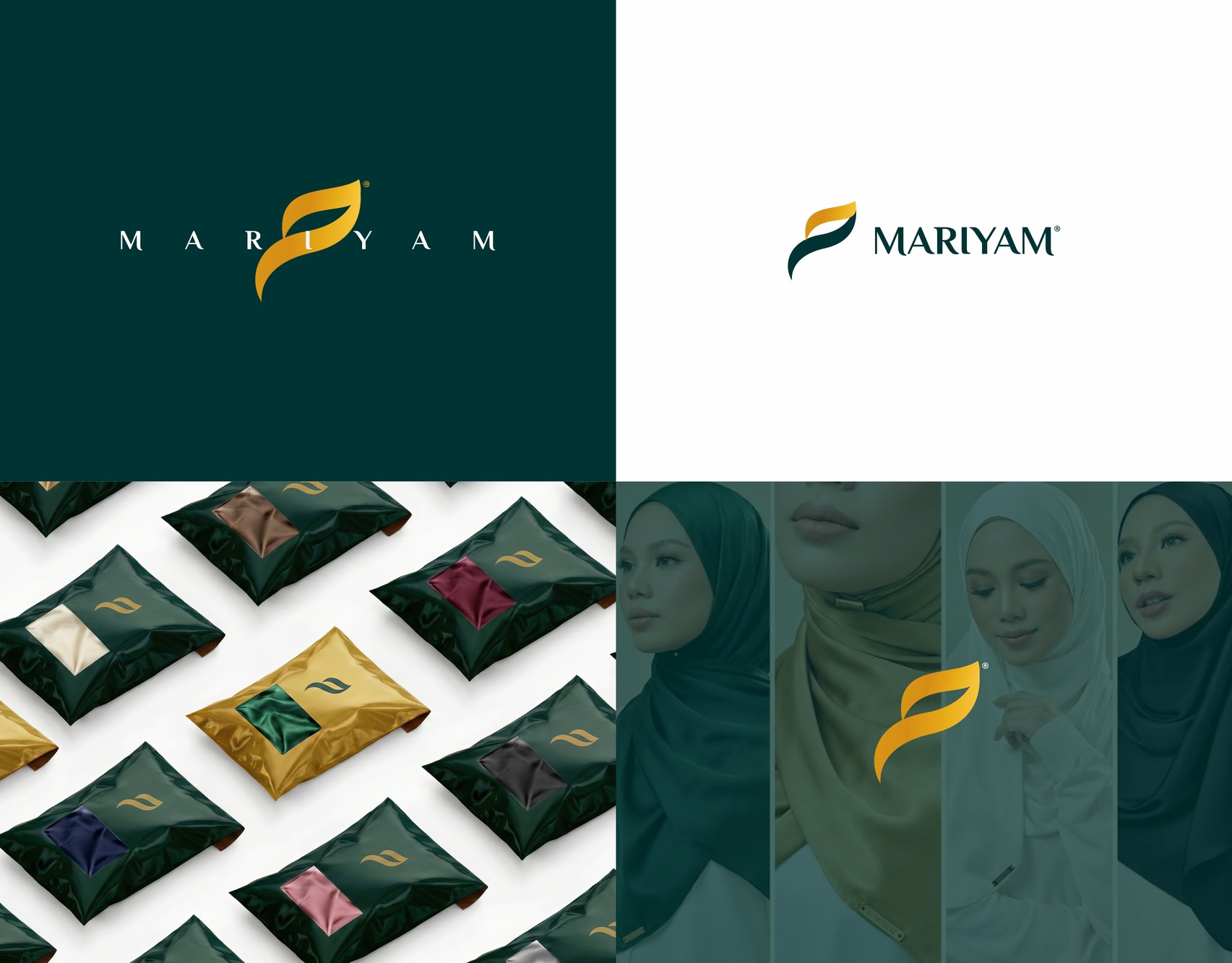
Mariyam - Luxury Logo & Brand Identity Design
If you want a premium brand, read here.
While working on the Mariyam brand identity, I didn’t start with trends.
I started with how a premium product should feel.
Scarves sit close to the skin.
They frame the face.
So every detail had to feel refined, soft, and intentional.
That’s why I went back to the name.
The Arabic letter “م” — chosen for meaning, not decoration.
I reshaped the design like fabric:
smooth curves, no sharp edges, only flow.
The symbol moves like cloth in motion —
subtle, elegant, controlled.
Mariyam’s audience values timeless elegance,
so the design had to age beautifully.
Deep green for trust and depth.
Gold for quiet luxury — not flash.
Before locking the design,
I tested it on packaging, fabric labels, brand covers, and social creatives.
The design didn’t dominate the product.
It complemented it.
That’s premium branding.
Because real luxury isn’t about decoration.
It’s about restraint and intention.
This is how premium branding is built.
Comment “PREMIUM” to build yours.
For collaborations or branding enquiries:
📩 ahemad.design@gmail.com
📞 +91 73831 25219
31 Jan 2026


