
LOYAN – Industrial Hydraulic Manufacturer Identity
LOYAN came without moodboards—just metal, cylinders, torque and truth.
No moodboards. No Pinterest references.
Just photographs of raw cylinders, steel force, oil lines and torque.
I didn’t want a polished “brand for manufacturing.”
I wanted something that felt built from the same material as their machines.
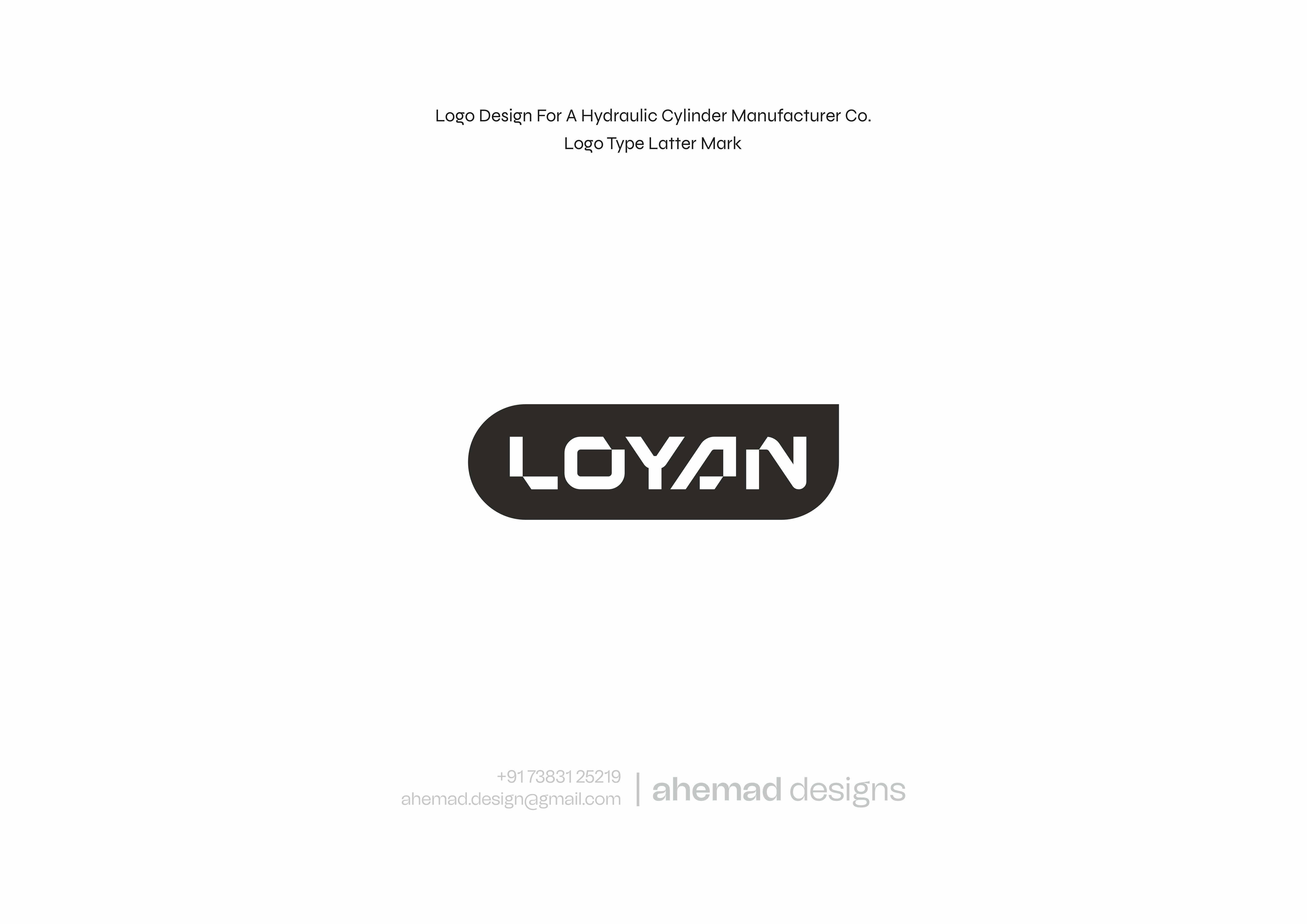
Letterforms took shape like components:
• L — bracket base
• O — sealed chamber
• Y/A — machined cuts
• N — piston lock
No curves. No softness.
Just industrial geometry built with purpose.
This mark sits naturally on:
metal plates, welding surfaces, hydraulic units, part crates and documentation.
Not loud. Not decorative.
Just engineered clarity.
Which form feels the most production-ready to you?
👇 Drop your pick.
20 Jan 2026
Keywords
Branding
Logo Design
Industrial Design
Manufacturing
Hydraulics
Identity Design
Graphic Design
Industrial Logo
Hydraulic Branding
Mechanical Identity
Metal Industry
Heavy Engineering
Brand Id


