Bansal Sweet — Traditional Indian Sweets Brand Identity
A strong business doesn’t need louder branding.
It needs branding that carries its weight.
Bansal Sweet was already a trusted name in Punjab — part of festivals, family gatherings, gifting, and everyday indulgence. The business had scale, loyalty, and reputation.
What hadn’t grown at the same pace was the visual identity.
The earlier logo wasn’t wrong.
But it didn’t fully represent the years of trust and emotion attached to the brand.
That’s a risky gap for growing B2C businesses.
I approached this identity as a respect-first redesign, not a visual experiment.
Before colours or shapes, I focused on one question:
What should someone feel before they taste the sweet?
Warmth. Tradition. Richness. Quiet confidence.
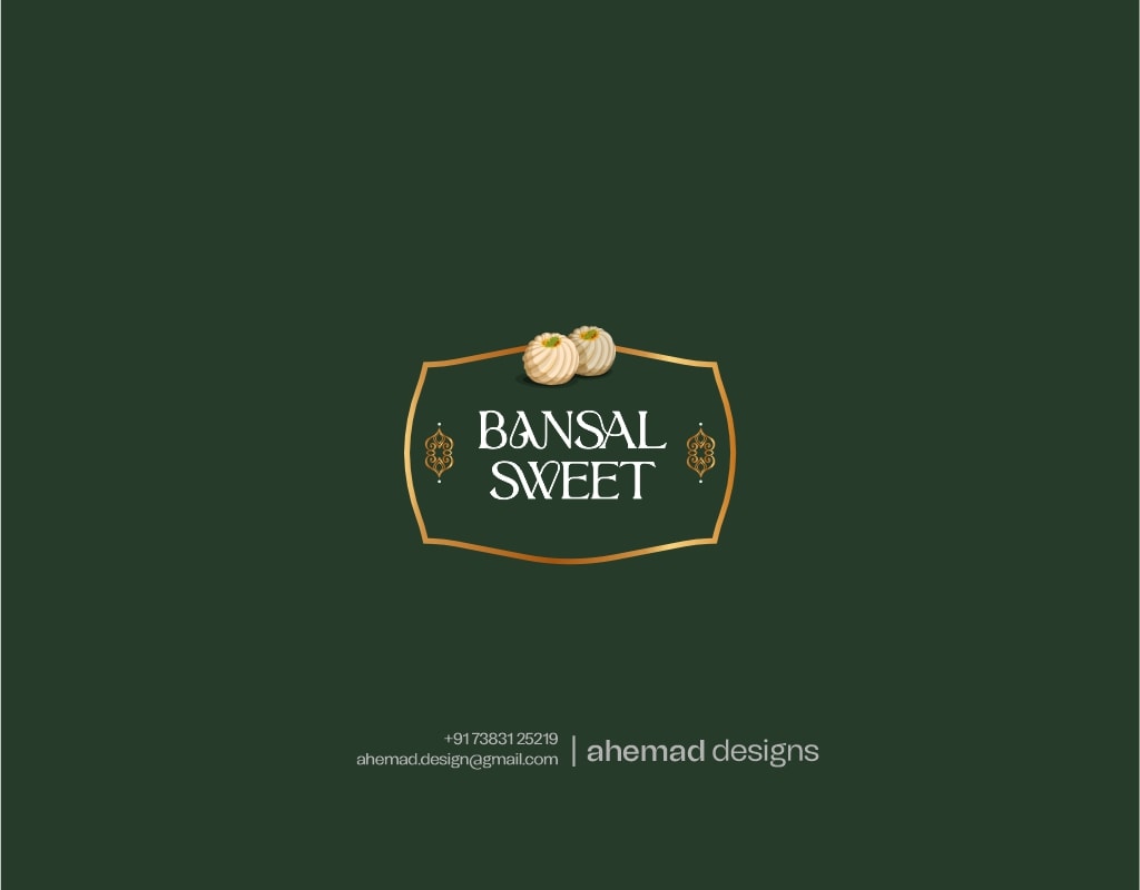
The badge structure takes inspiration from established Indian sweet shop signage — familiar, grounded, and dependable. The green and gold palette was chosen for freshness, quality, and trust, without making the brand feel heavy or flashy.
The sweet element is symbolic, not decorative — a subtle reminder of what the brand stands for.
This identity doesn’t shout.
It holds its presence — the way legacy brands should.
If your brand has grown, but its identity hasn’t caught up, let’s talk.
DM me or reach out at ahemad.design@gmail.com
22 Jan 2026