AstroLearn – Kids EdTech Brand Identity
Without any explanation, what does this logo tell you?
AstroLearn was designed for the age where curiosity runs high - and learning shouldn’t feel like a punishment.
It’s a kids EdTech platform for coding, maths, science, and digital skills.
So the logo and brand identity couldn’t look like a corporate LMS dashboard.
It had to feel like an invitation.
Fun for kids. Reassuring for parents. Zero exam trauma.
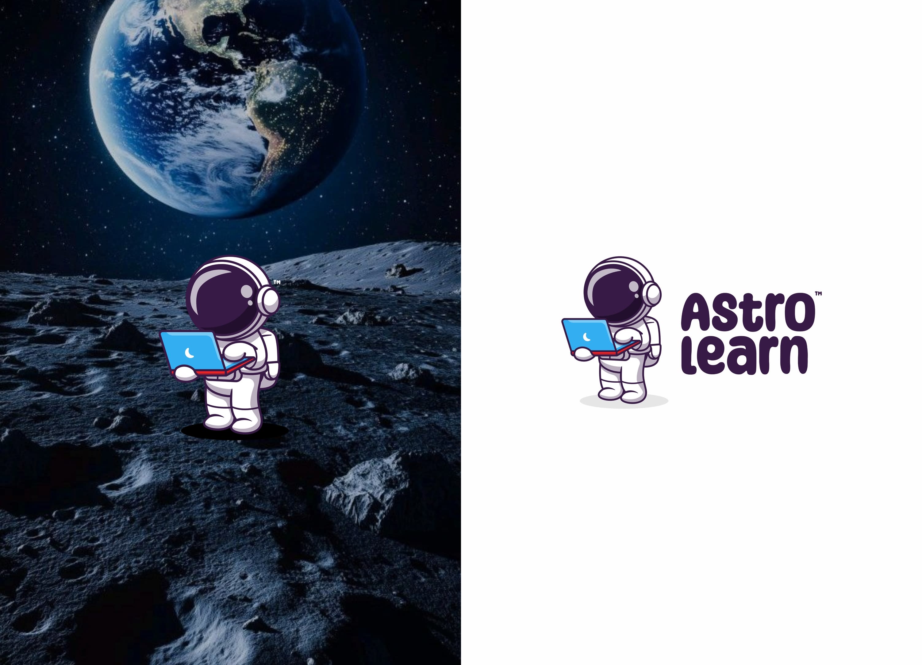
The astronaut was the obvious choice - tied to the name AstroLearn, and a symbol of curiosity and exploration that fits naturally into kids EdTech branding.
Soft, rounded forms keep the logo design friendly and approachable.
Clear visual structure builds trust with parents.
That’s how I approach brand identity design - starting from how users should feel, not just how things should look.
Curious to hear what you notice first.
If this kind of product-led branding resonates with you,
Comment 'LEARN' to start building with clarity.
For brand identity projects and collaborations:
📩 ahemad.design@gmail.com
📞 +91 73831 25219
Ahemad Designs
Brand Identity Designer | EdTech • Startups Branding | India
28 Jan 2026