Student Dashboard
At-a-Glance👀
Tackled LearnTube's challenges in user retention and certificate credibility. Devised a design strategy emphasizing an enhanced certificate page and achievement displays, resulting in improved engagement and trust.
Problem
Despite the valuable learning experiences offered by LearnTube, many users do not consistently return to the platform after their initial engagement. Furthermore, there's a perceptible hesitation among users to trust the credibility of the certificates issued, which potentially affects their long-term association with the platform.
👉🏼 User retention post-initial engagement and trust in certificate credibility are key challenges for LearnTube.
Solution
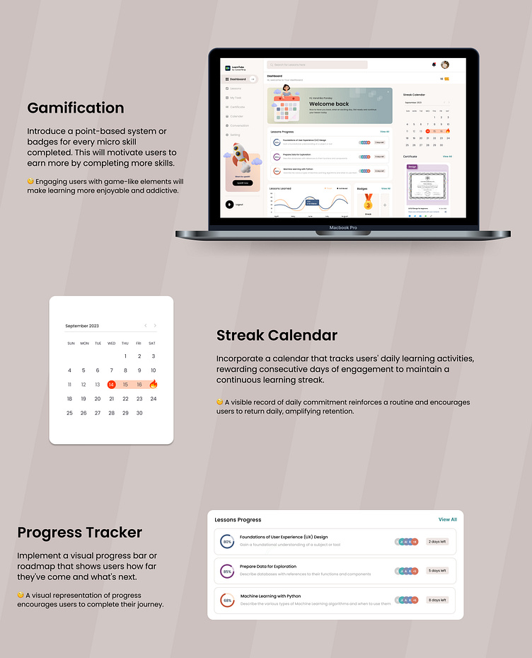
To enhance user retention and trust, LearnTube will integrate a gamified progress tracker, ensuring users stay motivated post-signup. Certificates will feature a unique verification badge and real-life testimonials, bolstering their credibility and reassuring users of their value in real-world applications.
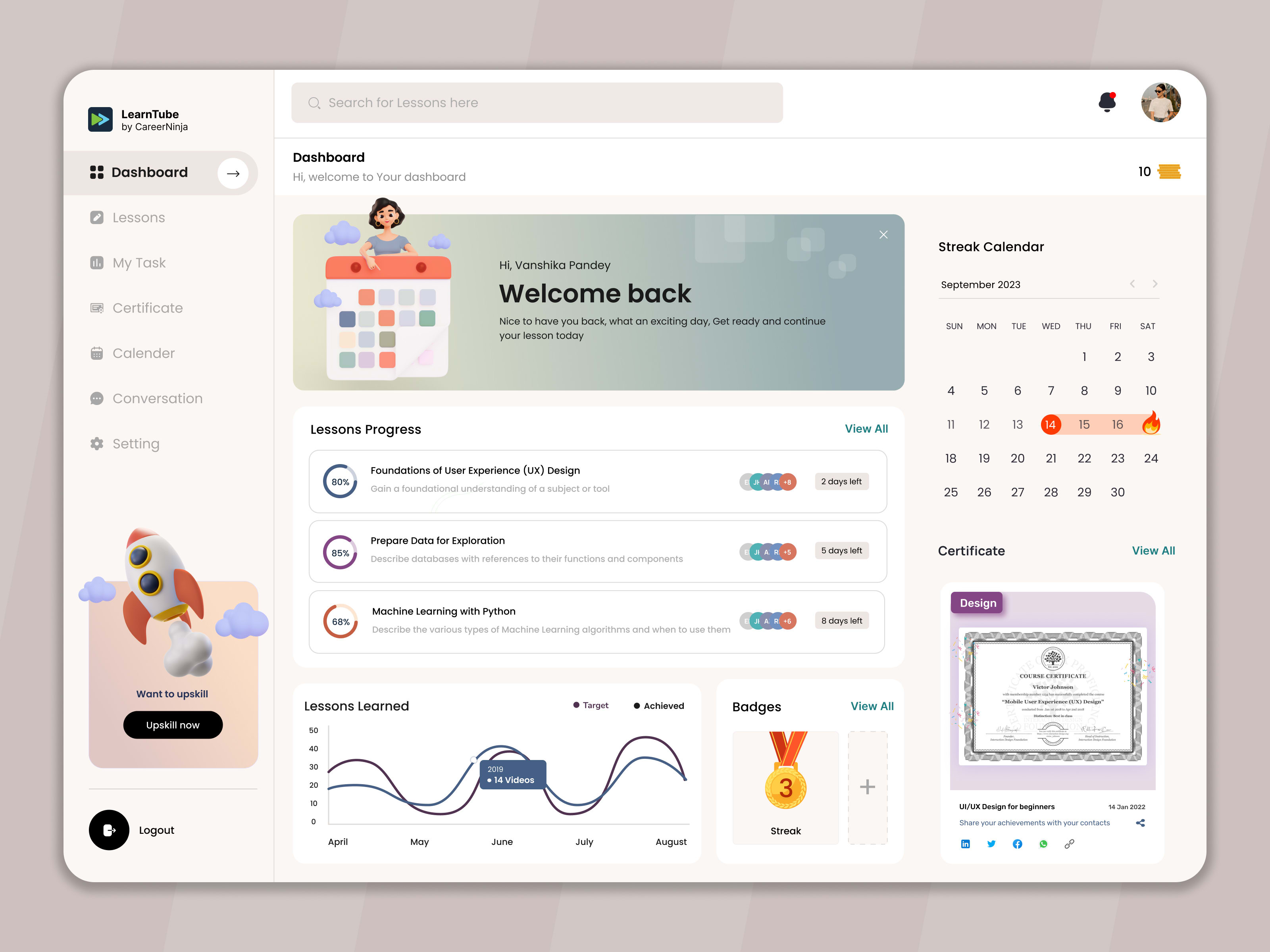
🚀 Designed a unified dashboard fusing gamified progress indicators with an authenticated certificate showcase.
Macro Problem: Retention & Engagement
After initial signup, users are directed to a dashboard showcasing their current progress. A roadmap or pathway displays the skills they've acquired and those they can take up next. As they complete skills, badges or points are added to their profile

Micro Problem: Trust in Certificates
In the updated dashboard, certificates are intuitively bifurcated into the 'Achieved' and 'Winning' sections. 'Achieved' showcases certificates from completed courses, each equipped with an option to generate a QR code ensuring authenticity when shared. In contrast, the 'Winning' section displays certificates for courses still in progress, represented in a muted format to denote their ongoing status. Enhancing the credibility of these certifications, a testimonial section is strategically positioned below, spotlighting real-life success stories from users. This structured and streamlined layout ensures clarity, fosters trust, and offers a cohesive user journey.

Design System
This design system, rooted in the chosen typography and color palette, ensures a cohesive, user-friendly interface, providing a consistent visual language across the entire platform.

Prototyping & Testing
I developed a clickable prototype to test the user flow and interactions.
👇🏼 Click to play with the prototype
What I Learned 🌱
Throughout this endeavor, I realized the profound impact of blending user needs with intuitive design. This experience reinforced that every design decision, no matter how minute, can substantially influence user trust and engagement, making me an invaluable asset for forward-thinking teams.
Liked the project? Let's work together.
01 Sep 2023


