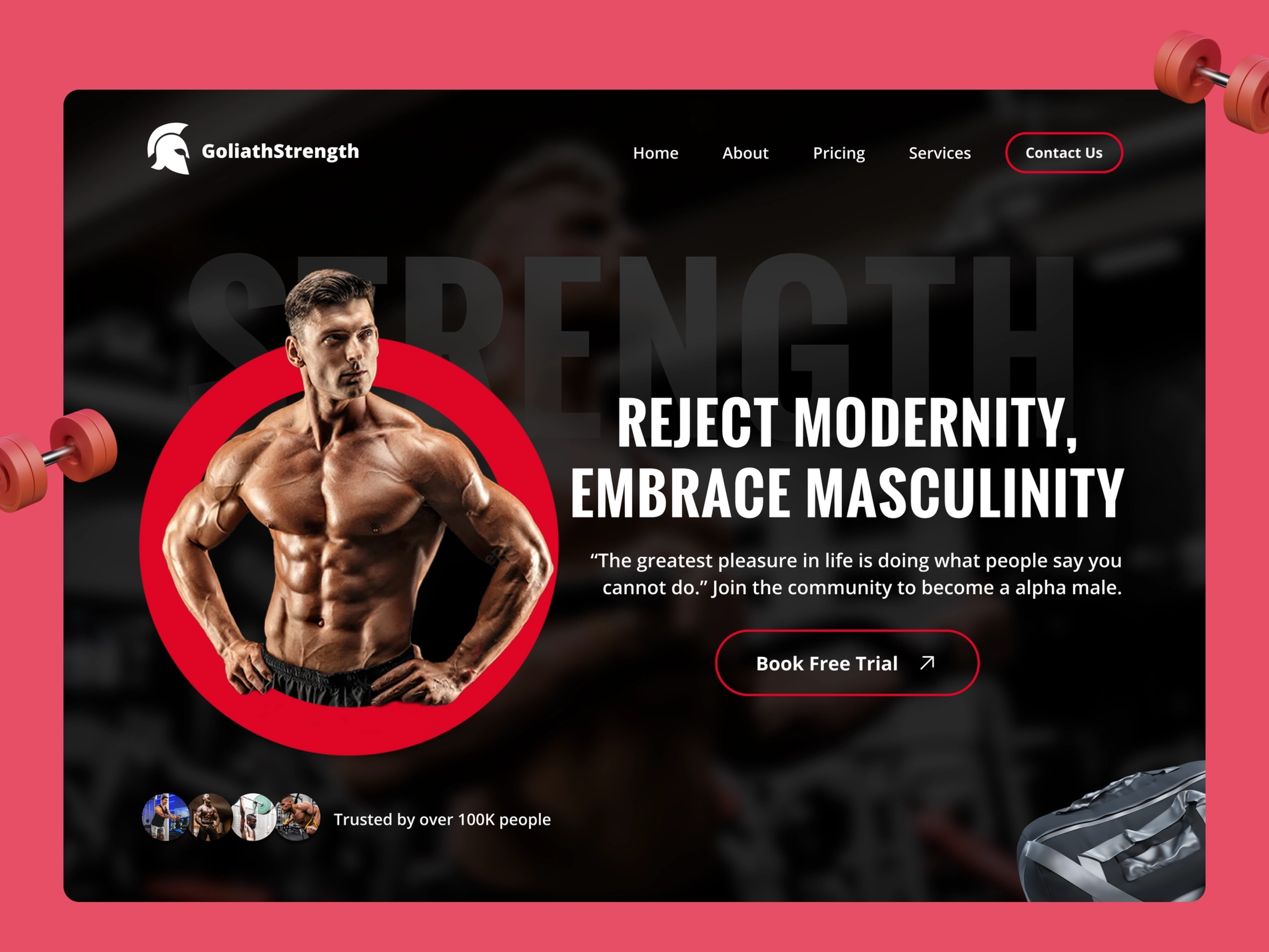
Gym Landing Page
Objective: My intention was to create a strong and masculine landing page for a gym website that would inspire people to visit the gym. Additionally, I aimed to feature the powerful sense of community within the gym.
Tools: I used Figma and a bit of Photoshop to create a strong, powerful, bold web design.
Thought Process: Upon experimenting with various concepts, I ultimately opted for a design featuring bold and tall typefaces with a dominant red accent color, adhering to the 60-30-10 color rule. To enhance the visual appeal, I also incorporated small gym-related elements such as dumbbells and gym bags.
Project Type: Personal
01 Apr 2023
Keywords
design
web design
ui design
landing page
gym
Design


