How to design alert dialogs? | UX | Flutter
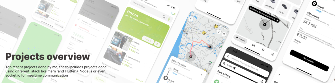
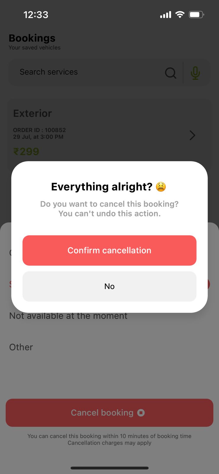
When it comes to mobile design, alert dialogs play a significant role in user experience. However, designing an alert dialog that adheres to UX principles is often overlooked. In this documentation, we'll delve into the key aspects of creating a well-crafted alert dialog: (How I build custom alert dialog for Hozzo using Flutter)
Let me break it down :
1. Clarity
2. Visibility and Positioning
3. Readable Typography
4. Use of Iconography or images
5. Avoid Ambiguity (Clearly highlight positive and negative actions to avoid confusion)
6. Consistency (Match with your app's theme unless it's an danger action like deleting or cancellation)
PRO TIP : 🎁
- Use haptic feedback on IOS (For Flutter use inbuilt haptic feedback or use Gaimon)
- Do't start scale transition of alert dialog from 0 instead start from .8 along with fade transition.
- Do't exceed title more than 3 words (I know this always do't work).
- Do't exceed animation duration more than 350ms. (One I use is speed of 120ms)
Use this package sha_alert build my me on pub.dev
https://pub.dev/packages/sha_alert
Shajin KP | Mern + Flutter developer | UX lover.
31 Jul 2023
Keywords

