MICSpharma website Landing Page design
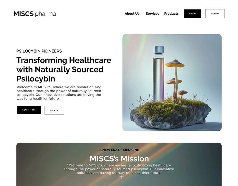
The UI/UX project focused on creating a landing page design for MCSICS, a pharmaceutical company pioneering the use of naturally sourced psilocybin for medical treatment. The design features a striking hero section with a white text box boldly proclaiming "PSILOCYBIN PIONEERS," immediately capturing visitors' attention. Below, a black text box warmly welcomes users, introducing MCSICS and its mission to revolutionize healthcare through psilocybin.
Emphasizing clarity and simplicity, the design presents MCSICS's innovative solutions prominently, showcasing its commitment to a healthier future. Clear calls to action buttons, inviting users to "LEARN MORE" and "SIGN UP," guide visitors seamlessly through the site.
The overall aesthetic exudes professionalism and user-friendliness, ensuring a positive user experience. Despite the complex subject matter, the design maintains a clear hierarchy of information, making key details easily accessible. By prioritizing clarity and user engagement, the landing page effectively communicates MCSICS's groundbreaking work in utilizing psilocybin for medical purposes.
(Note: Given the sensitive nature of psilocybin's legal status and its potential therapeutic benefits, the design tactfully navigates these complexities while adhering to legal and ethical guidelines.)
14 Mar 2024


