My Device Configuration
First Churn – Visual Identity Concept
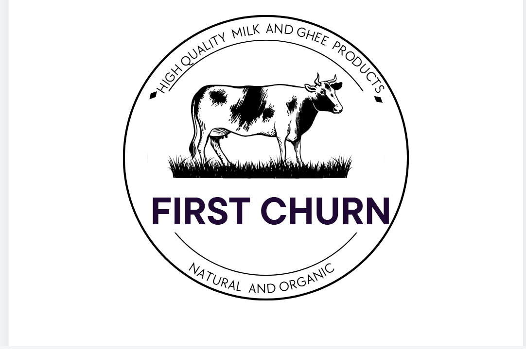
I made this logo keeping it simple and aesthetic, with a focus on showing that the brand is natural, organic, and high quality. I didn’t want it to look too modern or too basic, so I tried to keep a balance. I used a clean layout so it looks easy to understand and not cluttered. I added the cow because it directly connects to dairy and makes it more relatable, but I kept the overall design soft so it doesn’t feel too heavy. The target audience is people who care about what they consume, check quality, and prefer natural products, while also liking brands that look clean and not too loud. The feeling I wanted the logo to give is natural, calm, and trustworthy, while still showing good quality. I avoided using too many colors or making it too bright because that doesn’t match the kind of brand I was trying to create. Overall, I kept it simple, clear, and focused on quality and a natural feel.
05 Apr 2026