Designed logo for a Baby Apparel Brand
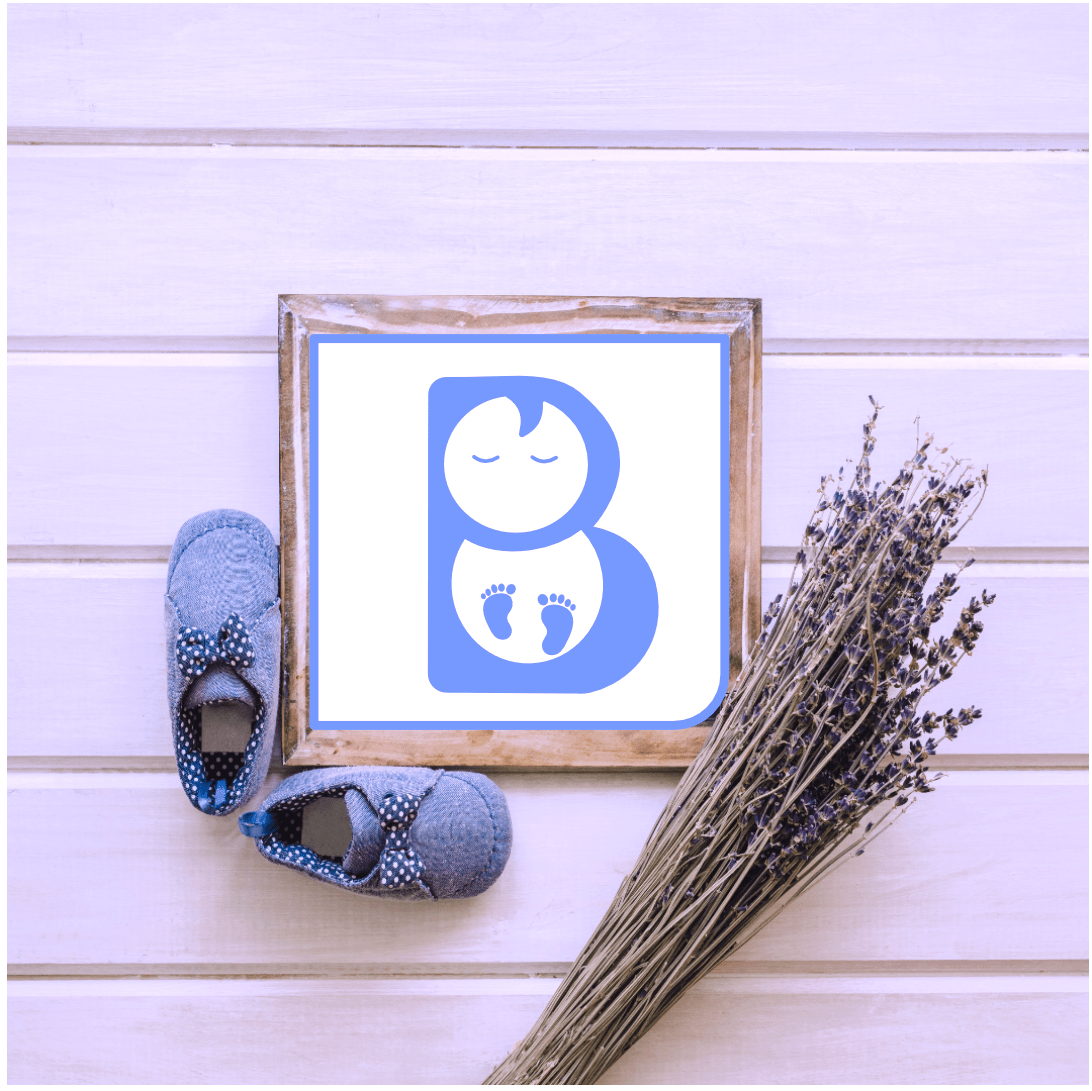
Baby Apparel logo
This logo design is part of my personal project i.e. #dailylogochallenge
Behind the scenes "
› To create this Baby apparel logo I used only two elements
• Letter B, Baby face and feet
What I did is quite simple
I wrote letter B
Used negative space to create baby look
Let's talk about colour
I used Blue but that wasn't my initial choice
I thought that this time I will be using pink colour because it is a baby brand so it should look cute
I searched other logos to found that majority was using pink color so I switched it to pink
Why Blue colour
Blue is a cool colour
I used soft shade of blue to make it more Baby friendly
Blue helps to keep babies calm and relaxed!
• Let's talk about B
What's there is to talk about B••
Only one thing I have kept corners of B round because that gives a sense of comfort to the viewer!
28 Apr 2022
