Star Club Tourism – Visual Identity for Tourism Brand
Built for five founders, designed as one brand.
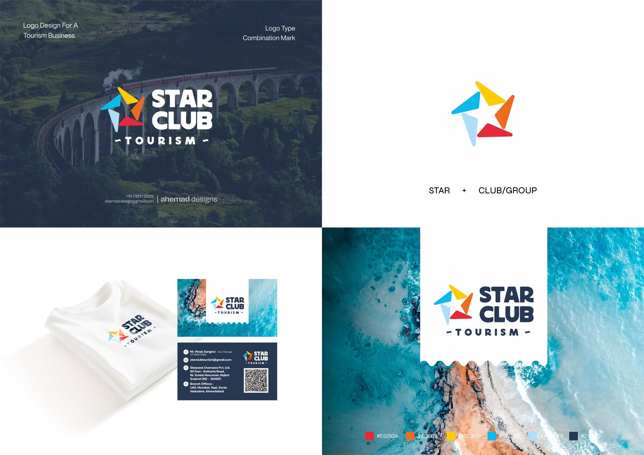
Star Club Tourism is shaped by multiple minds.
Built by five brothers - five perspectives, five roles, five ways of thinking.
So the star is thoughtfully constructed.
The star mark is designed around that idea.
Five distinct segments come together to form one symbol, representing their collective vision while keeping each identity visible.
The open structure keeps the logo flexible and modern,
while the rotation adds motion - a subtle reference to travel, movement, and growth.
A strategic logo design where brand identity supports a growing travel and tourism brand - across digital and physical touchpoints.
This is the level of logo thinking tourism brands need today.
Feel free to connect or drop a DM.
For strategic branding and logo design projects:
📩 ahemad.design@gmail.com
📞 +91 73831 25219
-
Ahemad Designs
Brand Identity Designer | Travel, Tourism & Business Branding | India
03 Feb 2026