Raja Spices — Crafting a Scalable Luxury Packaging System
Some brands don’t need reinvention.
They need a system that can grow without losing control.
When I worked on Raja Spices, I didn’t design a single packet.
I designed a family.
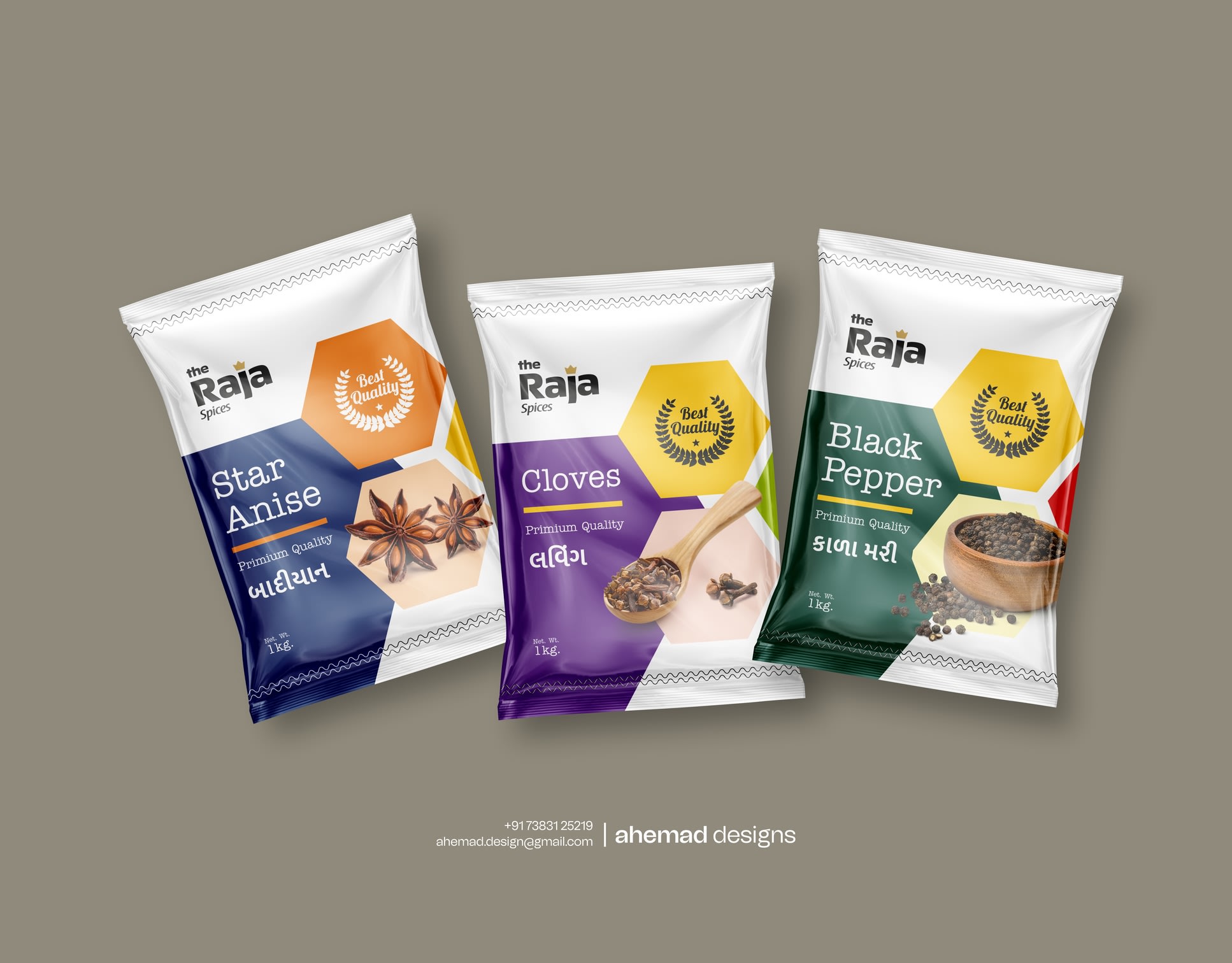
Today it’s black pepper, cloves, and star anise.
Tomorrow it could be ten more.
The challenge wasn’t product quality or demand.
It was consistency.
Most spice brands design one pack at a time. Over time, the shelf looks crowded and the brand slowly loses clarity. Raja Spices needed a visual system that could expand without breaking.
So I fixed the structure first — layout, grid, and hierarchy — before colours. Each spice gets its own colour identity, while the system stays disciplined. Hexagon elements act as visual anchors, keeping every pack balanced and repeatable. Typography stays clear from warehouse stacks to kitchen shelves.
This wasn’t about first impressions.
It was about long-term use.
If you’re building a product range meant to grow, let’s talk.
22 Jan 2026