Premium Incense Packaging Design | Harneel Fragrance
Good design doesn’t ask for attention.
It earns interest quietly.
That belief shaped this incense packaging project.
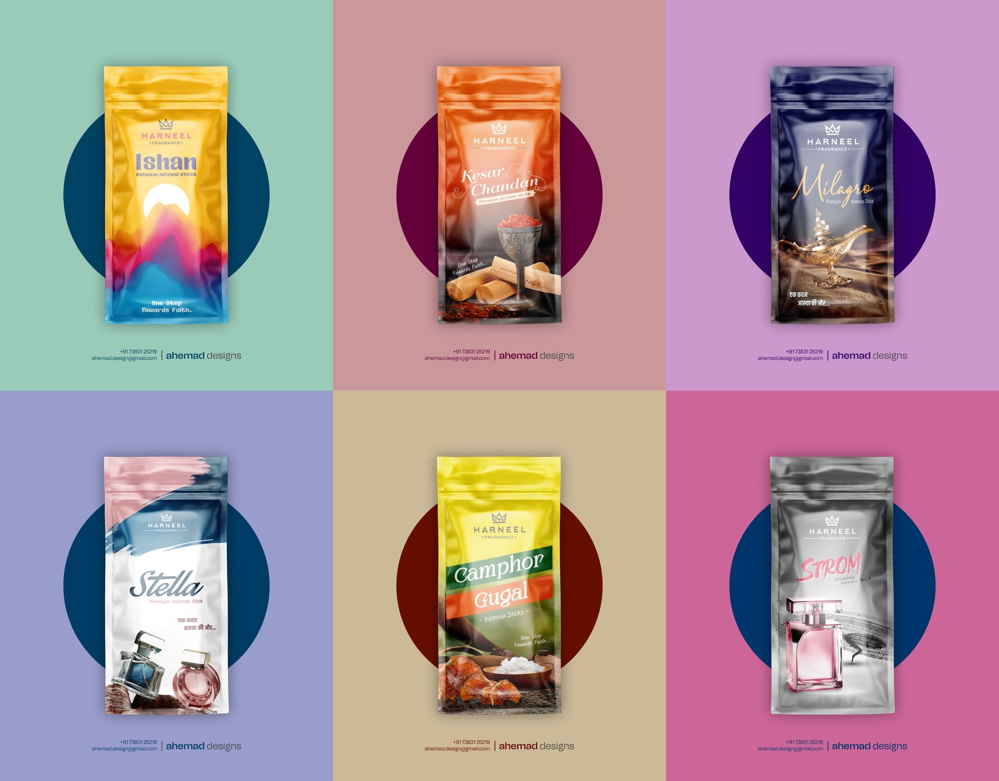
In a category where most packs look similar, the challenge wasn’t decoration — it was distinction. The incense itself was already high quality, made for people who care about what they bring into their homes and prayer spaces. But the visual language didn’t reflect that care.On the shelf, it blended in. Online, it didn’t pause the scroll.
The real problem wasn’t awareness.
It was clear identity.
I built a calm, modern packaging system that feels premium at first glance. Each variant carries its own mood through colour and imagery, while staying connected as one disciplined brand family. Typography stays refined and readable, layouts remain controlled, and nothing competes for attention.
The result is packaging that feels distinctive at first glance — and considered over time
If clarity and restraint matter to your brand, feel free to DM.
26 Jan 2026