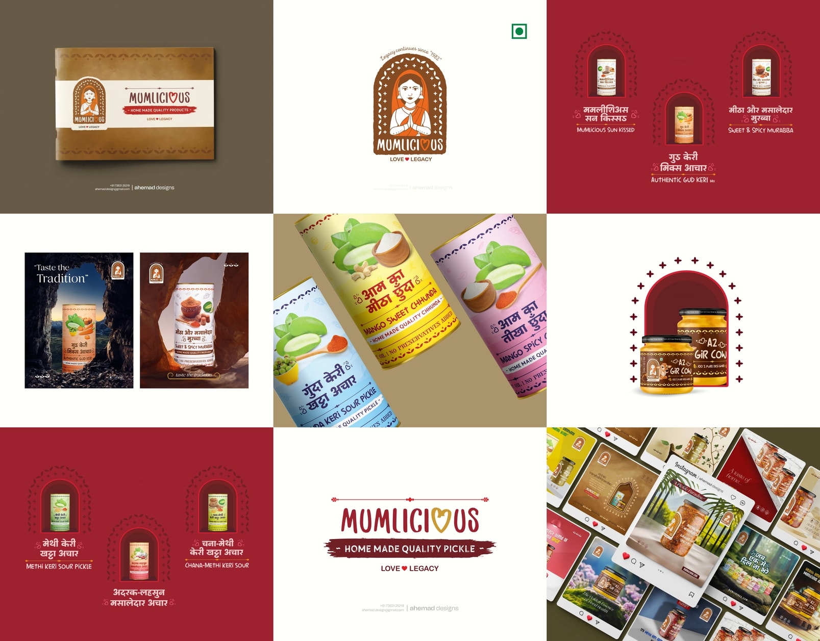
Mumlicious Brand Identity – Food Logo & Packaging Design
This is a brand identity I built from real family roots.
Before Mumlicious became a brand, it was a steel dabba travelling from Junagadh to different homes — carrying Leeriben’s homemade mango pickles. Hand-cut kairi, sun-dried spices, and recipes learned through years, not written in books.
So while working on this branding project, I didn’t follow trends.
I followed maa ke haath ka swaad.
The daughters built a business, but the soul had to stay homemade.
Not factory-made. Not flashy.
Something that feels like your neighbour aunty saying,
“Beta, achar le lo.”
That’s why the logo features a mother figure — calm, warm, familiar.
Folded hands for gratitude.
The arch inspired by old Indian homes.
Colours drawn from spice boxes and clay pots.
Beyond the logo,
I carried the same warmth into their packaging first,
then into their advertising creatives,
and finally across their social media designs —
keeping everything honest and rooted.
Even the heart in Mumlicious is intentional.
This brand runs on love — not preservatives.
As a graphic designer, my role wasn’t to modernise it.
It was to keep it real.
Comment “DM” to start your branding journey.
For collaborations or branding enquiries:
📩 ahemad.design@gmail.com
📞 +91 73831 25219
31 Jan 2026


