Fin Shark – Bold Financial Logo for Investment Brand
Finance with a bite. 🦈 Introducing Fin Shark.
Designing Fin Shark’s identity meant turning trust + momentum into a mark that feels bold and investable.
Brand: Financial services (investment, advisory, financial planning)
Direction: Modern, confident, and unmistakably about money.
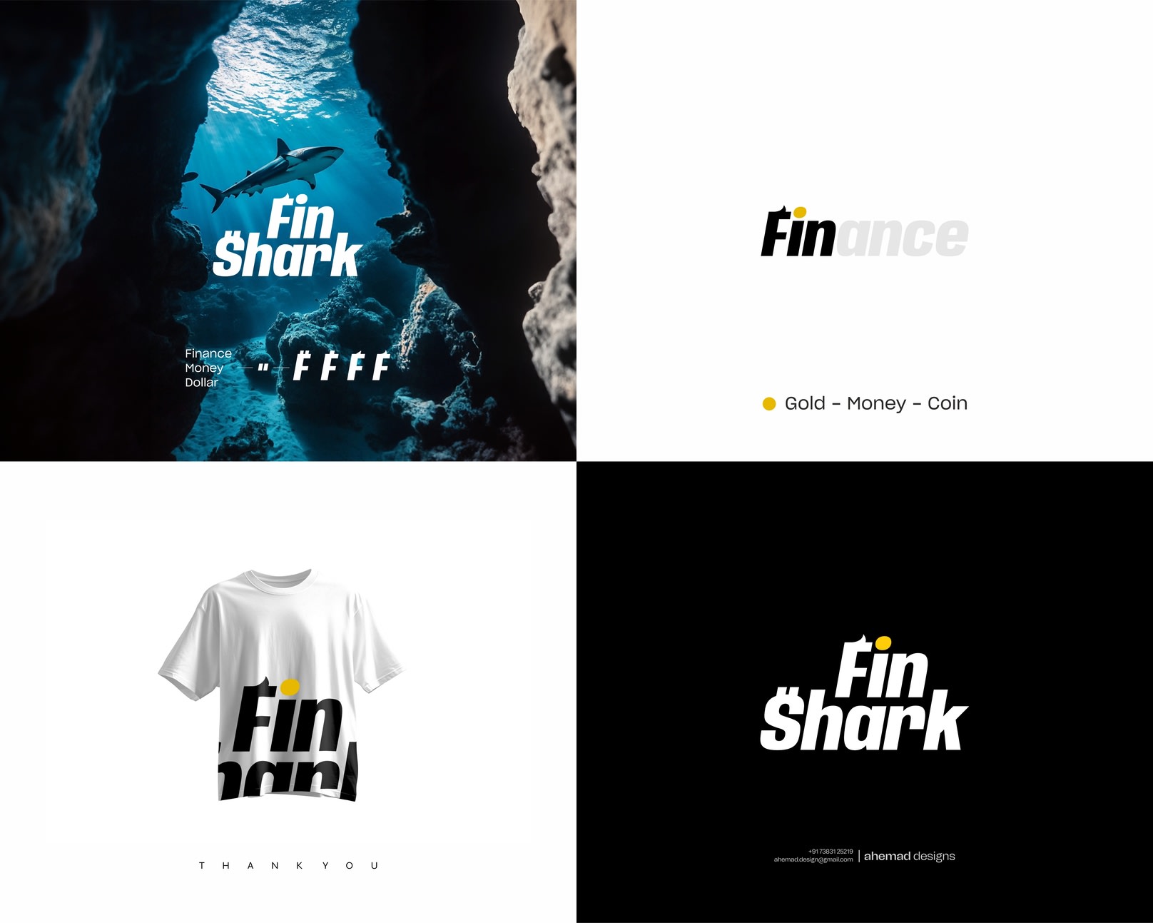
Concept Highlights
F = Fin (double meaning): The “F” is sculpted to echo a shark’s dorsal fin—a visual of speed, precision, and market agility. It also nods to Fin-ance and fin at once.
S = $: The “S” carries a dollar DNA, anchoring the wordmark to wealth, value, and returns without shouting.
Gold dot on “i”: A subtle coin cue—outcome-focused, symbolizing growth and payoff.
Forward-leaning geometry: Tight kerning and assertive angles project momentum and confidence.
Black/white with a gold accent: Premium, high-contrast, boardroom-ready.
Result: a wordmark that is clean, memorable, and financially fluent—built to scale across pitch decks, apps, and merchandise.
Designed by: Ahemad Designs
📍 Junagadh, Gujarat • 📞 +91 73831 25219 • 📧 ahemad.design@gmail.com
What do you notice first—the fin in the “F” or the “$” energy in the “S”?
Drop your take—I read every comment.
18 Jan 2026