Here's your complete First Churn design submission - both the PDF and the HTML
This project explores the creation of a premium dairy brand identity for First Churn, positioned in the space of quiet, craft-driven luxury. The objective was to move away from conventional dairy visual clichés and instead build a brand that communicates trust, quality, and restraint through subtle design choices.
The concept is rooted in the idea that premium brands don’t need to over-explain-they earn trust through simplicity, intention, and thoughtful execution. As outlined in the brand territory (page 2), the identity targets a discerning, urban consumer who values authenticity over loud marketing and prefers products that feel considered rather than advertised.
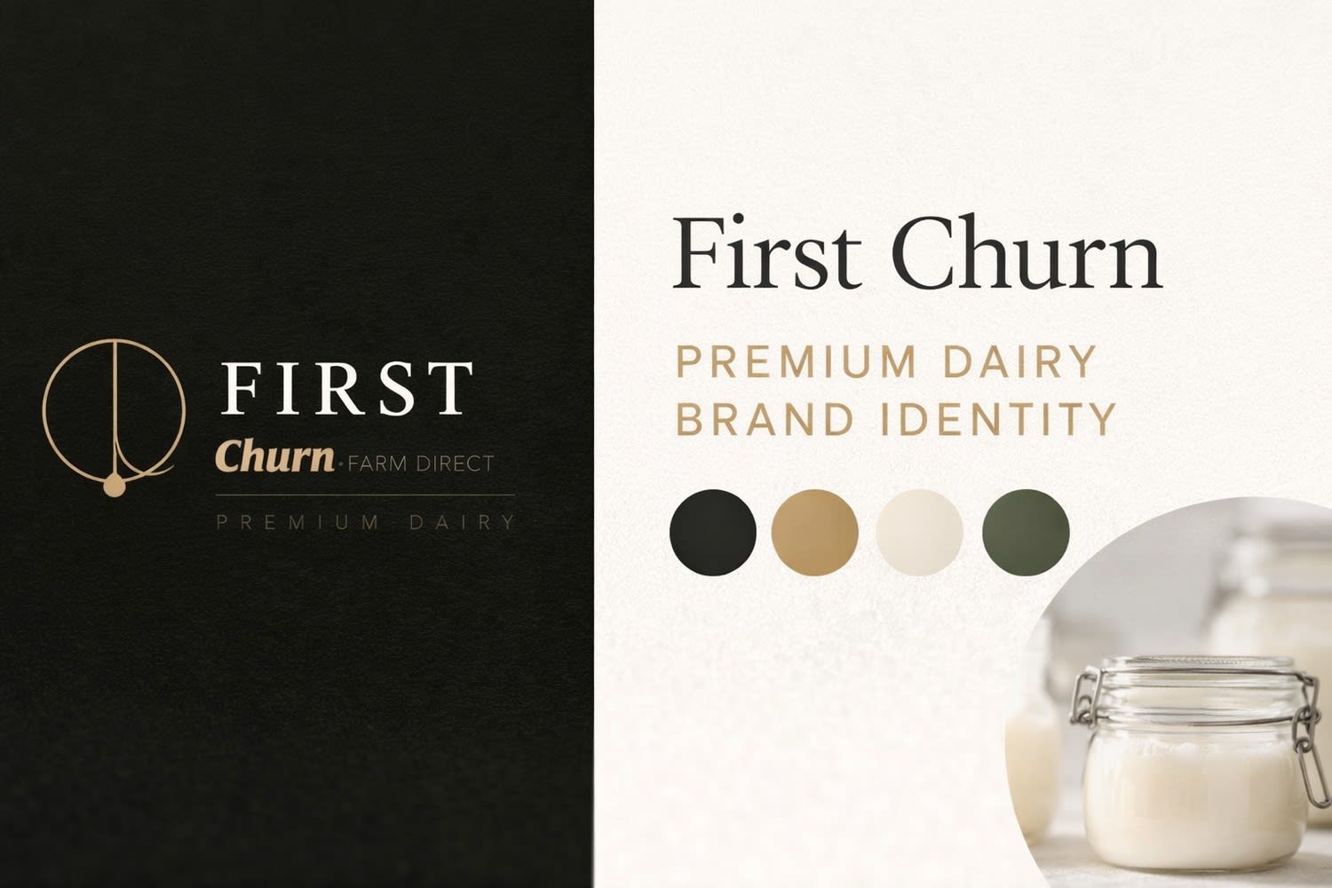
The logo design captures the act of churning rather than literal dairy symbolism. A single continuous circular form, interrupted by a drop, represents motion, craft, and transformation (page 4). This approach shifts the focus from “what the product is” to “how it is made,” reinforcing the brand’s emphasis on process and quality.
Typography is intentionally dual-toned-structured and declarative for “FIRST,” while “Churn” introduces warmth and tactility through italic styling. The color system combines deep obsidian tones with restrained gold accents to signal luxury and craftsmanship, supported by soft neutral bases for everyday usability (page 5).
Overall, this project demonstrates a strategic approach to branding-balancing minimalism, storytelling, and functional design to create a distinctive identity in a saturated category. The final outcome is a brand that doesn’t compete on noise, but on clarity, confidence, and quiet sophistication.
03 Apr 2026

👀 Assignment details
Designer for Ultra-Premium Dairy Brand “First Churn”
Design Assignment — First ChurnShortlisting Round | All-Rounder DesignerAbout First ChurnFirst Churn is an upcoming urban premium dairy brand. We sell milk and ghee — but we're building a brand, not a commodity.Our customer is urban, 25–40, health-conscious, and aesthetically driven. They read ingre...


