Habuild thumbnail design assignment

5 Key Issues Identified in the Graphic Carousel
Unclear Visual Hierarchy
The first slide lacks focus—multiple fonts and no highlighted keyword make it hard to understand what to look at first.
Weak Image Quality & Design
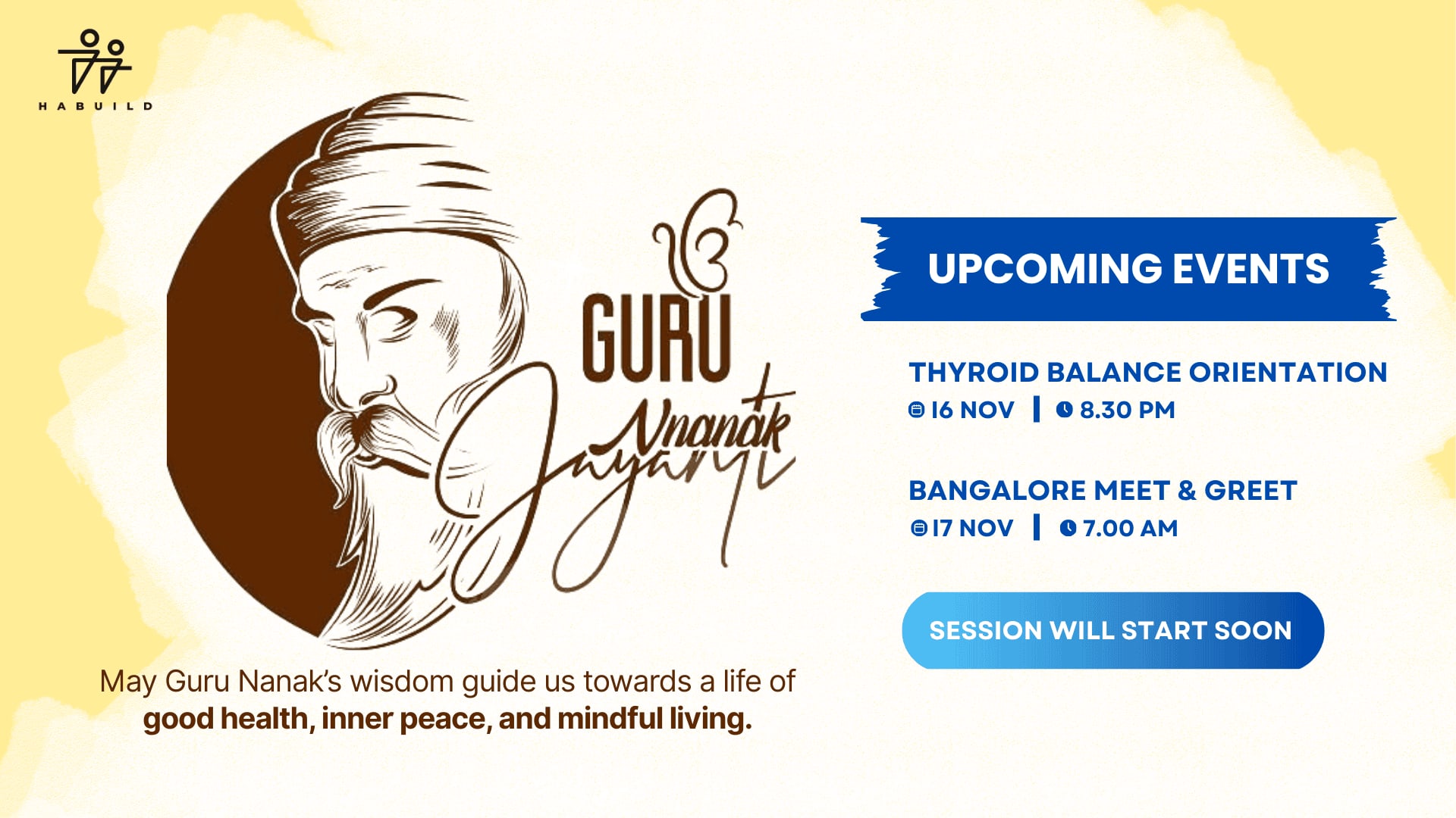
The main character image looks outdated and unpolished. Modern, AI-enhanced visuals or clean illustrations would look much better.
Poor Font Choices
Fonts across slides are inconsistent and don’t reflect the tone of a modern healthcare brand. They feel basic and unprofessional.
Low Visual Contrast
The myth vs fact section has dull colors and poor contrast, making it hard to read and visually unappealing.
Basic & Cartoonish Look
The last slide feels too simplistic and informal. It lacks the professionalism needed to build trust with a health-conscious audience.
To conclude:
If you choose to work with me, you’re not just hiring a designer—you’re getting a rare combination of copywriting, photography, and design expertise. This strong trio allows me to look at a graphic holistically and make smart decisions on font selection, imagery, and headline copy—all tailored to ensure your content not only looks modern and professional, but also connects emotionally with your audience. My approach focuses on clarity, consistency, and impact, so that every post delivers your message powerfully and drives the right action from your customers.
Yes, i can do this kind of illustrations with a much better output
22 Apr 2025

👀 Assignment details

Graphic Designer - Habuild
Part 1: Carousel Review Objective: Review this Instagram carouselTask: Assess the carousel for readability, design flow, and visual appeal. Based on your understanding, review the carousel and suggest changes for the same. Part 2: Thumbnail Design Objective: Redesign this thumbnailTas...