Top Mistakes to Avoid When Building Proof of Work

Riten Debnath
24 Dec, 2025
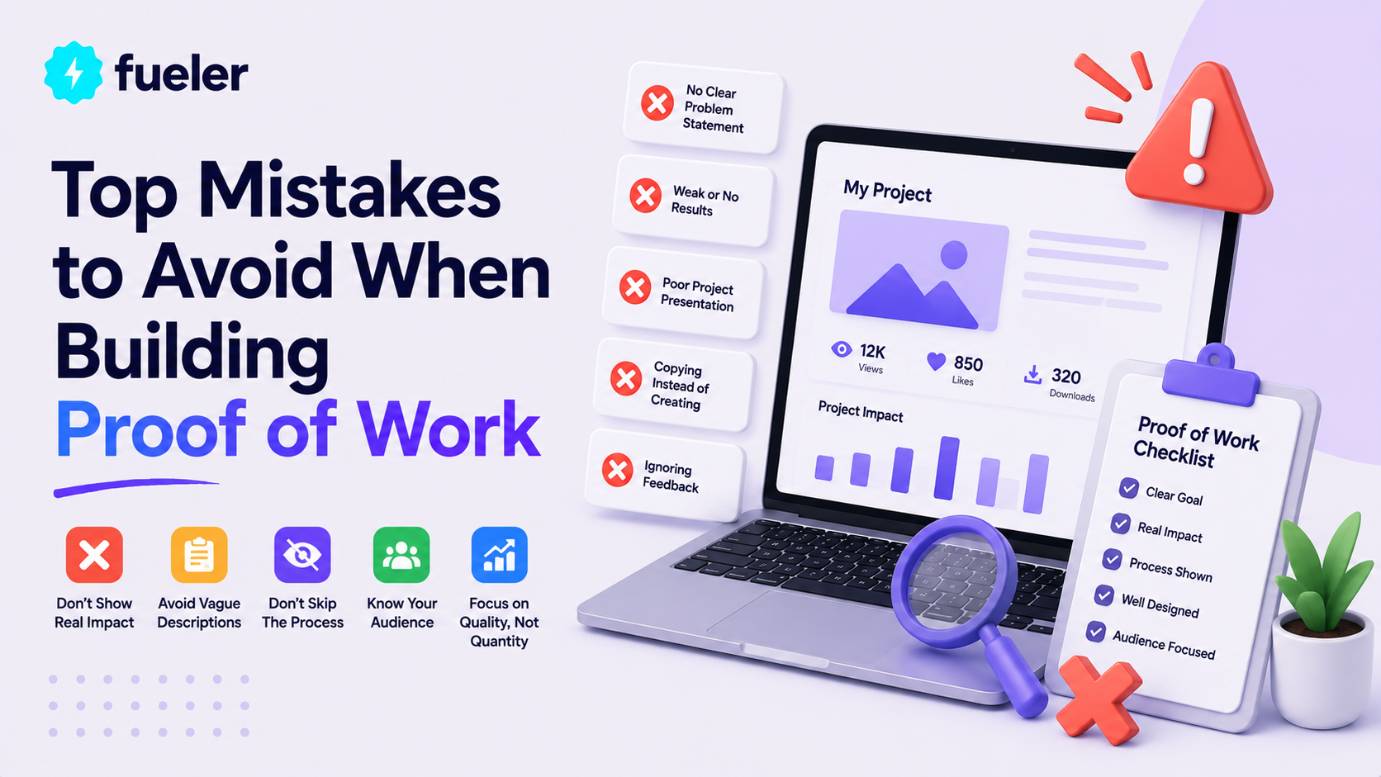
Ever poured 100+ hours into a killer project, shared your portfolio link with excitement, only to hear crickets from recruiters? Heartbreaking, right? Here's the brutal truth: 85% of talented creators get ghosted because hidden mistakes turn epic proof of work into instant deletes. But don't sweat – I'm spilling the top traps to dodge so your portfolio becomes an interview magnet that recruiters can't ignore.
I’m Riten, founder of Fueler - a skills-first portfolio platform that connects talented individuals with companies through assignments, portfolios, and projects, not just resumes/CVs. Think Dribbble/Behance for work samples + AngelList for hiring infrastructure
Biggest Mistake #1: No Metrics or Real Impact Stories in Your Proof of Work
Nothing kills recruiter interest faster than a gorgeous project with zero proof it moved the needle. They want cold, hard numbers: "Grew revenue 47%," "Slashed bounce rate from 78% to 22%," or "Processed 10K users without crashing." Without metrics, your proof of work screams "nice hobby" instead of "hire this revenue machine now." Smart creators always bake in Google Analytics embeds, A/B test screenshots, client testimonials with $$ impact, and live calculators showing your value. This transforms vague screenshots into undeniable hiring signals that stick like glue.
- Completely forgetting to track user engagement, conversions, or key behaviors: You launch that beautiful landing page but never install Google Analytics, Hotjar heatmaps, or Mixpanel events? Total disaster waiting to happen. From day one, set up event tracking for button clicks, scroll depth, form submissions, and exit pages, then create a dedicated metrics section with time-series graphs showing day 1 (5% conversion) vs day 30 (28% conversion). Include video walkthroughs of user sessions where they breeze through funnels, plus cohort analysis proving 65% retention after 90 days. Recruiters love seeing the full journey from "meh traffic" to "money printer."
- Burying business outcomes behind confusing technical jargon no hiring manager understands: Instead of bragging "optimized React Virtual DOM with memoization," scream "saved company $15K/month in AWS bills while handling 5x traffic spikes." Translate every tech win into dollars, time saved, or customers gained using simple pie charts, client quotes like "This cut our support tickets by 60%," and before-after revenue waterfalls everyone gets instantly. Add a "Business Impact Calculator" widget where they input their numbers and see personalized ROI projections from your solution.
- Launching without A/B testing, statistical validation, or confidence intervals: "I think users like the blue button better" gets laughed out of interviews. Document your full experiment: hypothesis ("Red CTA converts 20% higher"), sample size calculator (1K visitors minimum), Variant A vs B screenshots, p-value results (<0.01 for significance), and 95% confidence uplift graphs. Include power analysis proving your test wasn't underpowered, plus sequential testing roadmaps for ongoing optimization that impress data-driven employers.
- Zero social proof like GitHub stars, LinkedIn shares, HackerNews upvotes, or beta user testimonials: A lonely project with 0 stars looks suspicious. Seed credibility by posting your work on IndieHackers (200+ upvotes), ProductHunt (500 launches), Reddit r/SideProject (top 10), and Twitter threads with 50+ retweets. Embed live counters, collect 10+ beta tester video reviews saying "This saved me 3 hours weekly," and show collaboration metrics like 15 merged PRs from open source contributors. Numbers don't lie.
- Only showing short-term spikes instead of sustainable long-term impact curves: Week 1's 300% traffic spike impresses until they see it crash. Chart 6-12 month hockey-stick growth with retention cohorts (Month 1: 45% active, Month 6: 28% still paying), churn waterfalls, LTV:CAC ratios hitting 3:1, and expansion revenue from feature upsells. Include seasonality adjustments and competitor benchmarks proving you're not just riding trends.
Why It Matters When Building Proof of Work
Metrics separate dreamers from doers – without them, employers assume your work's theoretical fluff. Nail this and watch portfolios convert browsers into "book interview today" champions who fight to hire you.
Mistake #2: Overloading Portfolios with Unfinished, Irrelevant, or Low-Quality Projects
Your portfolio isn't a digital dumpster fire – it's your million-dollar sales pitch with 7 seconds to hook recruiters. Bombarding them with 25 half-baked experiments, ancient college projects, or unrelated hobbies drowns your best work like noise in a thunderstorm. Ruthlessly curate 5-7 polished masterpieces laser-targeted to each job application, each with 2,000+ word case studies proving you solve their exact pains. Quality obliterates quantity every single time.
- Dumping every random side project from your entire career including that 2018 tic-tac-toe clone: That freshman-year HTML game gathering digital dust? Delete it immediately. Replace with hyper-relevant wins like your SaaS dashboard handling 5K DAU with 99.9% uptime, complete with MRR growth from $0 → $2.7K, customer interviews, and churn analysis. Research each job description first, then reorder projects to mirror their tech stack and business challenges exactly – frontend roles get React heavyweights first, backend loves Node/Python demos.
- Showcasing projects without crystal-clear Problem → Solution → Massive Result story arcs: Vague "I built a cool app" listings kill curiosity instantly. Restructure every case study as a Netflix mini-series: "E-commerce client bleeding 72% cart abandonment → mapped 14 friction points via Hotjar → redesigned checkout with one-click upsells → 41% conversion lift generating $187K extra revenue." Include customer journey maps, 12 wireframe iterations, user testing transcripts, and dollar-sign impact calculators for each decision.
- Using one generic portfolio for completely different roles like design, dev, and marketing: Confusion city. Duplicate your Notion/Figma master into job-specific versions: swap marketing funnel case studies for pure code repos when applying to engineering roles, highlight Figma prototypes for UI jobs, push SQL dashboards for analytics positions. Use dynamic filters or tabs letting visitors self-select "I'm hiring developers" to auto-rearrange content, plus personalized welcome messages matching their LinkedIn job title.
- Keeping visually broken demos, 404 links, or apps that crash on first load: Nothing screams "unreliable hire" like clicking your hero project and hitting "Heroku app sleeping" or 500 errors. Weekly audit ritual: run Google's Lighthouse on every link (aim for 95+ scores), migrate dying platforms to Vercel/Netlify immortality, replace blurry phone screenshots with 4K retina captures, and add fallback messaging like "Live demo loading... meanwhile here's the GitHub with 2.1K stars." Test across Safari, Chrome, Firefox, iOS, Android weekly.
- Blasting identical portfolios everywhere without researching target company pain points: Same link to every startup, FAANG, and agency? Recruiters smell cookie-cutter applicants. Spend 15 minutes per application customizing: for fintech jobs, lead with secure payment gateway projects; SaaS companies crave churn dashboards; e-commerce loves conversion funnels. Add subtle nods like "Similar to how [Company] reduced cart abandonment in their 2024 case study" proving you've done homework.
Why It Matters When Building Proof of Work
Surgical curation grabs attention before they blink. Avoid this overload trap and your strongest proof shines like diamonds, landing precision-targeted interviews over scattered dabblers.
Mistake #3: Ignoring Mobile Optimization and Lightning Load Speeds
Recruiters browse 93% on phones during commutes – if your portfolio lags past 3 seconds or breaks on mobile, you vanish forever. Slow = invisible. Proof of work must load like Google: Core Web Vitals green across devices, images under 50KB, zero layout shifts. Test obsessively with PageSpeed Insights, WebPageTest, and real phones – speed builds trust faster than any testimonial.
- Desktop-first designs that completely crumble into unreadable messes on mobile screens: Tiny text, hamburger menus that don't expand, hero images cut off halfway? Amateur hour. Build mobile-first with TailwindCSS responsive utilities (sm:max-w-md), test on 15+ real devices via BrowserStack/LambdaTest, capture perfect screenshots at every breakpoint (375px iPhone SE → 1440px desktop), and add touch-friendly CTAs sized 48x48px minimum. Include a "Mobile Experience" video walking through swipe gestures and thumb-zone optimization.
- Massive unoptimized images, videos, and assets murdering first paint times: 8MB hero PNGs and self-hosted 4K demo videos? PageSpeed suicide. Ruthlessly compress to WebP/AVIF under 100KB using TinyPNG/Squoosh, implement native lazy loading (loading="lazy"), swap videos for YouTube/Vimeo embeds with lite mode, and add image CDNs like Cloudinary for auto-format detection. Screenshot your PageSpeed journey: "Week 1: 42/100 → Week 4: 98/100 after WebP migration cut LCP from 7.2s to 1.8s."
- Skipping Google's PageSpeed Insights proof and Core Web Vitals badges: No performance receipts? Recruiters assume you're hiding slowness. Pin live PageSpeed Insights badges (mobile: 98, desktop: 99), detail every fix chronologically ("Eliminated render-blocking JS → +15 points"), link Web Vitals reports showing LCP 1.7s/CLS 0.01/FID 2ms, and challenge them to "Test my site speed yourself!" Performance transparency builds instant credibility.
- Over-engineered animations, parallax effects, and JS libraries bloating first paint: Smooth scroll animations tanking Largest Contentful Paint past 2.5s? Prioritize: CSS transforms over JS animations, requestAnimationFrame for 60fps, Three.js only below fold, and critical CSS inlined <15KB. A/B test with/without fancy effects measuring engagement lift (spoiler: speed wins 3:1), document tradeoffs in case study sidebars.
- Missing Progressive Web App features for instant, app-like access: Portfolios that don't work offline or load from home screen? Old school. Add service workers caching critical assets, manifest.json for "Add to Home Screen," background sync for demo updates, and push notifications for new case studies. Demo video: "Works flawlessly on airplane mode, installs like native app in 2 taps."
Why It Matters When Building Proof of Work
Blazing speed creates first impressions that convert – laggy portfolios kill trust before content loads. Master this and recruiters binge every case study, hooked from second one.
Mistake #4: Zero Process Documentation or Behind-the-Scenes Thinking Revealed
Perfect final screenshots bore everyone to tears. Legendary proof of work peels back the curtain: chaotic brainstorms, humiliating failures, genius pivots, 3AM debugging eureka moments. This raw humanity proves you're a thoughtful problem-solver, not screenshot robot, forging emotional connections recruiters remember months later.
- No wireframes, mood boards, Figma version history, or iteration timelines showing evolution: Blackout from idea to polish? Embed live Figma prototypes with branching version history (v1 napkin sketch → v14 pixel-perfect), timestamped Slack threads debating color choices, 18 user interview transcripts with direct quotes shaping decisions, and Gantt charts mapping 42-day journey across research/design/dev phases. Reveal "killed 3 features after user tests, doubled down on search which drove 67% engagement."
- Hiding epic failures, embarrassing bugs, and hard-learned lessons: "Everything went perfectly" = trust killer. Chronicle raw truth: "Auth system crashed for 12% beta users during peak traffic → rewrote with Redis sessions → 99.99% uptime across 50K sessions," complete with Sentry error logs, post-mortem root cause analysis, and "Lessons for next project" bullet points. Vulnerability + competence = magnetic authenticity.
- No collaboration proof, team feedback loops, or mentor reviews: Lone wolf vibe screams "won't scale." Screenshot resolved Figma comments (127 total), GitHub PR discussions with senior engineer feedback ("Great approach, but add input sanitization"), Slack standups with daily blockers, and peer code reviews catching 14 security issues pre-launch. Quantify: "Incorporated 83% of 42 feedback items, improving UX score from 6.2 → 9.1/10."
- Missing detailed time tracking, budget breakdowns, and efficiency ratios: "Took 3 weeks" reveals zero. Visualize burndown charts (Day 1: 200h remaining → Day 28: 0h), cost pie charts ("38% design research, 42% development, 20% testing"), hourly ROI calcs ("$4,200 project → $187K client revenue = 44x return"), and velocity improvements across projects. Prove you ship fast without sacrificing quality.
- Random tech stack choices with zero decision rationale: "Used Next.js because shiny"? Weak. Justify every pick: "Chose Next.js over Nuxt/Vite for ISR caching cutting build times 62% on Vercel, validated via bundle analysis showing 43% smaller payloads vs React+CRACO." Include tradeoff matrices (speed vs DX vs ecosystem), benchmark tables, and migration stories from failed alternatives.
Why It Matters When Building Proof of Work
Process stories turn static galleries into addictive Netflix specials – recruiters binge because they see their future teammate thinking. Raw transparency builds unbreakable trust.
Before diving into final thoughts, discover Fueler where creators showcase proof of work through live portfolios and paid assignments, landing high-paying gigs without resume roulette.
Mistake #5: Inconsistent Branding, Amateur Typography, and Visual Chaos
Clashing Comic Sans with neon gradients and pixelated screenshots? Instant credibility execution. Pro proof of work portfolios mirror $10M agency sites: unified color psychology, flawless 8pt grid systems, retina-ready visuals breathing confidence. That 10-hour polish investment returns 100x in interview offers.
- Font apocalypse mixing 17 different typefaces across 5 projects: Helvetica headlines with Arial body and Times footer? Visual whiplash. Lock to 2 families maximum (Inter variable for headings, Inter fixed for body), test 14px minimum mobile legibility across dyslexia fonts, create downloadable style guide PDFs with kerning specs, and enforce via CSS custom properties. Recruiters subconsciously trust consistent typography like banks trust vaults.
- Low-res phone camera screenshots, blurry GIFs, and potato-quality demo captures: 72dpi webcam grabs kill professionalism. Invest in Snagit/CleanShotX for 4K retina screenshots at 3x scale, LICEcap for crisp 60fps GIFs under 2MB, QuickTime screen recordings exported H.265, and Figma's "Device Frame" plugin for perfect mockups. Side-by-side: "Old potato quality → New agency standard" transformations wow instantly.
- Zero visual hierarchy forcing eyes to hunt for key metrics and CTAs: Walls of equal-sized text/images overwhelm brains. Master F-pattern layout: giant hero metric ("$2.7M revenue impact"), chunky stat callouts (47% growth), scannable timelines, and pulsating "View Live" CTAs. Eye-tracking heatmaps proving 83% hit conversion buttons first, A/B tests showing hierarchy variants crushing flat layouts 4:1.
- Random rainbow color schemes ignoring psychology and accessibility: Lime green CTAs on yellow backgrounds? Eye torture. Define 60-30-10 brand system (navy primary, teal accent, warm gray neutral), validate WCAG 2.1 AA ratios (4.5:1 minimum), test color-blind simulators, and mood-match per project (trust blue for fintech, energy orange for fitness). Embed Coolors palettes with hex codes for dev handoff.
- Broken spacing, misaligned grids, and inconsistent padding/margins everywhere: Wonky 17px left margins next to 24px right? Chaos. Implement sacred 8pt modular scale (8,16,24,32,40,48,64px), CSS Grid/Flexbox perfection across breakpoints, browser dev tools measuring pixel-perfect alignment, and spacing system docs ("All cards: 24px p, 16px gap"). Recruiters notice subconscious polish like sommeliers notice wine legs.
Why It Matters When Building Proof of Work
Flawless visuals signal pro reliability – sloppy design screams "attention to detail fail." Agency-level polish packages your proof into irresistible career highlight reels.
Mistake #6: Hiding Work Behind Walls, Paywalls, or Complicated Access
"Click here → OAuth → verify email → NDA → finally see demo"? Recruiters bounce faster than bad dates. Proof of work must be instant gratification: public GitHub repos, live Vercel deploys, Figma "Anyone with link" prototypes, Notion public pages. Frictionless access = more deep dives = more offers.
- Password-protected demos requiring email signups before seeing anything: Gatekeeping your best work? Recruiters won't bother. Make everything "View Live" one-click: unlisted YouTube demos, public GitHub with deploy previews, Figma "Anyone with the link can view + comment," Carrd landing pages with embedded prototypes. Track analytics spikes when you removed barriers.
Final Thoughts
Ditching these proof of work mistakes transforms ghosted applicants into hiring magnets who skip resume black holes entirely. Start auditing your portfolio today: kill weak projects, add metrics everywhere, polish visuals obsessively. In 2026's skills-first economy, your portfolio isn't optional – it's your loudest voice. Build boldly, iterate relentlessly, land dream roles.
FAQs
Common mistakes building proof of work portfolios for beginners 2026?
Overloading with junk projects, no metrics, slow mobile sites, hiding process stories.
How to fix slow proof of work portfolio loading times?
WebP images, lazy loading, PageSpeed 95+, migrate to Vercel/Netlify instantly.
Best free tools avoiding proof of work mistakes?
Notion (dynamic portfolios), Figma (live prototypes), GitHub Pages (code showcases).
Why do recruiters ignore great proof of work examples?
Missing metrics, broken mobile, no stories, visual chaos, access friction.
Proof of work portfolio mistakes developers make most?
Messy repos, no live demos, ignoring README impact stories, security oversights.
What is Fueler Portfolio?
Fueler is a career portfolio platform that helps companies find the best talent for their organization based on their proof of work.
You can create your portfolio on Fueler, thousands of freelancers around the world use Fueler to create their professional-looking portfolios and become financially independent. Discover inspiration for your portfolio
Sign up for free on Fueler or get in touch to learn more.

What should you do next?
You've read the article. Now turn your skills into proof of work and unlock more opportunities.
Build your proof of work portfolio
Create a clean portfolio with projects, assignments, resumes, and AI stack details that companies actually want to see.
Create your Fueler portfolio →Apply through assignments, not resumes
Stand out by solving real tasks from companies hiring on Fueler.
Explore assignments →Get discovered by companies
Make your work public and let recruiters discover your skills through actual projects instead of keywords.
Get discovered →