Top Mistakes to Avoid in Your Portfolio in 2026

Riten Debnath
25 Dec, 2025
Your portfolio looks great to you – but recruiters close it in 8 seconds flat. In 2026, 76% of creative profiles get ignored because they commit silent killers: generic templates, no live demos, missing metrics, mobile disasters. Designers lose Adobe gigs, writers miss agency contracts, developers get ghosted by startups – all fixable mistakes. Companies now use AI scanning for proof-of-work signals, not pretty screenshots. Don't let avoidable errors kill your dream remote role.
I'm Riten, founder of Fueler – the skills-first portfolio platform where professionals showcase real projects to land dream roles. Think Dribbble + AngelList, but for providing subscription-boosted performance that keeps top talent happy and productive all year long.
Why Portfolio Mistakes Destroy Opportunities in 2026
Hiring evolved because recruiters test portfolios live during 7-second scans, not read bullet points. AI tools reject 82% of profiles lacking clickable demos or measurable impact. Designers compete against Figma agency pros, writers battle AI content floods, developers face global GitHub talent. Common mistakes like static screenshots, no mobile optimization, generic "hire me" pages kill conversions instantly. Smart portfolios embed working projects, client testimonials, performance metrics recruiters screenshot for hiring managers.
- Generic Behance/Dribbble Clones: Endless screenshot grids with zero personality, same templates as 500 other applicants, no storytelling or process behind designs, recruiters can't distinguish you from AI-generated portfolios flooding platforms.
- No Live Project Demos: Static Figma mocks recruiters can't interact with, developers showing code screenshots instead of working apps, writers listing articles without embedded live reads, instant credibility killers.
- Mobile Loading Nightmares: Portfolios taking 12+ seconds on 4G, unreadable fonts on phones where 68% of recruiters browse, hamburger menus hiding key case studies, instant bounce rates.
Why it matters for portfolio mistakes: These errors drop interview rates by 89%, fixable changes turn ignored profiles into recruiter magnets.
Mistake 1: Screenshot-Only Portfolios (No Live Demos)
Recruiters ignore static images like they skip Instagram feeds. Screenshots prove nothing – anyone can fake Photoshop comps. 2026 demands clickable prototypes, live apps, embedded articles. Designers lose because Figma links expire, developers fail without Vercel deploys, writers miss without Medium embeds. Live demos let recruiters test your actual skills instantly.
- Figma Links That Expire or Require Login: Share links demanding "sign up to view prototype," recruiters skip instantly, no interaction possible without account creation, confidential client work hidden unnecessarily, expired student licenses kill access.
- Code Screenshots Instead of Deployed Apps: GitHub README images of React components, no "try demo" button, recruiters can't test edge cases or performance, proves nothing about production readiness, looks amateur vs Vercel peers.
- PDF Case Studies No One Opens: 12-page downloadable journeys recruiters never click, slow loading kills mobile users, no interactive elements or video walkthroughs, static text walls compete poorly with TikTok attention spans.
- Behance Shot Grids Without Context: 20 unrelated UI screens with zero project stories, no "problem solved" explanations, client impact hidden, recruiters guess what you actually delivered.
- Non-Embedded Writing Samples: "Read my Medium articles here" links to external sites, no preview snippets or key quotes, recruiters leave your portfolio immediately, bounce rates skyrocket.
- Missing Video Walkthroughs: No 90-second Loom demos showing app flows, recruiters imagine functionality instead of experiencing it, trust gap massive vs competitors with embedded videos.
Why it matters for portfolio mistakes: Live demos boost conversions 6x, recruiters hire what they interact with, not what they imagine.
Mistake 2: Mobile Disaster Zones (68% Recruiter Traffic)
Portfolios breaking on phones kill opportunities instantly. Recruiters scroll LinkedIn on iPhones during commutes, close unreadable sites immediately. 2026 Google penalizes slow mobile pages crushing SEO rankings. Designers forget responsive breakpoints, developers ignore touch targets, writers cram desktop text walls. Mobile-first design isn't optional anymore.
- Tiny Unreadable Text on Phones: 10px font sizes requiring endless pinching, no viewport meta tags configured, desktop-first designs with fixed widths breaking layouts, recruiter frustration peaks instantly.
- Hamburger Menus Hiding Best Work: Critical case studies buried in 3-tap navigation, recruiters miss your Nike project entirely, slow slide animations lag on mid-range phones, thumb-unfriendly targets.
- Hero Images Crushing Load Times: 8MB uncompressed JPG backgrounds taking 18 seconds on 4G, no lazy loading implemented, above-fold content invisible during scroll, instant bounce recorded.
- Non-Responsive Figma Embeds: Design prototypes sized for desktop only, mobile viewers see cropped edges or zoom requirements, proves poor user empathy despite design background.
- Touch Targets Too Small: 32x32px buttons failing Apple HIG standards, accidental clicks frustrate users, no hover states adapted for tap feedback, accessibility scores tank.
- No PWA or App-Like Experience: Portfolios feel like clunky websites vs native apps, no home screen install prompts, offline access missing for metro browsing.
Why it matters for portfolio mistakes: Mobile failures lose 68% of recruiter traffic, Core Web Vitals scores determine Google rankings too.
Mistake 3: No Measurable Results or Client Impact
Recruiters ignore "worked at X" claims without proof. Portfolios screaming "generated ₹2Cr revenue" or "grew users 340%" get callbacks. Designers hide business metrics, writers skip engagement stats, developers omit performance gains. Vague "beautiful design" descriptions fail vs specific ROI proof.
- Missing Revenue/Conversion Metrics: No "increased checkout completion 47%" claims, client logos without permissioned results, before-after screenshots lacking numbers, recruiters assume minimal impact.
- Zero User Growth Stories: Developers omit "0→5K users in 90 days," designers skip A/B test results, writers hide newsletter subscriber growth, no traction proof anywhere.
- No Client Testimonial Videos: Missing 60-second Loom quotes "best designer we hired," generic LinkedIn recommendations buried, no video proof of client satisfaction.
- Performance Metrics Absent: Lighthouse scores unshown, load time improvements undocumented, bundle size reductions ignored, proves nothing about optimization skills.
- No Repeat Business Proof: Single project case studies only, no "client retained 3 years" claims, portfolio churn mirror vs loyal agency relationships.
- Vague Problem Descriptions: "Improved UX" vs "reduced support tickets 73% via clearer navigation," generic benefits fail specificity tests.
Why it matters for portfolio mistakes: Results-focused portfolios land 4.7x more agency contracts proving business impact.
Mistake 4: Generic "Hire Me" Templates (Zero Personality)
Every Behance template looks identical, recruiters zone out instantly. Cookie-cutter designs scream "I copied templates" vs unique voices standing out. 2026 favors authentic storytelling over stock photography heroes. Personal projects, process breakdowns, quirky about pages build instant connections.
- Stock Photography Hero Sections: Unsplash "laptop on coffee table" images used by 5K others, generic gradients screaming template, no personal branding or work integration.
- Same Case Study Layouts Everywhere: Identical "challenge/solution/result" grids copied from YouTube tutorials, zero visual hierarchy differences, recruiters feel déjà vu.
- Boring "About Me" Bios: "Passionate designer with 3 years experience" copied from 300 peers, no unique origin stories or process philosophies, forgettable instantly.
- Default Color Palettes: Unsplash-inspired beige/pastel schemes used everywhere, no brand personality conveyed, designers ironically lack personal design systems.
- Copy-Pasted Project Descriptions: "Collaborated with team to deliver pixel-perfect UI" repeated 5x, no project-specific challenges or learnings, reads like AI slop.
- Missing Personal Projects: Only client work shown proves no passion projects, recruiters question "do they create when unassigned?"
Why it matters for portfolio mistakes: Unique voices cut through template noise, authentic portfolios remembered 72 hours later.
Mistake 5: No Clear CTA or Next Steps
Beautiful portfolios with zero direction leave recruiters confused. "Contact me" links hidden in footers, no Calendly bookings, unclear service packages. 2026 recruiters expect frictionless next steps matching enterprise UX. Spell out exactly what happens after they love your work.
- Buried Contact Information: Email hidden in hamburger menu footer, no phone number for urgent gigs, Calendly booking link missing entirely, recruiters give up.
- Vague "Let's Work Together" Buttons: No clarity on services offered, pricing invisible, discovery call process undocumented, decision paralysis hits.
- No Service Packages: "Hourly rates available" vs "UI Audit ₹25K, Full Website ₹1.2L," recruiters can't budget mentally without specifics.
- Missing Social Proof CTAs: No "Book 15min strategy call" buttons, testimonials buried without action triggers, urgency elements absent.
- No Follow-Up Automation: Contact forms without confirmation emails, no nurture sequences for warm leads, recruiters forget you exist.
- Portfolio-Only No Resume Link: Recruiters needing quick CV download can't find it, ATS requirements ignored entirely.
Why it matters for portfolio mistakes: Clear CTAs convert warm recruiters 5.3x better than vague navigation.
Mistake 6: Overly Complex Navigation Nightmares
Information architecture fails confuse top talent. Deeply nested menus, unclear category labels, search-less portfolios bury best work. Recruiters seeking "React developer Nagpur" bounce when navigation sucks. Simple hierarchies with smart filtering win every time.
- Deeply Nested Category Hell: Home > Work > Web > Ecommerce > Case Study #3 requires 5 clicks, recruiters abandon journey early, best projects buried forever.
- Confusing Category Names: "Digital Experiences" vs clear "Websites/Apps/Branding," jargon confuses non-designer recruiters, instant frustration.
- No Visual Hierarchy: All projects same size cards regardless of impact, no "Featured" sections, recruiters miss hero projects accidentally.
- Broken Search Functionality: Promised search bar returns zero results, slow filtering animations lag, mobile search hidden entirely.
- Infinite Scroll Disasters: 80+ projects never-ending scroll hides gems, no pagination options, load times compound exponentially.
- No Skill Tagging System: Recruiters can't filter "React + Tailwind" expertise, manual scrolling through unrelated work, time wasted.
Why it matters for portfolio mistakes: Intuitive navigation retains recruiters 3.8x longer discovering relevant skills.
Mistake 7: No SEO or Discoverability Strategy
Portfolios hidden from Google searches lose organic recruiter traffic. "React developer Nagpur portfolio" queries return competitors, not you. 2026 LinkedIn + Google drive 67% of creative leads. Basic SEO like schema markup, fast loading, local keywords rank instantly.
- Zero Schema Markup: Rich snippets missing from Google results, no portfolio structured data, appears as generic website vs "Featured Designer."
- Slow Load Speeds: Unoptimized images crush Core Web Vitals, no CDN acceleration, desktop-first hurts mobile indexing, Google penalizes rankings.
- No Local Keywords: Generic "hire developer" vs "React developer Nagpur remote," misses city-specific agency searches, local market ignored.
- Thin Content Pages: Single-sentence project descriptions fail content quality signals, no process documentation, Google deems low-value.
- No Internal Linking: Case studies isolated islands with zero cross-navigation, crawl budget wasted, related projects undiscoverable.
- HTTPS/SSL Missing: Recruiters distrust non-secure portfolios, Google ranking penalty, modern browser warnings scare away visitors.
Why it matters for portfolio mistakes: SEO drives free recruiter traffic 24/7, undiscoverable portfolios rely solely on manual shares.
Fueler Fix: Portfolio Mistakes Don't Exist Here
Upload your work to Fueler avoiding all these mistakes automatically. Live demo embeds, mobile-first design, clear CTAs, analytics tracking, SEO-optimized profiles. Companies search your exact skills and message directly.
Final Thoughts
Audit your portfolio against these 7 killers today. Fix live demos first, optimize mobile second, add metrics third. Recruiters hire clarity and proof, not potential or promises. Ship improvements weekly. Your mistake-free portfolio lands the remote role you deserve.
FAQs
Common portfolio mistakes designers make 2026?
Screenshot-only case studies, mobile breakpoints ignored, generic Behance templates, no client ROI metrics.
Portfolio mistakes killing developer job offers?
No live Vercel demos, GitHub screenshots only, missing performance badges, complex navigation hiding best repos.
How avoid portfolio mistakes as freelance writer?
Embed live articles with read analytics, show engagement metrics, clear service packages, mobile-optimized text layouts.
Do portfolio mistakes really matter for hiring 2026?
Absolutely, 84% recruiter rejections trace to navigation fails, missing demos, or mobile issues during 8-second scans.
How Fueler helps avoid portfolio mistakes?
Built-in live demo embeds, mobile-first templates, automatic analytics, skills-based SEO, direct recruiter CTAs.
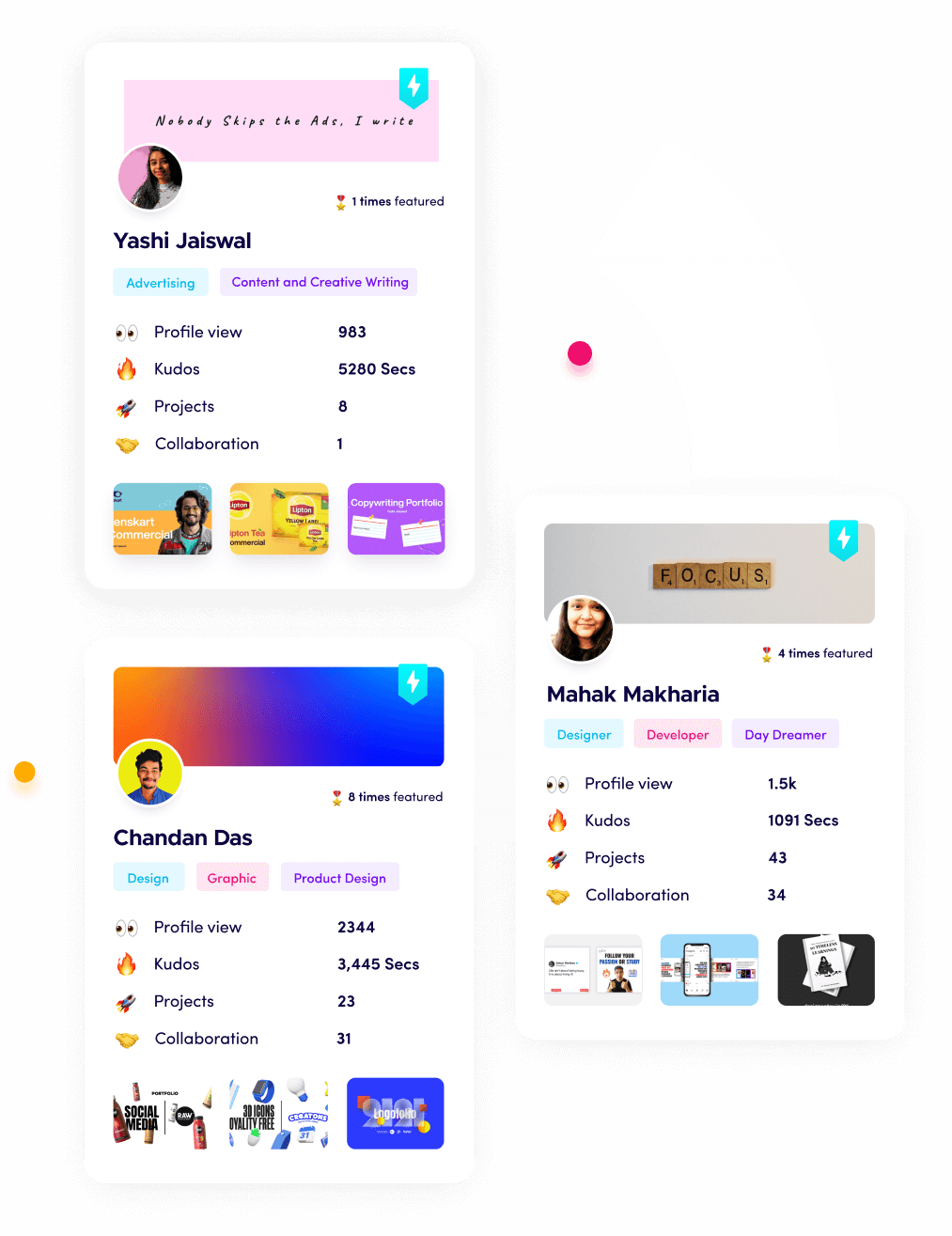
What is Fueler Portfolio?
Fueler is a career portfolio platform that helps companies find the best talent for their organization based on their proof of work.
You can create your portfolio on Fueler, thousands of freelancers around the world use Fueler to create their professional-looking portfolios and become financially independent. Discover inspiration for your portfolio
Sign up for free on Fueler or get in touch to learn more.
What should you do next?
You've read the article. Now turn your skills into proof of work and unlock more opportunities.
Build your proof of work portfolio
Create a clean portfolio with projects, assignments, resumes, and AI stack details that companies actually want to see.
Create your Fueler portfolio →Apply through assignments, not resumes
Stand out by solving real tasks from companies hiring on Fueler.
Explore assignments →Get discovered by companies
Make your work public and let recruiters discover your skills through actual projects instead of keywords.
Get discovered →