Top 7 High-Converting Landing Page Examples from US Brands (2026)

Riten Debnath
20 Jan, 2026
In the fast-moving digital world of 2026, you have exactly three seconds to convince a visitor to stay on your website. If your landing page feels cluttered, confusing, or outdated, you are not just losing a click; you are handing your revenue directly to your competitors. High conversion rates are no longer about flashy animations or aggressive sales pitches. Today, the most successful US brands are winning by using extreme clarity, hyper-personalization, and design that guides the human eye with surgical precision.
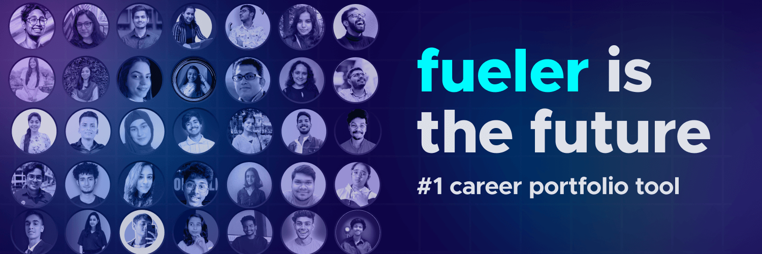
I’m Riten, founder of Fueler, a skills-first portfolio platform that connects talented individuals with companies through assignments, portfolios, and projects, not just resumes/CVs. Think Dribbble/Behance for work samples + AngelList for hiring infrastructure.
1. Shopify: The Master of the "Low-Friction" Entry
Shopify continues to dominate the e-commerce space by making the barrier to entry almost non-existent for new entrepreneurs. Their 2026 landing page focuses on a "Speed-to-Market" promise, ensuring that users feel they can go from an idea to a live store in minutes. The design is intentionally minimalist, using a clean white background and high-contrast primary buttons to ensure the visitor’s attention never wanders away from the sign-up box.
- Single-Field Lead Capture: The hero section features just one input box for an email address, which significantly reduces the psychological effort required for a visitor to start their free trial.
- Benefit-First Headline: Instead of talking about technical features, the headline focuses on the end result, such as "Start Your Business Today," hitting the emotional desire of the target audience.
- Dynamic Social Proof: As you scroll, the page displays a live ticker of stores being launched or sales being made on the platform, creating a powerful sense of community and proven success.
- Interactive Tool Integration: They often include a "Business Name Generator" or "Profit Margin Calculator" right on the page, providing instant value before the user even signs up for an account.
- Mobile-First Sticky CTA: No matter how far you scroll on your phone, a small "Start Free Trial" button remains at the bottom of the screen, ensuring the conversion point is always one tap away.
Why it matters:
Shopify understands that for busy founders, time is the greatest enemy. By stripping away every unnecessary link and focusing on a single, easy action, they maintain one of the highest conversion rates in the SaaS industry.
2. Airbnb: Using Aspirational Imagery to Drive Action
Airbnb’s landing page strategy in 2026 has shifted from simple listings to "Experience Storytelling." They use high-resolution, full-width video backgrounds that transport the visitor to a unique location immediately upon landing. By selling the dream of a perfect vacation rather than just a room, they bypass the logical "price-checking" brain and tap directly into the traveler's emotions.
- Predictive Search Functionality: The search bar uses AI to suggest destinations based on your current weather, upcoming holidays, or past browsing history, making the experience feel deeply personalized.
- Trust Through Verified Reviews: Every listing featured on the landing page is accompanied by a "Guest Favorite" badge and a clear star rating, which alleviates the common fear of "expectation vs. reality."
- High-Contrast "Book Now" Buttons: They use a specific shade of coral-red for their action buttons that stands out against any background, making it the most visually prominent element on the entire page.
- Transparent Pricing Modules: Airbnb has moved toward showing the "Total Price" including all fees upfront, which reduces cart abandonment and builds long-term trust with the consumer.
- Localized Content Blocks: Depending on your IP address, the landing page dynamically changes to show "Stays Near You" or "Top Rated in [Your City]," making the service feel immediately relevant and accessible.
Why it matters:
Airbnb proves that visuals are the most powerful tool for conversion. When you show people a beautiful reality they can participate in, you don't have to work as hard to convince them to click the "Search" button.
3. Trello: Clarity Through Visual Organization
Trello’s landing page is a masterclass in "Showing, Not Telling." Instead of long paragraphs explaining how their project management software works, they use an interactive, simplified version of their actual product interface as the hero image. This allows potential users to understand the "Board, List, Card" system in seconds without reading a single line of instructional copy.
- Interactive Product Demo: The hero section features an animated board where cards move automatically, demonstrating the drag-and-drop functionality that made the tool famous.
- Low-Commitment Language: Their CTAs use phrases like "Sign up - it's free!" which removes the financial risk and encourages users to jump in and experiment without hesitation.
- Logical Visual Hierarchy: The page is structured to answer the three biggest questions in order: What is it? How does it work? Who else uses it? This prevents the visitor from feeling overwhelmed.
- Collaborative Proof Points: They prominently display logos of world-class teams like Google and Fender, which serves as a silent "seal of approval" for professional project managers.
- Simplified Footer Navigation: Unlike a corporate website, the landing page removes the traditional massive footer, keeping the user’s focus entirely on the path toward creating their first board.
Why it matters:
Trello wins by respecting the visitor's intelligence and time. By letting the product speak for itself, they attract users who are looking for simplicity and organization in an increasingly complex work environment.
4. Netflix: The King of "Risk Reversal"
The Netflix landing page is perhaps the most famous example of "Less is More." In 2026, they have doubled down on a dark, cinematic aesthetic that makes their content pop. Their entire strategy revolves around "Risk Reversal," making sure the user knows they can cancel at any time and that there are no hidden contracts or commitments.
- Bold, Benefit-Driven Headline: The text is large and centered, usually saying something as simple as "Unlimited movies, TV shows, and more," which immediately confirms the visitor is in the right place.
- Secondary "Cancel Anytime" Messaging: Placed directly above or below the CTA, this tiny piece of micro-copy does the heavy lifting of removing the user's fear of getting stuck in a subscription.
- Visual "Content Peak": They use a background grid of their most popular original shows, which creates a "Fear of Missing Out" (FOMO) by reminding the user of all the great content they are currently missing.
- Zero-Distraction Layout: There are no "About Us" or "Blog" links in the header; there is only a logo, a language selector, and a "Sign In" button, leaving only one path forward for new visitors.
- FAQ Section for Objection Handling: At the bottom of the page, they use an accordion-style FAQ to answer common questions about price and device compatibility without cluttering the main design.
Why it matters:
Netflix demonstrates that if your brand is strong enough, you don't need to explain your product. You only need to remove the obstacles standing between the customer and the "Play" button.
5. Salesforce: Building B2B Trust with Data
Salesforce handles a more complex product, so its landing page focuses on "Problem-Solution" mapping. For 2026, they use personalized entry points for different industries (e.g., "Salesforce for Retail" or "Salesforce for Healthcare"). This ensures that a visitor feels the software was built specifically for their unique business challenges.
- Industry-Specific Landing Modules: The page uses dynamic text replacement to change headlines based on the visitor’s industry, making the value proposition feel 10x more relevant.
- Outcome-Focused Statistics: Instead of listing features, they use large, bold numbers like "29% increase in sales" to provide concrete, logical reasons for a business to invest in their platform.
- Guided "Pathways" via Quiz: They often use a "Find Your Solution" button that leads to a 3-step quiz, helping the user navigate their massive product suite without feeling lost.
- Trust Badges and Compliance Icons: For B2B, security is everything. They prominently display SSL certificates and data protection badges right next to the lead generation form to build instant credibility.
- Professional Video Testimonials: They move beyond text quotes and include 30-second video clips of real CTOs talking about their ROI, which is much more persuasive for high-ticket enterprise buyers.
Why it matters:
Salesforce shows that complexity doesn't have to mean confusion. By segmenting their audience and using hard data, they turn a complicated software purchase into a logical business decision.
6. Canva: Empowering the "Non-Designer"
Canva’s landing page is built to solve the visitor's problem before they even create an account. In 2026, they feature a "Start Designing" section that shows hundreds of templates based on what is trending right now, such as "Instagram Reels" or "AI-Generated Logos." This "Immediate Gratification" strategy is why they continue to grow at such a rapid pace.
- Template-First Discovery: The page allows you to hover over different design categories to see real examples of what you can create, giving the user a "head start" on their project.
- Drag-and-Drop Visual Cues: They use subtle animations that mimic the act of moving an element onto a canvas, which mentally prepares the user for how easy the software is to use.
- Ecosystem Integration Logos: By showing icons for Slack, Instagram, and LinkedIn, they prove that Canva isn't just a design tool, but a central hub for a professional's entire digital workflow.
- Clear "Free Forever" Tier: They emphasize their free version heavily, which builds a massive user base that eventually converts into "Pro" subscribers once they are hooked on the value.
- Community-Led Social Proof: They highlight that "Millions of people design with Canva," using the power of social validation to prove that the tool is the industry standard for non-designers.
Why it matters:
Canva’s success comes from its "Human-Centric" design. They don't talk about pixels or vectors; they talk about your ideas coming to life, which makes the platform feel approachable to everyone.
7. HubSpot: The King of Educational Lead Magnets
HubSpot is famous for its "Inbound Marketing" approach. Their landing pages for 2026 are often focused on giving away a free tool or a highly valuable resource (like an E-book or a Template) in exchange for an email. This "Value-Exchange" model builds a relationship of trust before they ever ask the visitor to spend a single dollar.
- High-Value "Lead Magnets": The primary focus is often a free resource that solves a specific problem, such as a "2026 Marketing Strategy Template," which attracts high-intent business leads.
- Simplified 3-Field Forms: They have optimized their forms to only ask for the essentials (Name, Email, Website), which keeps the "friction" low while still gathering enough data to qualify the lead.
- "What’s Inside" Preview: Below the form, they usually provide a blurred or "sneak peek" image of the resource, which increases the visitor’s desire to complete the download.
- Consistent Brand Voice: The copy is helpful, educational, and slightly informal, making the brand feel like a "partner" or a "mentor" rather than a cold software corporation.
- Exit-Intent Technology: If you try to leave the page without converting, a subtle pop-up offers one last "Bonus Tip" or a different resource, capturing a significant percentage of traffic that would otherwise be lost.
Why it matters:
HubSpot proves that the best way to get a customer is to first be a teacher. By providing immense value for free, they earn the right to pitch their paid products later in the customer journey.
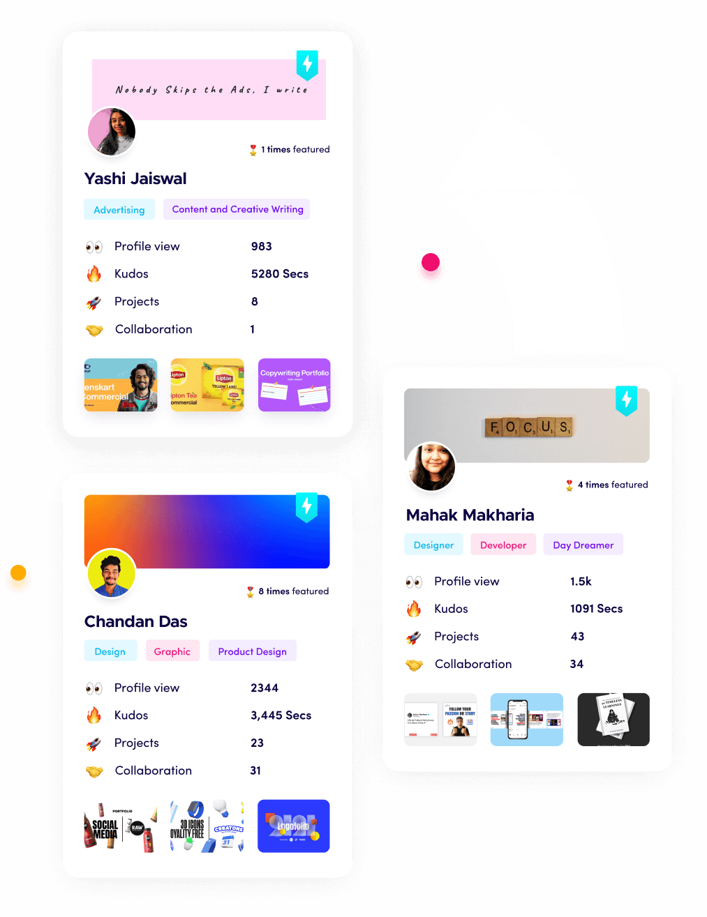
Promoting Your Skills with Fueler
While these big brands have million-dollar budgets to design their landing pages, as a freelancer or professional, your "landing page" is actually your portfolio. This is where Fueler comes in. Instead of a static resume that tells a recruiter what you did, Fueler allows you to show them. You can build a high-converting personal brand by organizing your work samples into a "Proof of Work" portfolio. Whether it is a landing page you designed, a code snippet you wrote, or a marketing campaign you managed, Fueler helps you present your skills with the same clarity and impact as the brands listed above.
Final Thoughts
Building a high-converting landing page in 2026 is about more than just aesthetics; it is about psychology and trust. Whether you are using a minimalist approach like Netflix or an educational one like HubSpot, your goal is to make the visitor's journey as frictionless as possible. By studying these top US brands, you can see that the secret to conversion is understanding your audience's pain points and offering a clear, visual solution immediately. Remember, clarity will always outperform cleverness when it comes to your bottom line.
FAQs
What makes a landing page high-converting in 2026?
A high-converting page focuses on a single goal, uses high-contrast CTAs, and provides immediate value through clear headlines and visual proof. In 2026, mobile optimization and fast loading speeds (under 2 seconds) are also non-negotiable factors for success.
How many CTA buttons should a landing page have?
While you can have multiple buttons, they should all lead to the same single goal. For example, you might have a "Sign Up" button at the top, middle, and bottom of the page to capture intent at different stages of the user's scroll.
Is social proof really necessary for conversion?
Yes, social proof is one of the most powerful psychological triggers. Using client logos, customer testimonials, or "Verified" badges can increase your conversion rate by over 15% because it reduces the visitor's perceived risk of trying something new.
How do I reduce "friction" on my landing page forms?
The best way to reduce friction is to ask for as little information as possible. Stick to 2-3 fields like Name and Email. You can always gather more information later in the onboarding process once the user has already committed to your service.
Can I use a portfolio as a landing page for my freelance business?
Absolutely. For freelancers, a portfolio is your most effective landing page. Using a platform like Fueler allows you to showcase "Proof of Work," which acts as the ultimate form of high-converting content for potential clients and employers.
What is Fueler Portfolio?
Fueler is a career portfolio platform that helps companies find the best talent for their organization based on their proof of work. You can create your portfolio on Fueler. Thousands of freelancers around the world use Fueler to create their professional-looking portfolios and become financially independent. Discover inspiration for your portfolio
Sign up for free on Fueler or get in touch to learn more.