Top 12 Data Visualization Tools for US Companies

Riten Debnath
06 Jul, 2025
Last updated: May 2026
With data shaping every major business decision across the United States, organizations need high-performing visualization tools that turn complex numbers into clear, interactive insights. The right platform can help your team spot hidden trends, communicate critical results, and drive bottom-line growth across your entire ecosystem. Whether you are running an agile startup or managing a large enterprise, these data visualization tools offer the specific features, processing flexibility, and cloud integrations you need to stay ahead of the competition.
I’m Riten, founder of Fueler, a skills-first portfolio platform that connects talented individuals with companies through assignments, portfolios, and projects, not just resumes/CVs. Think Dribbble/Behance for work samples + AngelList for hiring infrastructure.
The modern business environment demands absolute transparency, and nothing establishes your professional authority faster than letting stakeholders interact with your live creations. Let us dive into the top data visualization platforms utilized by US companies, updating their capabilities, exact marketplace pricing, and corporate value.
At a glance: Comparing the Top Data Visualization Tools for US Companies
Tableau
Best for: Enterprise-grade business intelligence, advanced dashboards, and large-scale data analytics for corporations.
Tableau is a market leader in enterprise-grade interactive data visualization, offering intuitive drag-and-drop dashboard construction alongside deep analytical processing layers. It connects natively to hundreds of corporate data sources and is heavily utilized by modern businesses for complex financial modeling, operational reporting, and scaled marketing analytics.
- Extensive Cloud and Local Data Connectivity: The platform links directly to hundreds of structured database networks, cloud data warehouses, and localized flat files without requiring custom middleware development.
- Live Automated Data Refreshes: Executive users can interact with live dashboards that update automatically as fresh data enters the corporate ecosystem, eliminating manual report generation.
- Advanced Statistical Modeling and Built-In Forecasting: Business analysts can easily add predictive trend lines, cluster distributions, and mathematical calculations to their reports to guide long-term strategic investments.
- Massive International Peer Community and Support: The platform features a large global network of data professionals who share custom dashboard templates, advanced design strategies, and troubleshooting help.
- Comprehensive Multi-Device Layout Customization: Report authors can design specific, responsive dashboard layouts tailored perfectly for desktop screens, internal company tablets, or secure mobile applications.
- Pricing Structures for Every Tier:
- Tableau Creator: $75 per user, per month (billed annually)
- Tableau Explorer: $42 per user, per month (billed annually)
- Tableau Viewer: $15 per user, per month (billed annually)
Why it matters
Tableau empowers US corporations to turn massive pools of unorganized data into highly actionable, beautiful visual assets that accelerate executive decision-making. Its robust enterprise architecture ensures that growing organizations can securely scale their data distribution across thousands of parallel users without sacrificing platform speed.
Microsoft Power BI
Best for: Businesses already using the Microsoft ecosystem and looking for affordable, scalable BI reporting.
Power BI is Microsoft’s premier business analytics framework, built to integrate perfectly with the corporate Office 365 ecosystem and advanced Azure cloud infrastructure. It is designed specifically to simplify the creation, publication, and internal sharing of detailed corporate reports, making advanced business intelligence accessible to everyone in the organization.
- Native Syncing with the Corporate Microsoft Ecosystem: The platform integrates natively with everyday productivity software like Excel spreadsheets, Teams collaboration spaces, Sharepoint portals, and Azure repositories.
- Advanced Algorithmic Insight Generation: Non-technical corporate managers can type standard conversational English questions directly into the platform to generate new data charts instantly without writing code.
- Secure Enterprise-Grade Access Governance: Built on top of Microsoft’s comprehensive security framework, the tool features robust row-level security protocols and strict global compliance policies.
- Fully Automated Cross-Platform Mobile Access: Teams can view, analyze, and interact with published corporate reports via dedicated mobile applications optimized for modern smartphones and tablets.
- Scalable Data Preparation via Power Query: The software utilizes an intuitive data transformation engine that allows analysts to clean, reshape, and merge messy data inputs from distinct corporate sources.
- Pricing Structures for Every Tier:
- Power BI Desktop: Completely free for individual report authoring on a local PC
- Power BI Pro: $10 per user, per month, allowing users to publish and share dashboards
- Power BI Premium: $20 per user, per month, offering advanced analytical modeling and capacity
Why it matters
Power BI democratizes the data analysis process, allowing every individual department inside a US business to visualize, share, and act on live operational trends securely. Its budget-friendly entry pricing makes it an incredibly attractive option for companies that want to build a completely data-driven culture.
Google Looker Studio
Best for: Marketing teams, startups, and agencies needing free cloud-based reporting dashboards.
Google Looker Studio is an accessible, cloud-based data visualization environment designed for building clean, shareable dashboards without upfront platform costs. It serves as an ideal solution for companies looking to connect digital marketing statistics, spreadsheet databases, and enterprise data warehouses into a unified interface.
- Unlimited No-Cost Interactive Report Creation: The platform allows organizations to build an unlimited number of custom data dashboards and share them across teams without incurring licensing fees.
- Instant Native Integration Across Google Infrastructure: The tool offers seamless, single-click data connections to primary marketing platforms like Google Analytics, digital advertising suites, and BigQuery databases.
- Live Real-Time Team Collaboration: Multiple team members can work on the exact same dashboard layout simultaneously, replicating the familiar collaborative environment of modern cloud documents.
- Extensive Global Library of Customized Templates: Users can access hundreds of pre-designed visual templates tailored for digital marketing audits, financial tracking, and operational product metrics.
- Flexible Web Embedding Capabilities: Constructed dashboards can be embedded directly into internal company intranets, private client portals, or public-facing websites using secure code snippets.
- Pricing Structures for Every Tier:
- Core Platform: Completely free for unlimited standard reports and default Google data connectors
- Looker Studio Pro: Custom enterprise tier for organizations requiring advanced enterprise management and dedicated support
Why it matters
Looker Studio makes professional-grade data visualization accessible to any US organization by removing the standard software cost barrier and offering deep ecosystem connections. It is an invaluable resource for marketing teams that need to visualize multi-channel advertising performance clearly and quickly.
Qlik Sense
Best for: Organizations that want AI-driven insights and deep exploratory data analysis.
Qlik Sense is a self-service business intelligence and analytics application powered by a unique, associative data exploration engine. It is recognized for its responsive dashboard layouts, automated insights, and its ability to help corporate users discover hidden connections in data that traditional search systems miss.
- Proprietary Associative Data Engine: Unlike standard query tools that restrict users to rigid, pre-defined data pathways, the associative engine maps every single data point together to show unexpected patterns.
- Automated Data Alerting and Proactive Insights: The system constantly monitors background enterprise data feeds to identify significant performance drops, unexpected sales spikes, or operational shifts.
- Fully Responsive and Device-Agnostic Framework: Every dashboard element adapts its visual structure automatically to match the exact resolution of the screen being utilized by the viewer.
- Rigorous Centralized Data Governance: The application provides corporate IT administrators with a secure environment to manage centralized data definitions, custom business metrics, and user access permissions.
- Embedded Analytics Modules for Custom Apps: Development teams can extract individual charts or full analytical interfaces and embed them directly into proprietary corporate software products.
- Pricing Structures for Every Tier:
- Qlik Sense Business: $30 per user, per month (billed annually) for standard team analytics capabilities
- Qlik Sense Enterprise SaaS: Custom-tailored pricing models designed for massive enterprise scales
Why it matters
Qlik Sense helps US enterprises dig deeper into complex data fields, allowing teams to uncover unexpected patterns and make highly informed tactical pivots. Its unique associative methodology is perfect for organizations dealing with disparate data sources that need a unified viewpoint.
Domo
Best for: Large enterprises managing multiple data sources and cross-department collaboration.
Domo is a comprehensive, cloud-native business intelligence architecture built to connect data from thousands of scattered sources into a single live dashboard. It is engineered specifically for large-scale data consolidation, workflow automation, and cross-departmental collaboration inside fast-moving corporate environments.
- Massive Library of Over One Thousand Connectors: The platform features a large portfolio of pre-built data integrations that connect to cloud applications, on-premise servers, and legacy databases.
- Real-Time Data Processing and Custom Alerts: Domo processes data rapidly as it flows into corporate servers, reflecting operational shifts instantly across all connected dashboard systems.
- Integrated Data Transformation Builders: The software includes built-in data preparation environments that allow business analysts to clean, blend, and restructure complex datasets using a visual interface.
- Collaboration-First Dashboards with Integrated Portals: Every data dashboard features built-in communication sections where team members can tag colleagues, leave contextual comments, and debate insights.
- Native Mobile Architecture for Remote Management: Built from the ground up with a mobile-first focus, the platform delivers an identical analytical experience across all handheld screens.
- Pricing Structures for Every Tier:
- Domo Starter: $300 per month for small, growing data teams of up to 5 concurrent users
- Domo Professional: $600 per month for expanding companies requiring access for up to 20 active users
- Enterprise Tier: Bespoke custom software agreements engineered for global organizations with massive scale
Why it matters
Domo breaks down deeply entrenched data silos across large organizations, enabling faster cross-team alignment and agile corporate decision-making. Its massive data connector library and automated engineering tools make it ideal for enterprises managing fragmented software stacks.
Sisense
Best for: Tech companies and SaaS platforms needing embedded analytics and heavy data processing.
Sisense is an elite data analytics application celebrated for its capacity to process massive, highly complex data structures with incredible speed and flexibility. Its unique internal technology architecture and advanced embedding options make it a top choice for organizations looking to integrate heavy analytics into their products.
- High-Velocity Processing of Massive Datasets: The platform utilizes advanced, proprietary memory-optimization tech to process billions of rows of data without experiencing performance lag.
- Customizable Embedded Analytics Frameworks: Developers can completely white-label the reporting interface, styling dashboards to match the exact aesthetic of their own applications.
- Advanced Predictive Analytics and Machine Learning: The application features built-in forecasting tools, automated text explanations, and predictive modeling features that help teams look into future business patterns.
- Elastic Cloud Architecture Supporting Massive Scaling: Built to thrive in modern cloud environments, the software scales its infrastructure resources dynamically based on active user volume.
- Visual Data Modeling Interfaces for Fast Testing: The tool features a drag-and-drop data modeling layer that simplifies the process of joining complex database tables and establishing metric relationships.
- Pricing Structures for Every Tier:
- Cloud Platform Plans: Base configurations typically start around $100 per user, per month for standard cloud deployments
- Corporate Enterprise: Customized annual licensing structures available depending on precise data volume requirements
Why it matters
Sisense allows US companies to visualize and analyze exceptionally heavy datasets effortlessly, giving organizations the structural clarity needed to drive continuous product innovation. It is a fantastic option for product-led tech companies that want to offer premium analytics directly to their clients.
Zoho Analytics
Best for: Small-to-mid-sized businesses looking for affordable and easy-to-use analytics software.
Zoho Analytics is a highly intuitive, user-friendly business intelligence application designed to make detailed report generation accessible to growing businesses. It features an extensive collection of data connectors, automated alert systems, and forecasting tools, providing advanced analytics capabilities at an affordable price.
- Simplified Drag-and-Drop Construction Interface: Non-technical workers can quickly build sophisticated data charts, pivot tables, and dashboard layouts using a simple drag-and-drop workspace.
- Automated Data Alerts and Trend Forecasting: The platform utilizes a smart assistant to analyze data trends, predict future business metrics, and answer natural language questions.
- Simultaneous Integration Across Diverse Platforms: The tool connects smoothly with over 500 popular business applications, covering everything from CRM databases to accounting software.
- Secure Collaboration Portals with Comment Threads: Report authors can share individual charts or full dashboards with team members while setting precise, read-only or editing permissions.
- Fully White-Labeled Portals for Client Presentation: Freelance consultants and professional service agencies can completely rebrand the analytics interface with their own logos and domains.
- Pricing Structures for Every Tier:
- Basic Tier: $30 per month (billed annually), providing core platform access for up to 2 users
- Standard Tier: $60 per month (billed annually), expanding capabilities for up to 5 team members
- Premium Tier: $145 per month (billed annually), offering advanced analytical modeling features for up to 15 users
- Enterprise Tier: $575 per month (billed annually), supplying large-scale corporate infrastructure supporting up to 50 users
Why it matters
Zoho Analytics brings advanced business intelligence within financial reach for US companies of all sizes, allowing internal teams to turn raw information into clear action items. Its accessible design and extensive software connections make it a perfect fit for growing small-to-midmarket businesses.
Google Charts
Best for: Developers who want free, lightweight, and customizable web-based charts.
Google Charts is a reliable, free, web-based visualization toolset designed specifically for web developers who need to build and embed interactive charts inside websites. It operates as a highly flexible solution for display rendering, requiring minimal code to produce clean, cross-browser data visuals.
- Extensive Portfolio of Highly Customizable Charts: The developer library includes everything from standard bar graphs and pie charts to complex timeline displays and tree maps.
- Cross-Browser Compatibility and Responsive Rendering: Built utilizing modern web standards, all charts render perfectly across distinct internet browsers, operating systems, and mobile formats.
- Live Web Connection and Real-Time Interactive Features: Rendered charts can connect directly to live web data streams, updating their visual elements automatically on the page as new information flows in.
- Clean Web Documentation and Developer Support: The tool is backed by comprehensive, public-facing documentation filled with practical code examples, implementation guides, and layout tutorials.
- Zero Software Licensing Costs or Access Limitations: The visual library is completely free to use for both personal projects and large-scale commercial business applications without hidden upgrade fees.
- Pricing Structures for Every Tier:
- Open-Source Library: Completely free for all personal, educational, and scaled commercial web developments across the globe
Why it matters
Google Charts offers a completely free, highly reliable, and flexible way for US web developers to build interactive data visuals for public consumption. Its clean code architecture and light weight make it a go-to solution for embedding simple data charts into corporate websites.
Zebra BI
Best for: Financial reporting, variance analysis, and executive dashboards following IBCS standards.
Zebra BI is a highly specialized data visualization extension engineered specifically for accounting professionals, corporate controllers, and business analysts who need to build clear reports. Unlike general-purpose design tools, it is built to strictly adhere to the International Business Communication Standards (IBCS), ensuring absolute formatting consistency.
- Strict Adherence to International Communication Standards: The software applies uniform colors, layout rules, and chart structures to every report automatically based on global business communication best practices.
- Seamless Integration Extensions for Microsoft Platforms: The tool operates directly as an advanced plugin extension inside Microsoft Power BI, Excel spreadsheets, and PowerPoint presentation decks.
- Automated Variance Analysis and Discrepancy Tracking: The system calculates and visualizes differences between financial plans, historical actuals, and future forecasts with a few clicks.
- Dynamic Commenting Modules Embedded Within Visuals: Report creators can type contextual explanations, project notes, and regulatory disclosures directly inside the charts themselves.
- Smart Responsive Layout Scaling for Dashboards: Charts adjust their visible level of detail, text sizing, and grid lines automatically based on the digital workspace available on the user's screen.
- Pricing Structures for Every Tier:
- Core Platform Tiers: Offers a basic free version with premium Pro plans and custom Enterprise scales available upon consultation
Why it matters
Zebra BI eliminates the messy design inconsistencies that plague traditional corporate reporting, replacing them with standardized, executive-ready financial dashboards. It is an essential tool for finance departments that want to automate variance tracking and deliver crystal-clear insights to the boardroom.
Atlassian Analytics
Best for: Software development teams tracking engineering workflows and operational performance.
Atlassian Analytics is a modern, cloud-based data tracking platform built to help technology teams blend, analyze, and visualize data across their entire software development lifecycle. It connects information from multiple project workspaces into clean dashboards, helping managers align daily engineering tasks with overarching business goals.
- Unified Data Blending Across Complex Workspaces: The tool combines data from software tracking channels, customer service queues, and operational roadmaps into a centralized repository.
- Simplified Drag-and-Drop Chart Creation Workflow: Non-technical project managers can build comprehensive operational charts and performance dashboards without writing complex SQL database queries.
- Real-Time Progress Tracking Against Corporate Goals: Dashboards update instantly as engineering teams close code tasks, update project steps, and log customer support tickets.
- Secure Enterprise Collaboration and Sharing Permissions: Project authors can share completed data reports across full organizational departments or restrict view access to specific team leaders.
- Native Alignment with Enterprise Management Frameworks: Built specifically to support software organizations, the tool includes dashboard templates engineered for agile workflows and issue management tracking.
- Pricing Structures for Every Tier:
- Software Bundling: Included with Jira Software Premium and Enterprise subscription tiers, with baseline user configurations starting at $15.25 per user, per month
Why it matters
Atlassian Analytics provides technology-driven US companies with the visibility needed to align daily software engineering efforts with broad business goals. It eliminates the blind spots that often separate technical development teams from business executives.
Infogram
Best for: Marketing teams and designers creating interactive infographics and presentation visuals.
Infogram is a web-based, designer-friendly data visualization platform built for creating highly engaging interactive infographics, marketing reports, and executive presentation slides. It serves as an exceptional tool for creative teams who need to transform dry corporate data into media-rich visual content.
- Expansive Creative Library of Graphic Templates: The design workspace provides users with immediate access to thousands of pre-made layouts, corporate infographic designs, map templates, and vector icons.
- Intuitive Drag-and-Drop Visual Editor for Assembly: Marketing managers can easily place interactive charts, text boxes, images, and video links onto the design canvas using an intuitive visual editor.
- Highly Engaging Interactive Elements and Animations: Constructed graphics feature smooth zoom effects, pop-up data cards, and scroll animations that react dynamically as a user reads the content.
- Simultaneous Multi-User Collaboration inside the Editor: Creative teams can collaborate in real time, leaving design notes, updating text copies, and tweaking chart layouts together.
- Flexible Publishing Formats and High-Res Downloads: Completed infographics and charts can be published online via hosted web links, embedded into blog posts, or downloaded as clean, print-ready files.
- Pricing Structures for Every Tier:
- Basic Tier: Completely free configuration offering baseline template access and core chart tools
- Pro Tier: $25 per month (billed annually), unlocking expanded template selections and high-resolution image downloads
- Business Tier: $79 per month (billed annually), adding custom corporate branding capabilities
- Team Tier: $179 per month (billed annually), providing full real-time collaboration features
Why it matters
Infogram empowers creative and marketing departments across the US to turn complex datasets into highly shareable, stunning visuals for public presentations and digital campaigns. It is a vital asset for teams looking to boost audience engagement using data-driven storytelling. Many businesses also rely on tools like Sonra's XML to CSV tool to prepare structured data for visualization platforms such as Tableau, Power BI, and Google Looker Studio
IBM Cognos Analytics
Best for: Large enterprises requiring secure, enterprise-grade analytics and compliance-focused reporting.
IBM Cognos Analytics is an enterprise-grade business intelligence and data visualization platform engineered for complex corporate data environments and rigorous security settings. It utilizes built-in analytics assistance to automate report creation, guide data cleaning, and deliver secure operational insights across global networks.
- Automated System Exploration and Visual Recommendations: The platform features an advanced analytics assistant that guides users through the entire analysis cycle using conversational text prompts.
- Automated Multi-Departmental Report Delivery: Corporate teams can configure the system to generate complex operational reports automatically and distribute them to thousands of stakeholders on a set schedule.
- Deep Data Virtualization across Cloud Networks: The platform connects across distinct multi-cloud storage environments, local mainframe networks, and modern enterprise database systems simultaneously.
- Rigorous International Regulatory Compliance Tracking: Built to safeguard highly sensitive data, the software features elite user-governance protocols, encryption standards, and strict global compliance tracking.
- Custom Enterprise Dashboard Embedding for Portals: Engineering teams can use developer toolkits to integrate complex data reports directly into custom internal software systems or secure client portals.
- Pricing Structures for Every Tier:
- Standard Tier: $10 per user, per month (billed annually) for core data connectivity and report tools
- Plus Tier: $40 per user, per month (billed annually), adding advanced automated insights and deeper options
- Premium Tier: $80 per user, per month (billed annually), providing full enterprise-grade management features
Why it matters
IBM Cognos Analytics provides large US corporations with a highly stable, secure environment to manage, analyze, and visualize data across sprawling global teams. It is built specifically for security-conscious companies that cannot compromise on data governance or system reliability.
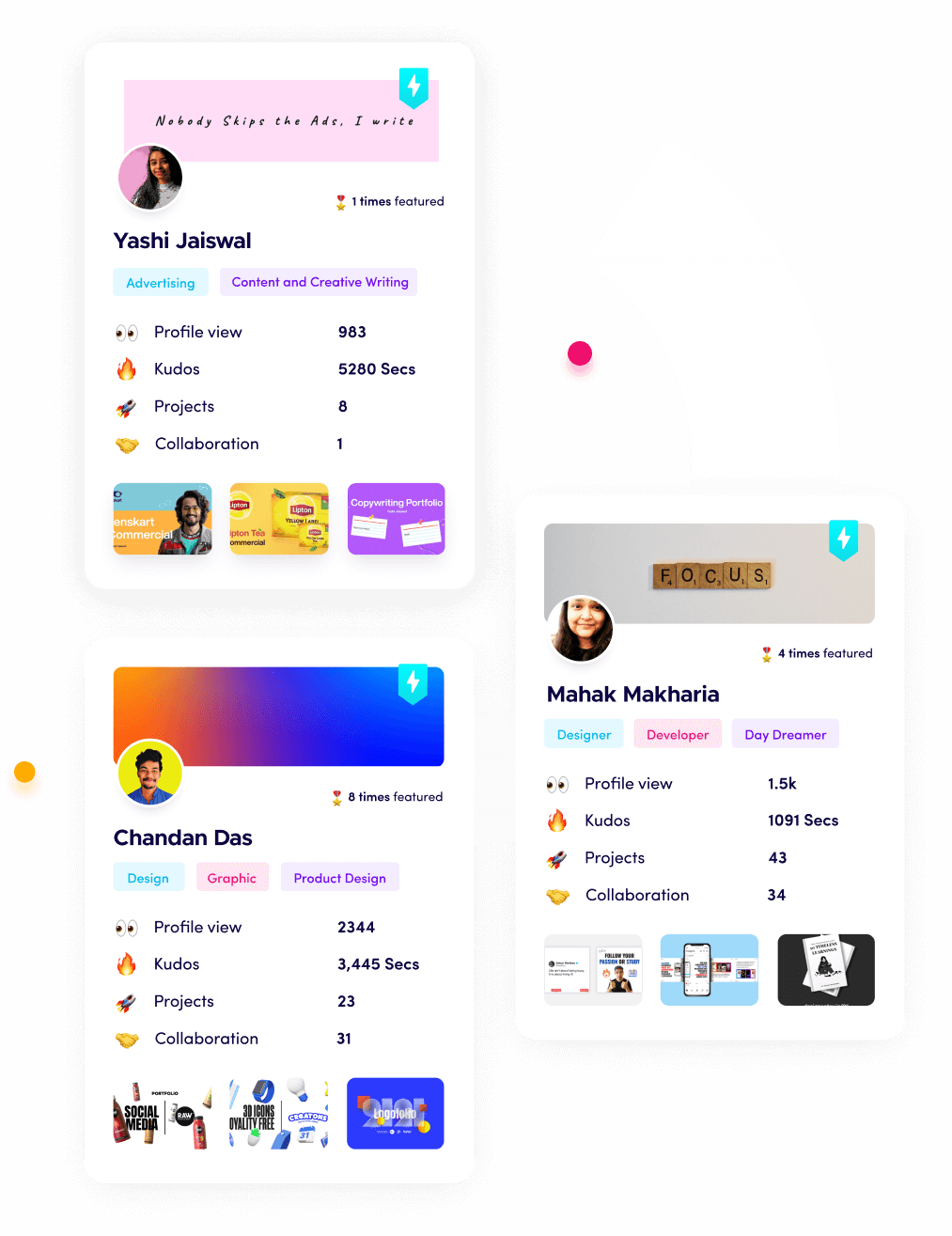
How does this connect to Building a Strong Career or Portfolio?
As modern US companies transform their operations using advanced data visualization tools, the baseline expectations for data professionals have completely shifted. Employers do not have the time to read through paragraphs of unverified text claims on a flat resume; they want to see live, undeniable proof of your capabilities.
To build a secure career in today's market, you must transition into a proof-of-work model. This means documenting your technical journey, publishing your completed data dashboards, and organizing your assignments into a clean, public portfolio space. Showing an employer a live, interactive data visualization sample proves you understand modern data pipelines and can immediately generate business value, helping you bypass traditional recruitment hurdles.
The Ultimate Way to Showcase Your Proof of Work
This is exactly why we built Fueler. If you want to stand out in a global job market where practical skills matter far more than university degrees, you need a dynamic, professional space to display your actual output. Fueler allows you to organize your best data visualization samples, case studies, and corporate assignments into a beautifully structured portfolio.
Instead of sending a boring document to a recruiter, you can share a live profile link that visualizes your practical expertise across any discipline, whether you are a data analyst, growth marketer, product manager, or developer. Fueler gives you the professional infrastructure to show the world exactly what you are capable of building, helping you secure high-paying remote roles, valuable contract projects, or corporate partnerships entirely on your own terms.
Final Thoughts
Choosing the right data visualization platform can completely transform how your company understands and acts on its daily data pools. Whether you require a simple embeddable web chart or a massive, enterprise-grade data warehouse dashboard, these tools help you turn numbers into insights, drive better corporate strategies, and maintain a competitive edge. Invest in the specific toolset that matches your current team capacity, and start making your data work for your business growth.
Frequently Asked Questions
What is the best data visualization tool for US companies looking to scale?
Tableau and Microsoft Power BI remain the top choices for the majority of US corporations due to their immense data connector ecosystems, corporate infrastructure scaling options, and powerful dashboard sharing features.
Are there free data visualization tools available for startups?
Yes, Google Looker Studio and the open-source libraries from Google Charts and Plotly offer incredibly robust, free options for constructing professional dashboards and embedding interactive charts without licensing expenses.
How do I choose the right data visualization tool for my business team?
You should carefully evaluate your team’s current programming skills, your primary corporate data storage environments, your annual software budget constraints, and the specific visual complexity required for your final reports.
Can these visualization tools handle massive big data and real-time streams?
Platforms such as Sisense, Domo, and IBM Cognos Analytics are engineered from the ground up to process massive, complex datasets and deliver live, real-time reporting updates without experiencing performance lag.
What is the most effective way to showcase my data visualization skills to employers?
The absolute best approach is using Fueler to organize and display your live dashboards, interactive data reports, and analytical assignments within a polished, public portfolio space that clearly highlights your practical results.
What is Fueler Portfolio?
Fueler is a career portfolio platform that helps companies find the best talent for their organization based on their proof of work. You can create your portfolio on Fueler. Thousands of freelancers around the world use Fueler to create their professional-looking portfolios and become financially independent. Discover inspiration for your portfolio
Sign up for free on Fueler or get in touch to learn more.

What should you do next?
You've read the article. Now turn your skills into proof of work and unlock more opportunities.
Build your proof of work portfolio
Create a clean portfolio with projects, assignments, resumes, and AI stack details that companies actually want to see.
Create your Fueler portfolio →Apply through assignments, not resumes
Stand out by solving real tasks from companies hiring on Fueler.
Explore assignments →Get discovered by companies
Make your work public and let recruiters discover your skills through actual projects instead of keywords.
Get discovered →