Top 8 AI Data Visualization Tools for US Companies

Riten Debnath
04 Jun, 2026
Last updated: June 2026
In 2026, waiting days for data engineering teams to write SQL scripts and compile static reports is an unacceptable operational drag. Modern business intelligence requires dynamic, autonomous visualization infrastructures that convert multi-source streaming datasets into immediate semantic dashboards. Forward-thinking companies use conversational AI layers to bypass manual chart configuration entirely. Teams can now discover outlier trends, project financial health scenarios, and generate localized data reports using natural language processing.
I’m Riten, founder of Fueler, a skills-first portfolio platform that connects talented individuals with companies through assignments, portfolios, and projects, not just resumes/CVs. Think Dribbble/Behance for work samples + AngelList for hiring infrastructure.
Evaluating data visualization tools requires assessing semantic integration speeds, natural language processing accuracy, cloud pipeline extensibility, and automated report rendering capabilities. The ideal system balances direct data security with intuitive discovery mechanics to democratize metrics across your organization.
Here are the best AI data visualization tools in 2026.
At a glance: Comparing the Top AI Data Visualization Tools for US Companies
1. Tableau Pulse
Best For
Enterprise organizations requiring secure, deeply integrated data infrastructures, advanced governance protocols, and autonomous metric tracking across massive cloud data warehouses.
Tableau Pulse represents a complete shift from complex desktop chart building to automated insight delivery. Built directly on top of the Salesforce Data Cloud foundation, it acts as an intelligent notification layer that proactively delivers personalized metrics, anomaly alerts, and root-cause analyses straight to a user's business workspace.
- Automated Metric Outlier Detection: Tracks core organizational KPIs continuously against historical statistical baselines, automatically surfacing critical trend variations, sudden drops, or sudden volume spikes to operations leaders before standard quarterly reviews occur.
- Natural Language Insight Generation: Generates concise textual summaries alongside interactive charts to explain exactly why a metric shifted, completely bypassing the manual dashboard filtering processes that historically slowed down administrative decision-making cycles.
- Unified Enterprise Data Governance: Enforces rigorous role-based permission schemas across all dynamic charts, ensuring that automated visual insights remain strictly compliant with internal data access policies and global security frameworks.
- Direct Slack and Email Ingestion: Delivers critical data visualizations and trend summaries directly to team communication channels, allowing decentralized executives to monitor performance without logging into independent software portals.
- Custom Legacy Migration Friction: Delivers incredible value for organizations anchored in modern data lakes, but migrating complex, highly customized legacy dashboards into the Pulse architecture requires careful configuration planning.
Pricing
- Tableau Creator: $75 per user, per month (billed annually). Full access to advanced data modeling, platform development, and administration tools.
- Tableau Explorer: $42 per user, per month (billed annually). Controlled self-service data exploration and interactive dashboard building capabilities.
- Tableau Viewer: $15 per user, per month (billed annually). Access to view, filter, and receive automated insights from established organizational dashboards.
Why It Matters in 2026
Tableau Pulse remains a critical enterprise asset because it actively pushes tailored intelligence to the edge of the organization. It eliminates the need for every business manager to be an expert in visual analytics.
2. Microsoft Power BI Copilot
Best For
Companies heavily embedded in the Azure ecosystem that need to scale visual intelligence across thousands of team members via automated corporate report building.
Microsoft Power BI Copilot embeds language intelligence directly into the enterprise data architecture. It allows users to build comprehensive, interactive visual reports from scratch simply by typing text prompts, making analytics instantly accessible within the standard operating environment.
- Prompt-to-Report Dashboard Construction: Transforms complex, multi-layered data tables into beautifully arranged, fully functioning visual dashboards using a single conversational request, eliminating hours of manual drag-and-drop layout design.
- Automated DAX Code Orchestration: Generates flawless Data Analysis Expressions (DAX) formulas and database query strings instantly, allowing operational managers to execute advanced data modeling operations without deep engineering experience.
- Native Azure Data Lake Linking: Synchronizes directly with Microsoft Fabric and Azure Synapse, providing near-zero latency data visualization pipelines that scale reliably to process petabytes of unstructured corporate information.
- Contextual Executive Summary Cards: Produces smart, bulleted executive highlights right inside corporate workspaces, making it easy for stakeholders to understand complex multi-variate charts during time-sensitive reviews.
- Ecosystem Vendor Lock-In Dynamics: Delivers unmatched efficiency inside a pure Windows and Microsoft environment, but teams operating heavily on alternative open-source architectures may encounter system configuration hurdles.
Pricing
- Power BI Pro: $10 per user, per month. Basic report sharing, publishing capabilities, and core cloud dashboard visualization infrastructure.
- Power BI Premium (Per User): $20 per user, per month. Advanced analytics, larger data model sizes, and automated data management pipelines.
- Power BI Premium (Capacity): Starts at $4,995 per month. Dedicated cloud computing scale, maximum governance controls, and organization-wide content viewing permissions.
Why It Matters in 2026
Power BI Copilot democratizes corporate business intelligence by turning data exploration into a simple conversation. It allows teams to instantly translate data warehouse updates into strategic boardroom visual assets.
3. ThoughtSpot
Best For
Modern data teams, product managers, and growth analysts who want to replace static charts with a search-driven, live analytics interface.
ThoughtSpot eliminates traditional dashboard maintenance by organizing data around a consumer-grade search bar. Powered by its advanced Sage AI engine, the platform translates conversational queries into highly precise SQL code, instantly generating live visualizations from cloud data environments.
- Search-Driven Graph Generation: Renders accurate, customized charts instantly when a user types questions into a central search interface, fundamentally changing how cross-functional departments access live database metrics.
- Sage AI Contextual Modeling: Utilizes specialized semantic understanding models to accurately interpret ambiguous business questions, ensuring generated visualizations match the user's strategic intent.
- Live-Link Cloud Cloud Pipeline Connectivity: Queries cloud data ecosystems like Snowflake, BigQuery, and Databricks directly without moving or caching files, ensuring displayed charts always reflect live pipeline infrastructure.
- Automated Interactive Drill-Down Paths: Enables non-technical users to click directly into any visual chart element to instantly break down granular data layers without needing a developer to build custom views.
- Initial Semantics Layer Setup Overhead: Eliminates long-term dashboard building tasks, but requires an structured initial data modeling effort to map business definitions before opening up self-service search tools.
Pricing
- Team Plan: $95 per month. Fixed data query volumes, unlimited users, and standard connections to modern cloud databases.
- Pro Plan: $2,500 per month. Designed for scaling mid-market setups requiring full search capabilities and advanced custom security controls.
- Enterprise Plan: Custom volume pricing. Uncapped data scale, dedicated computing environments, and comprehensive multi-tenant deployment parameters.
Why It Matters in 2026
ThoughtSpot removes the delays typical of centralized business intelligence setups. It turns data consumption into an interactive discovery process, allowing team members to independently answer complex performance questions in seconds.
4. Polymer
Best For
Marketing teams, small-business operators, and digital creators who want to transform messy spreadsheets into interactive web dashboards without coding.
Polymer acts as an agile data assistant that automatically converts unorganized spreadsheets and CSV exports into structured web apps. It uses lightweight machine learning to analyze raw spreadsheets, clean column formats, and generate optimized dashboards in minutes.
- Instant Spreadsheet Visual App Conversion: Scans uploaded files to instantly create an interactive web portal featuring pre-built filter bars, key trend graphs, and searchable data blocks automatically.
- Algorithmic Column Type Optimization: Identifies and fixes messy date formats, geographical coordinates, and currency values automatically, bypassing manual spreadsheet cleaning phases.
- Pre-Built Marketing Integration Hubs: Connects directly to major ad networks, payment platforms, and web analytics tools to streamline multi-channel marketing performance reporting.
- Embedded Client Presentation Layouts: Allows agencies to generate clean, white-labeled web URLs for data presentation, giving clients real-time access to performance metrics without exposing backend databases.
- Complex Multi-Table Joining Constraints: Ideal for visualizing flat datasets and combined spreadsheets, but not built to manage complex relational database connections.
Pricing
- Starter Plan: $20 per user, per month (billed annually). Core visualization features, manual file uploads, and standard template access.
- Pro Plan: $40 per user, per month (billed annually). Adds direct API integrations, customized company branding, and unlimited metric widgets.
- Enterprise Plan: Starts at $250 per month. Dedicated data synchronization queues, advanced custom styling options, and prioritized customer onboarding support.
Why It Matters in 2026
Polymer makes data visualization accessible to non-technical teams by eliminating complex installation phases. It allows agile businesses to quickly analyze spreadsheet data without dedicating weeks to learning specialized BI tools.
5. Akkio
Best For
Growth agencies, mid-market operators, and revenue teams who want to combine automated data visualization with predictive machine learning models in one place.
Akkio unifies historical metric visualization with predictive forecasting tools. It enables operations professionals to clean complex data tables, build predictive models, and generate interactive dashboards through an intuitive, visual workflow.
- Predictive Visual Trend Forecasting: Generates reliable forward-looking trend lines and business outcome forecasts directly inside your current dashboards, helping teams identify upcoming market shifts early.
- Conversational Data Preparation Assistant: Cleans, merges, and reformats messy rows of data via simple text prompts, saving analysts from writing complex spreadsheet formulas.
- Lead Conversion Probability Dashboards: Scores incoming opportunities against historical win factors to visually highlight high-performing lead segments right inside your performance views.
- Custom Live App Deployment Blocks: Packages complex data charts and predictive models into lightweight, shareable web interfaces for internal cross-functional reviews or external stakeholder alignment.
- Massive Live Database Scale Limitations: Built for rapid predictive charting and mid-market data files, making it less optimal for massive, real-time enterprise streaming pipelines.
Pricing
- Starter Plan: $49 per month. Basic data cleaning tools, standard chart builders, and entry-level predictive model training capacity.
- Professional Plan: $99 per user, per month. Full natural language data preparation tools and expanded training thresholds.
- Enterprise Plan: Custom volume pricing. Dedicated machine learning execution nodes, custom compliance features, and tailored training workflows.
Why It Matters in 2026
Akkio changes dashboards from historical records into proactive planning tools. It helps growth teams anticipate future customer trends and operational changes rather than just reviewing past results.
6. MonkeyLearn Studio
Best For
Customer experience teams, support managers, and product researchers who need to transform unstructured text feedback into quantified visual dashboards.
MonkeyLearn Studio specializes in extracting quantitative insights from unstructured text data like reviews, support tickets, and open-ended surveys. It uses natural language processing to categorize text sentiment, tag key topics, and build dynamic consumer trend dashboards.
- Automated Text Sentiment Categorization: Analyzes thousands of customer interactions simultaneously, instantly sorting qualitative comments into clear positive, neutral, or negative visual charts.
- Custom Keyword and Topic Mapping: Organizes messy feedback records into structured thematic categories automatically, highlighting recurring product complaints or customer service bottlenecks.
- Native Customer Service App Sync: Integrates directly with leading customer helpdesks to automatically clean, tag, and visualize incoming ticket data in real time.
- Granular Intent Detection Infrastructure: Separates customer feature requests from bug reports and general feedback, allowing product managers to build evidence-based prioritization roadmaps.
- Pure Quantitative Metric Limitations: Optimized specifically for text analytics and qualitative data, meaning it requires pairing with traditional BI platforms for heavy financial modeling.
Pricing
- Team Plan: $299 per month. Includes full access to the core studio visualization dashboard, standard text classifiers, and API access limits.
- Enterprise Plan: Custom configuration pricing. Tailored text modeling pipelines, custom integration routing, and dedicated data engineering support.
Why It Matters in 2026
MonkeyLearn Studio Bridges the gap between qualitative customer feedback and quantitative charts. It allows operations leaders to easily monitor brand sentiment and product issues without manually reading thousands of feedback rows.
7. Sisense Fusion
Best For
Software product managers, engineering teams, and enterprise developers who want to embed deeply customized, AI-driven white-label analytics directly into their own applications.
Sisense Fusion provides a highly flexible cloud analytics infrastructure designed for embedding custom charts and data exploration tools directly into customer-facing software apps, backed by scalable cloud computing node allocation.
- White-Label Embedded Analytics Blocks: Enables product teams to integrate fully branded, interactive chart dashboards directly into external web applications without rebuilding analytical engines from scratch.
- Scalable Cloud In-Chip Compute Cache: Utilizes optimized high-performance caching infrastructure to process large data tables rapidly, ensuring embedded customer charts load instantly.
- Predictive Extraneous Trend Alerts: Monitors embedded customer workflows to flag unusual data variations automatically, providing users with context-aware performance tips.
- Flexible API-First Developer Toolsets: Supports extensive custom styling, visual extensions, and tailored chart components via modern web development frameworks and API routes.
- Engineering Resource Implementation Requirements: Built as an advanced developer framework, meaning it requires technical engineering resources to fully implement and deploy compared to no-code alternatives.
Pricing
- Sisense Fusion Subscription: Custom quote-based pricing only. Scaled around specific cloud computing usage, data query volumes, user models, and app distribution targets.
Why It Matters in 2026
Sisense Fusion enables product companies to turn data visualization into a premium feature within their software applications. It provides end-users with robust data exploration capabilities without forcing internal teams to maintain custom charting engines.
8. Veezoo
Best For
Mid-market companies and operational departments that want to replace manual report building with an intuitive, conversational question-and-answer data interface.
Veezoo uses an advanced semantic parser to deliver an instant, conversational data exploration experience. By typing questions, business managers can instantly generate tailored, interactive data graphs, making weekly report compilation much more efficient.
- Conversational Graph Generation Engine: Visualizes data points automatically when users ask questions in natural language, removing the need to manually configure axis settings or data types.
- Smart Next-Step Question Suggestions: Evaluates active user search pathways to suggest relevant follow-up questions, guiding team members toward deeper data insights automatically.
- Multi-Layer Geography Mapping Frameworks: Converts regional data tables into detailed interactive maps automatically, helping sales leaders track performance across specific territories.
- One-Click Team Dashboard Pinning: Allows users to easily save conversationally generated charts to shared team dashboards, simplifying collaborative report building.
- Advanced Cross-Database Modeling Limits: Works exceptionally well with cleanly structured SQL warehouses, but requires clear table relationships to handle highly complex data models across separate environments.
Pricing
- Free Tier: $0. Full access for up to 5 team members with standard cloud file uploads and core charting utilities.
- Growth Plan: $30 per user, per month. Direct connections to live SQL databases, unlimited dashboard sharing, and prioritized data processing.
- Enterprise Plan: Custom architecture pricing. Advanced security configurations, custom semantic layer optimization, and dedicated customer success management.
Why It Matters in 2026
Veezoo eliminates the internal friction that often separates business teams from technical databases. It ensures that any department lead can generate accurate, presentation-ready charts on demand without waiting for data engineering assistance.
Which Tool Should You Choose?
- Beginners & Creators: Choose Polymer to quickly convert standard marketing spreadsheets into clean web-based dashboards without writing a line of code.
- Startups & Growth Teams: Choose Veezoo for quick, search-driven data visualizations, or Akkio to combine interactive data cleaning with predictive forecasting models.
- Enterprises: Choose Tableau Pulse or Microsoft Power BI Copilot to deploy managed, highly secure analytics infrastructure across massive global cloud environments.
- Product Teams & Developers: Choose Sisense Fusion to embed deeply customized, white-labeled visual analytics widgets directly into your software applications.
- Qualitative Researchers: Choose MonkeyLearn Studio to transform unstructured text feedback, support logs, and customer reviews into quantified trend charts.
Building a Strong Career or Portfolio With AI Data Visualization
Modern business hiring heavily rewards operators who can translate complex, raw datasets into clear strategic action plans. Mastering advanced visualization frameworks is no longer an isolated technical skill; it is a critical career differentiator for analytics managers, growth marketers, and operations leaders. Proving you can configure automated data pipelines, map out intuitive dashboards, and use natural language queries to uncover hidden business insights directly establishes your value to leadership.
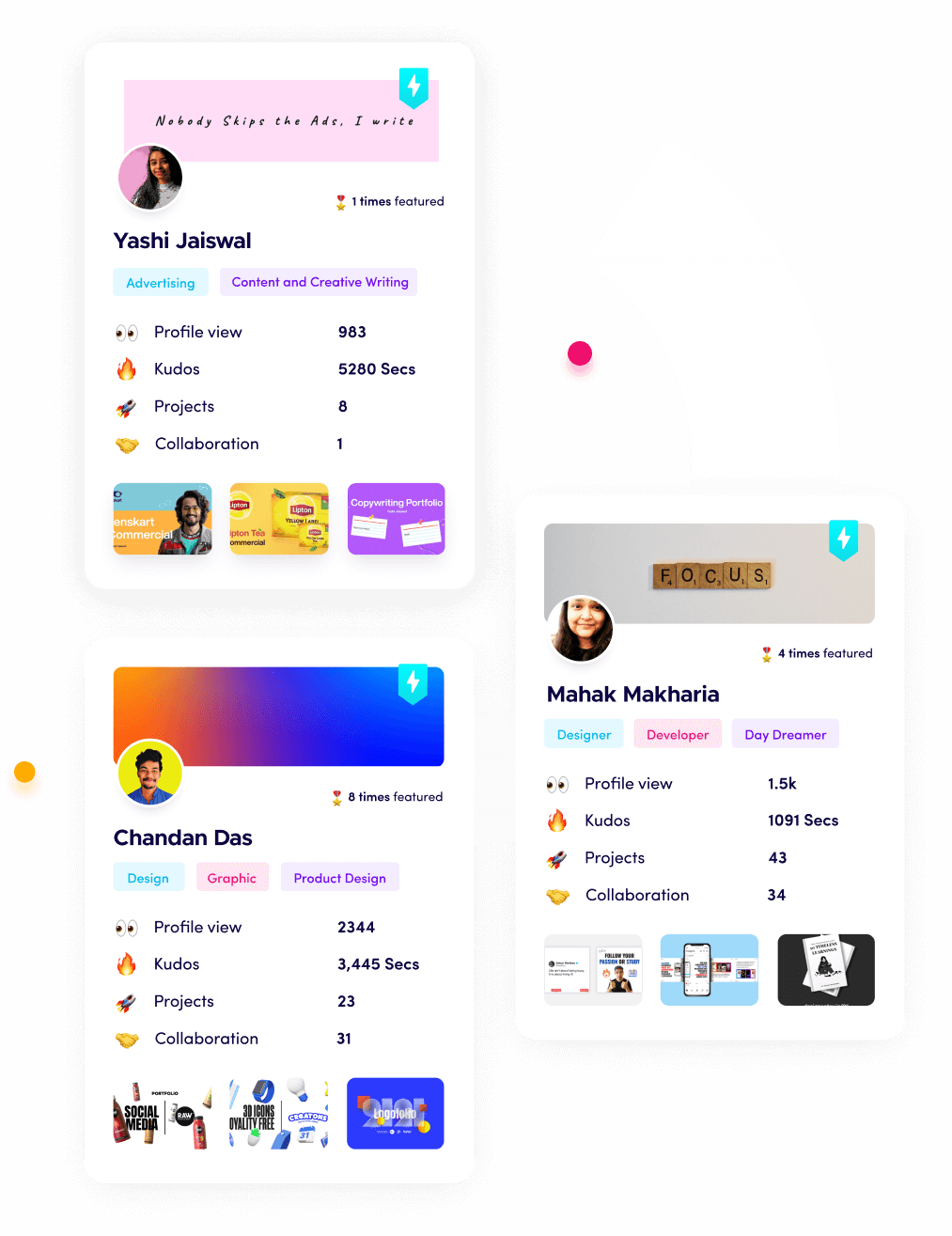
Documenting these analytical systems as public proof of work provides concrete evidence of your business impact. Sharing your dashboard architectures and automated report setups on Fueler gives prospective hiring managers clear proof of your ability to convert raw data into profitable business decisions.
Final Thoughts
The choice of data visualization infrastructure determines how quickly an organization turns information into action. Moving to intelligent, search-driven charting systems allows companies to eliminate the operational delays associated with manual dashboard creation. Assess your current technology ecosystem: teams integrated into corporate cloud setups will maximize efficiency with Tableau Pulse or Power BI Copilot, while agile groups can stay faster using search-driven options like ThoughtSpot or Veezoo. Select a visualization platform that matches your team's technical comfort level, automate your standard weekly metrics tracking, and keep your data infrastructure focused on driving clear, actionable business decisions.
FAQ
What are the premier AI data visualization tools for small businesses in 2026?
Polymer and Veezoo are excellent small-business choices. Polymer allows teams to convert static spreadsheets into interactive web dashboards instantly, while Veezoo offers a conversational question-and-answer tool that eliminates manual charting tasks.
Can these visualization tools connect directly to live cloud data warehouses?
Yes. Professional systems like Tableau Pulse, Power BI, and ThoughtSpot establish live links to data warehouses like Snowflake and BigQuery, ensuring charts update automatically as new information streams in.
Do I need to know SQL to use modern data visualization platforms?
No. Modern platforms utilize natural language processing to translate conversational English queries into accurate database code, allowing non-technical professionals to generate charts without writing manual scripts.
What is the primary benefit of embedded analytics tools?
Embedded tools like Sisense Fusion allow software developers to integrate interactive dashboard components directly into their own applications, providing users with robust reporting capabilities without building an analytical engine from scratch.
How secure are conversational data visualization tools?
Enterprise-focused platforms enforce strict data governance and role-based permissions, ensuring that automated insights and charts remain fully compliant with internal data access policies and security frameworks.
What is Fueler Portfolio?
Fueler is a career portfolio platform that helps companies find the best talent for their organization based on their proof of work. You can create your portfolio on Fueler. Thousands of freelancers around the world use Fueler to create their professional-looking portfolios and become financially independent. Discover inspiration for your portfolio
Sign up for free on Fueler or get in touch to learn more.

What should you do next?
You've read the article. Now turn your skills into proof of work and unlock more opportunities.
Build your proof of work portfolio
Create a clean portfolio with projects, assignments, resumes, and AI stack details that companies actually want to see.
Create your Fueler portfolio →Apply through assignments, not resumes
Stand out by solving real tasks from companies hiring on Fueler.
Explore assignments →Get discovered by companies
Make your work public and let recruiters discover your skills through actual projects instead of keywords.
Get discovered →