12 Landing Page Tips to Increase Conversion for US Businesses

Riten Debnath
07 Jul, 2025
Ever wondered why some landing pages turn visitors into loyal customers while others fall flat? The secret is in the details. In 2025, US companies that master landing page optimization are seeing bigger returns, more leads, and faster growth, even in crowded markets. If you want your website to become a conversion machine, these proven tips will help you get there.
I’m Riten, founder of Fueler, a platform that helps companies hire through assignments and professionals showcase their best work. In this article, I’ll share the most effective landing page tips for US businesses, breaking down each point with actionable advice and real-world relevance. Remember, your landing page is more than a digital brochure, it’s your proof of expertise, your credibility, and your shortcut to trust in the digital marketplace.
1. Craft a Clear and Compelling Headline
Your headline is the first impression visitors get when they land on your page. It should instantly communicate your offer and spark curiosity, setting the tone for the rest of the content. A strong headline keeps users from bouncing and encourages them to scroll further. It’s important to use simple, direct language that highlights a benefit and avoids jargon. Test different headlines to see what resonates with your audience and drives engagement.
- Use direct, benefit-driven language
- Focus on the main solution or offer
- Keep it short and impactful
Why it matters: A clear headline quickly communicates value, grabs attention, and encourages US visitors to stay on your page, which increases your conversion chances.
2. Use a Strong, Relevant Visual
Visuals are powerful for making a first impression and supporting your message. The right image or video can demonstrate your product, evoke emotion, and make your landing page memorable. Avoid generic stock photos and instead use visuals that show your product or service in action. Make sure your visuals load quickly and look good on all devices.
- High-quality, relevant images or videos
- Show your product or service in real-life scenarios
- Ensure visuals match your brand style
Why it matters: Relevant visuals help visitors connect emotionally with your brand, making them more likely to trust and engage with your offer, which is essential for boosting conversions in the US market.
3. Write Persuasive, Benefit-Focused Copy
Your landing page copy should focus on what the visitor will gain, not just what you do. Use simple, persuasive language to highlight how your offer solves their problems or improves their life. Break up text with bullet points and keep paragraphs short for easy reading. Include real examples or testimonials to back up your claims.
- Address pain points and provide solutions
- Use bullet points for key benefits
- Include testimonials or social proof
Why it matters: Benefit-focused copy makes your offer more appealing and relatable, increasing the likelihood that US visitors will take the action you want.
4. Highlight a Single, Clear Call-to-Action (CTA)
Every landing page should have one main action you want visitors to take, like signing up or making a purchase. Your CTA should stand out visually and use action-oriented language. Place your CTA above the fold and repeat it as needed throughout the page. Make it easy for visitors to know exactly what to do next.
- Use a contrasting color for the CTA button
- Keep CTA text clear and direct
- Repeat the CTA in key locations
Why it matters: A clear and focused CTA removes confusion, guiding US visitors toward your conversion goal and improving your landing page’s effectiveness.
5. Minimize Distractions
Too many links, navigation bars, or unrelated elements can distract visitors from your main offer. A clean, focused landing page keeps attention where it matters most and improves the user experience. Remove unnecessary navigation and keep the design simple and uncluttered. Use whitespace to help important elements stand out.
- Remove unnecessary navigation and links
- Limit options to one main goal
- Use whitespace to direct focus
Why it matters: Minimizing distractions keeps visitors engaged with your message and increases the chance that US users will complete your desired action.
6. Build Trust with Social Proof
People trust what others say about you more than what you say about yourself. Adding testimonials, reviews, or logos of well-known clients can reassure visitors and make your offer more credible. Video testimonials or case studies can be especially powerful. Display trust badges or security seals if you’re asking for sensitive information.
- Customer testimonials or video reviews
- Trust badges and security seals
- Logos of well-known clients or partners
Why it matters: Social proof builds credibility and reassures US visitors, making them more likely to trust your business and convert.
7. Optimize for Mobile Devices
With more users browsing on phones, your landing page must look great and work smoothly on all devices. A mobile-optimized page loads quickly, is easy to navigate, and keeps visitors from leaving due to poor usability. Test your page on different devices to ensure a seamless experience.
- Responsive design for all screen sizes
- Fast loading times on mobile
- Easy-to-read text and clickable buttons
Why it matters: Optimizing for mobile ensures your landing page reaches all US users and prevents lost conversions due to technical or usability issues.
8. Use Short, Simple Forms
Long forms can scare visitors away. Only ask for the information you truly need, and make your forms easy to fill out on any device. Use autofill and validation features to make the process smoother. Place forms near your CTA and use clear labels for each field.
- Limit fields to essentials (name, email)
- Use autofill and validation features
- Place forms close to the CTA
Why it matters: Short forms reduce friction and make it easier for US visitors to become leads or customers, improving your conversion rate.
9. Add a Sense of Urgency
Encouraging visitors to act quickly can boost conversions. Use limited-time offers, countdown timers, or highlight scarcity to motivate immediate action. Make sure your urgency is genuine and not overused, or it may lose its effect.
- Time-limited discounts or bonuses
- Countdown timers for special offers
- Highlight low stock or limited spots
Why it matters: Creating urgency motivates US visitors to act now, rather than delaying or leaving, which can significantly increase your conversions.
10. Test and Optimize Regularly
Continuous improvement is key to higher conversions. Regularly test different headlines, images, CTAs, and layouts to find what works best for your audience. Use analytics to track performance and make data-driven decisions.
- Run A/B tests on key elements
- Track conversion rates and user behavior
- Use analytics to guide changes
Why it matters: Testing and optimizing ensures your landing page keeps improving, helping US businesses stay competitive and maximize results.
11. Use Clear, Benefit-Driven Subheadings
Break up your content with subheadings that highlight key benefits. This makes your page easier to scan and helps visitors quickly find the information they care about. Use bold or larger fonts for emphasis and organize sections logically.
- Subheadings that focus on value
- Use bold or larger fonts for clarity
- Organize content in logical sections
Why it matters: Benefit-driven subheadings make your content easier to digest and keep US users moving toward your CTA, improving engagement and conversions.
12. Make Your Offer Risk-Free
Reduce hesitation by offering guarantees, free trials, or easy refunds. When visitors know there’s little risk, they’re more likely to take the next step. Clearly display your guarantee or refund policy near your CTA.
- Money-back guarantees or free trials
- Clear refund or cancellation policies
- Highlight “no risk” in your CTA
Why it matters: A risk-free offer removes barriers for US customers, increasing trust and the likelihood of conversion.
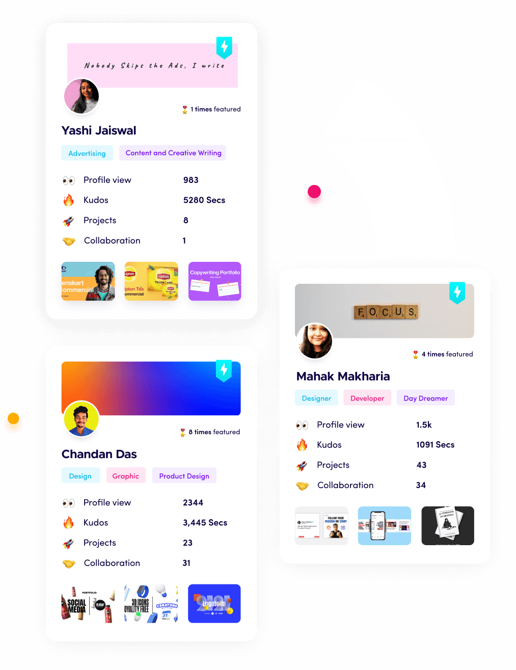
Why Fueler is a Smart Choice for Landing Page Projects
Fueler lets you showcase your best landing pages, A/B tests, and conversion wins in a professional portfolio. By documenting your landing page strategies and results, you can prove your expertise to clients and employers, making it easier to win new business and assignments.
Final Thought
Landing pages are the gateway to higher conversions for US businesses in 2025. By following these tips—clear headlines, strong visuals, focused CTAs, and ongoing optimization—you can turn more visitors into loyal customers and grow your business online.
FAQs
1. What is the most important element of a high-converting landing page?
A clear and compelling headline is crucial for grabbing attention and setting the tone for conversions.
2. How do I increase trust on my landing page?
Add testimonials, reviews, and trust badges to reassure visitors and build credibility.
3. Why should landing pages be mobile-optimized?
Most US users browse on mobile, so a responsive design ensures a smooth experience and higher conversions.
4. What is the best way to test landing page performance?
Use A/B testing and analytics to compare different elements and improve results over time.
5. How can I showcase my landing page results to clients or employers?
Use Fueler to organize and present your best landing page projects and conversion wins in a professional portfolio.
What is Fueler Portfolio?
Fueler is a career portfolio platform that helps companies find the best talents for their organization based on their proof of work.
You can create your portfolio on Fueler, thousands of freelancers around the world use Fueler to create their professional-looking portfolios and become financially independent. Discover inspiration for your portfolio
Sign up for free on Fueler or get in touch to learn more.

What should you do next?
You've read the article. Now turn your skills into proof of work and unlock more opportunities.
Build your proof of work portfolio
Create a clean portfolio with projects, assignments, resumes, and AI stack details that companies actually want to see.
Create your Fueler portfolio →Apply through assignments, not resumes
Stand out by solving real tasks from companies hiring on Fueler.
Explore assignments →Get discovered by companies
Make your work public and let recruiters discover your skills through actual projects instead of keywords.
Get discovered →