Introducing Fueler Profile New Layout

Aquib Jawed
08 Oct, 2022
Hello Friends 👋
Here at Fueler, we give you all the flexibility and modern design you need to get started quickly to showcase your Proof of Work. We understand that not everyone is satisfied with the same solution, so we constantly work to improve our existing offerings.
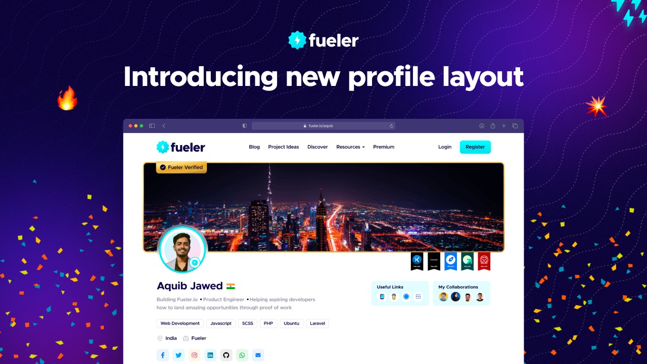
We are pleased to announce the launch of the new profile layout for your Fueler Profile. We have been working on this upgrade for a long time, putting our best effort into improving the user experience, and showcasing more information at once is now much easier in a very aesthetically pleasing manner. 😉
So what exactly has changed?
New profile layout
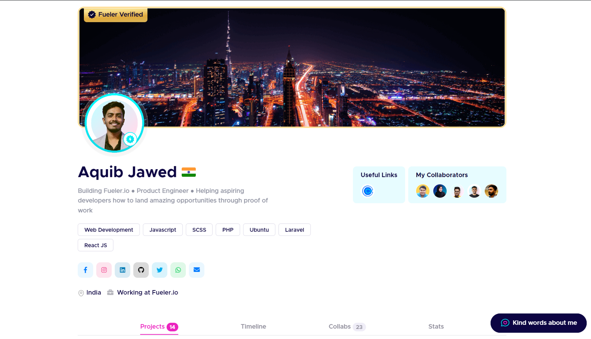
With the new layout, we have fit the profile in a container with a maximum width of 1200px, so no matter how much bigger your screen is, your fueler profile will all look alike on each screen.
Cover Image Dimension Update
The Cover Image gets extra special treatment on top of your profile thus we’ve decided to introduce a new and improvised dimension of 1400*350 or 4:1 aspect ratio. Since there is a crop feature in the cover image so make sure to crop accordingly.
Please note that, if you find your cover image is not displaying in a proper manner, make sure to update the cover image as per new guidelines.
Introducing Location/Country
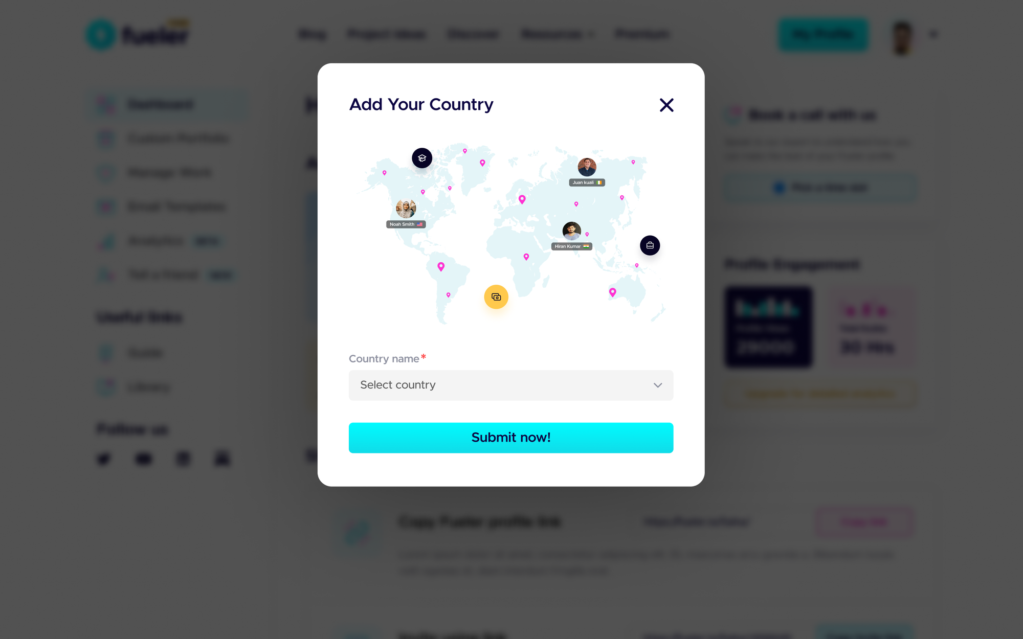
Location plays a vital role in building connections and attracting opportunities across the globe. Thus we’ve decided to launch the location and country flag in your fueler profile.
How to enable the Location & country flag in your profile?
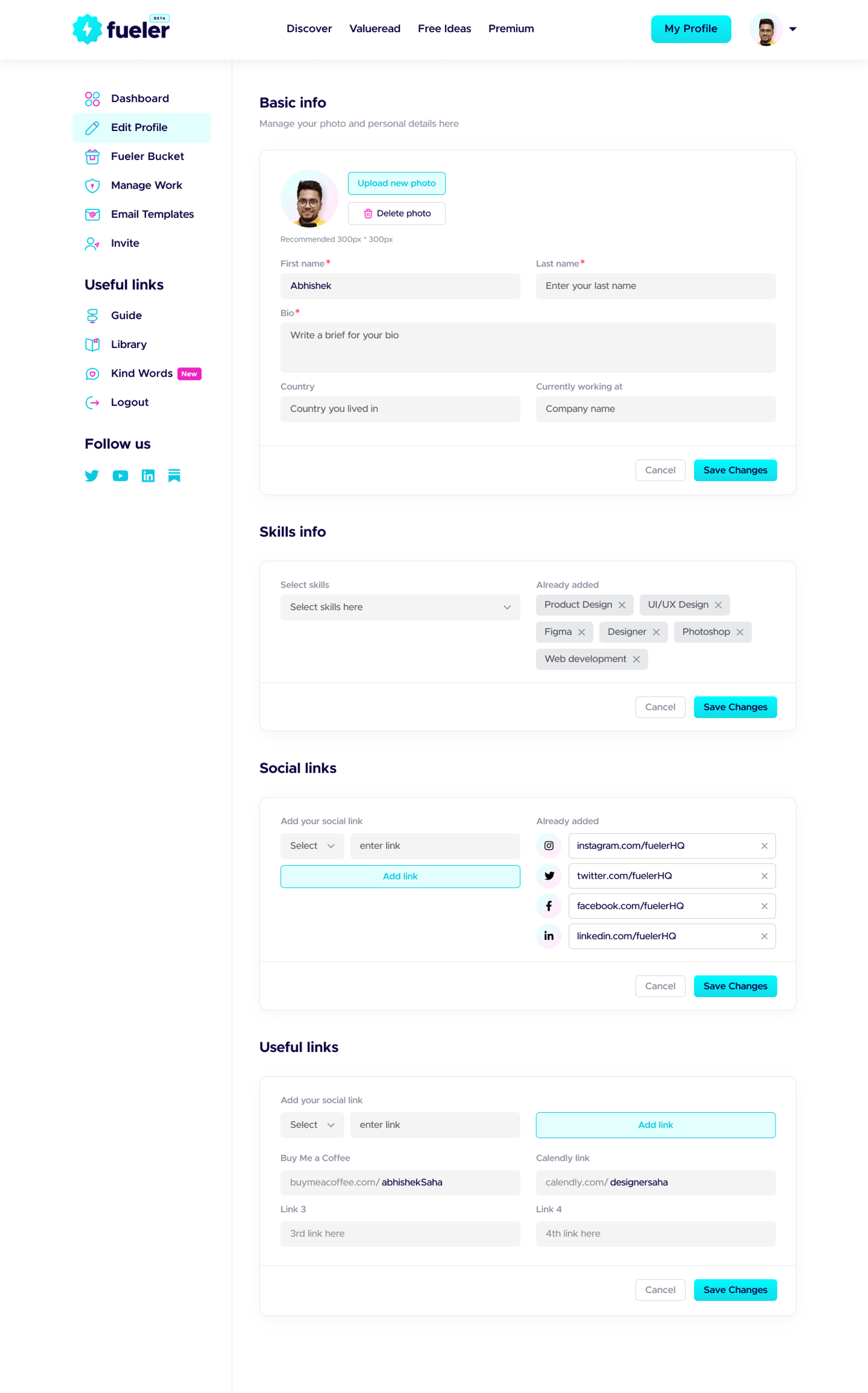
Navigate to Dashboard and you’ll find a brand new Edit Profile Option in the side navbar.
Now, under the Edit Profile Page, scroll to the Basic info section find the country option make your selection and you’re good to go.
Visit your profile page to see the new country flags in action.
Alternatively, you’ll find a popup to enable the location & country flag after login. Make a selection and you’ll see new country flags in your profile.
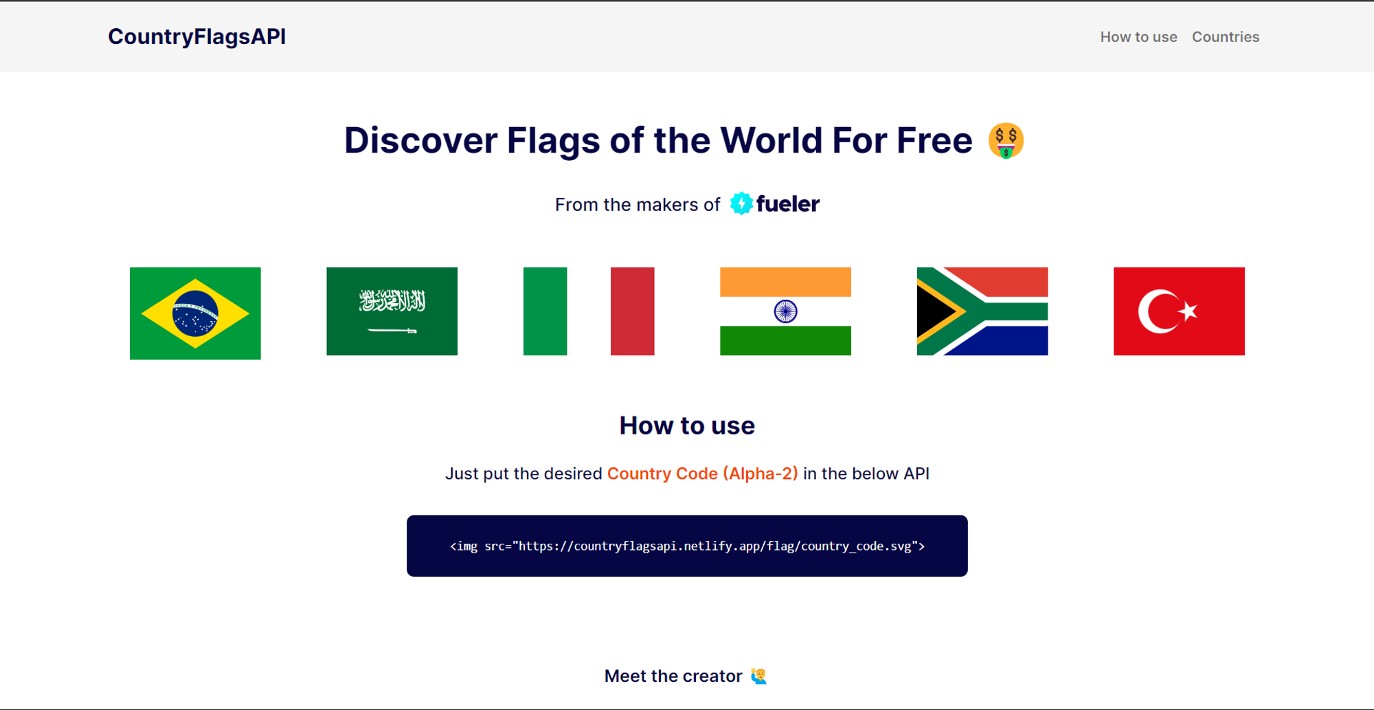
At the same time, we’ve developed our own CountryFlagsAPI to fetch the flag icon of the respective country against the user name in the Fueler Profile.
This is what the landing page of API looks like.
All Edit option from your profile has been shifted to separate “Edit Page”
You’ll find the “Edit Profile” option in the side navbar of the dashboard. From that page, you can update
- Profile Details
- DP
- Cover Image
- Bio
- Country
- Currently Working status
- Skills
- Social Links
- Useful Links
Work replaced with Projects
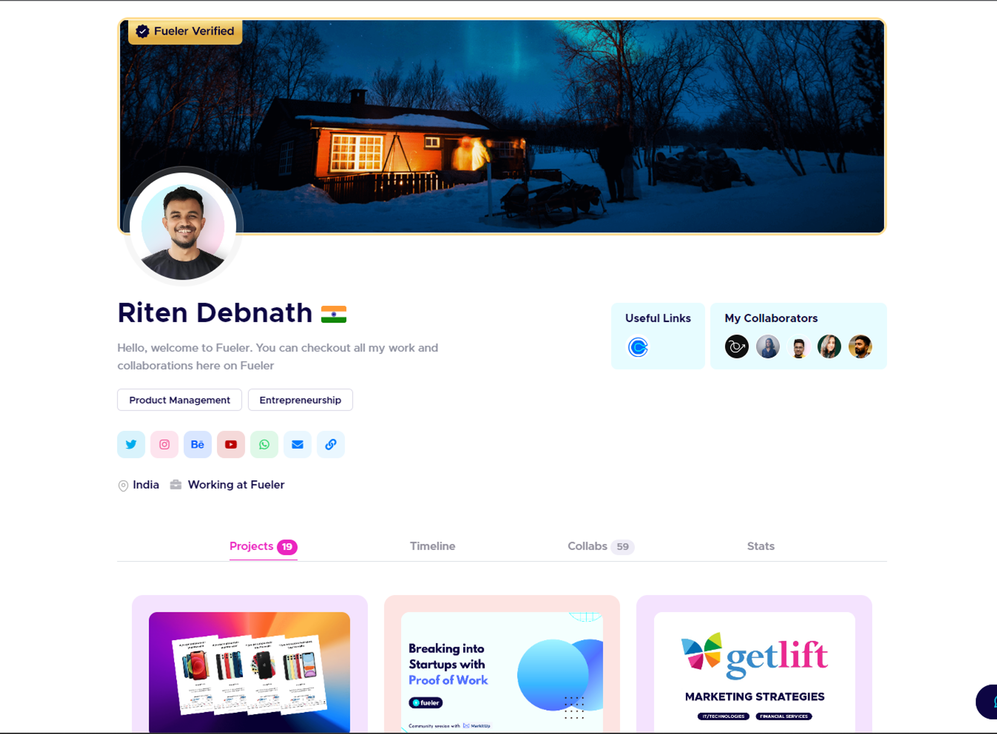
Since your fueler profile helps you showcase your Proof Of Work and builds your professional presence based on the skill set you possess. so we thought why not bring it in front rather than showing your whole timeline in front?
No no, we’re not removing the timeline from your profile, just changed its priority and shifted it to a Timeline tab in your profile after Projects. 😀
Bug fixes and improvements
- Removed all the unused code from the fueler profile page
- Implemented AJAX method to fetch user contents using API on full loading of the page which eventually resulted in reduced load time.
- Improved Performance of a Fueler Profile
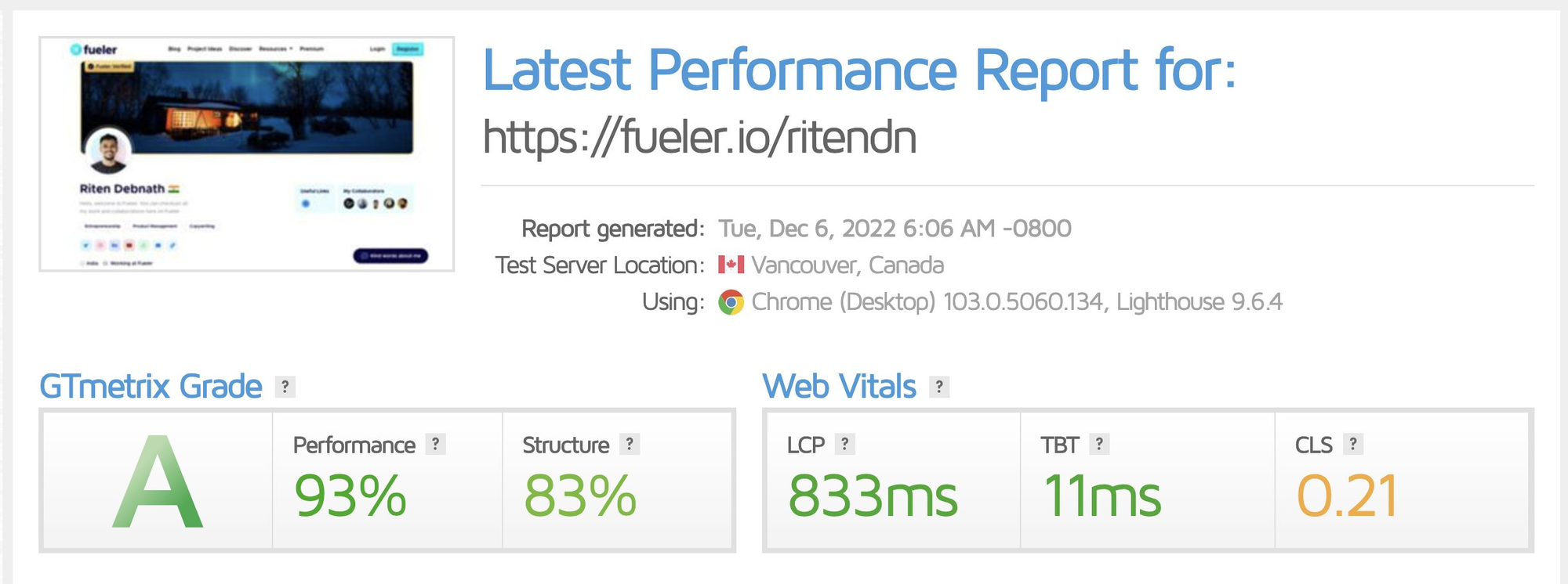
- Made it easier for users to update their profile information like DP, Cover Image, Bio, etc.
- Migrated all the editing options from the profile page and to a separate Edit Profile page in Dashboard.
